You're staring at a pricing page that almost converts. The visitor scrolls, pauses on the plan that fits, and then leaves without a word. A small bubble sits in the corner, and you aren't sure whether it is a person, a bot, a form, or just decoration. That bubble is a website chat widget, and the type you choose decides whether it answers a buying question, handles a support issue, or pushes people away.
Four Types of Website Chat Widgets Compared
A website chat widget is the launcher, usually in a corner, that connects a visitor to a person, an automated assistant, or a shared conversation. The word chat hides four different products. Pick the type before you paste any code, because the visitor only gets what that type can do.
| Type | How It Answers | Best For | Main Risk |
|---|---|---|---|
| Live chat | A human agent replies in real time | Complex questions and high-value buyers | Slow or unstaffed replies |
| Bot | An automated assistant answers from set content | Common questions outside working hours | Wrong or flat answers to unusual questions |
| Hybrid | A bot answers first and hands off to a person | Support teams with mixed question volume | Handoff that loses conversation context |
| Social-proof-enabled | A visible group conversation shows others asking questions | Launches, courses and webinars | Simulated activity that feels deceptive if undisclosed |
Live chat fits a sales call where the buyer asks about a custom contract. It fails on a Sunday night if nobody is scheduled to reply. A bot fits "What is your refund window?" at 11 p.m. It fails when the question is unusual and the script has no honest answer. A hybrid fits a help desk that gets both password resets and billing disputes. It fails when the handoff drops the transcript and the visitor has to start over. A social-proof-enabled widget fits a course launch where people want to see the same objections others raise. It fails when the group thread looks like real buyers and isn't labeled as a sample. That visible-group approach is what products like FOMOchat are built around: real conversations next to an AI trained on your pages, not a notification popup that only flashes a name. If you want a deeper look at the category, this roundup of the best website chat widget options and a walkthrough of an AI chat widget are useful next stops.
Most sites still don't offer real conversation. A 2025 study of more than 3,000 business websites found that only 5.9% offered any chat widget. Among those widgets, 78.5% were contact forms in a chat-like interface, and only 21.5% provided genuine live chat.
Practical rule: If the panel only collects a name and a message, call it a form. Don't tell the visitor they're chatting.
If you're weighing an automated assistant against a staffed inbox, this comparison of chatbot versus live chat lays out the tradeoffs in plain terms. Teams choosing software can also use choosing a small business chatbot platform from DesignStack as a checklist for fit, not just features. The type decides what the visitor receives, so choose it before you install anything.
Core Features That Decide What a Widget Can Do
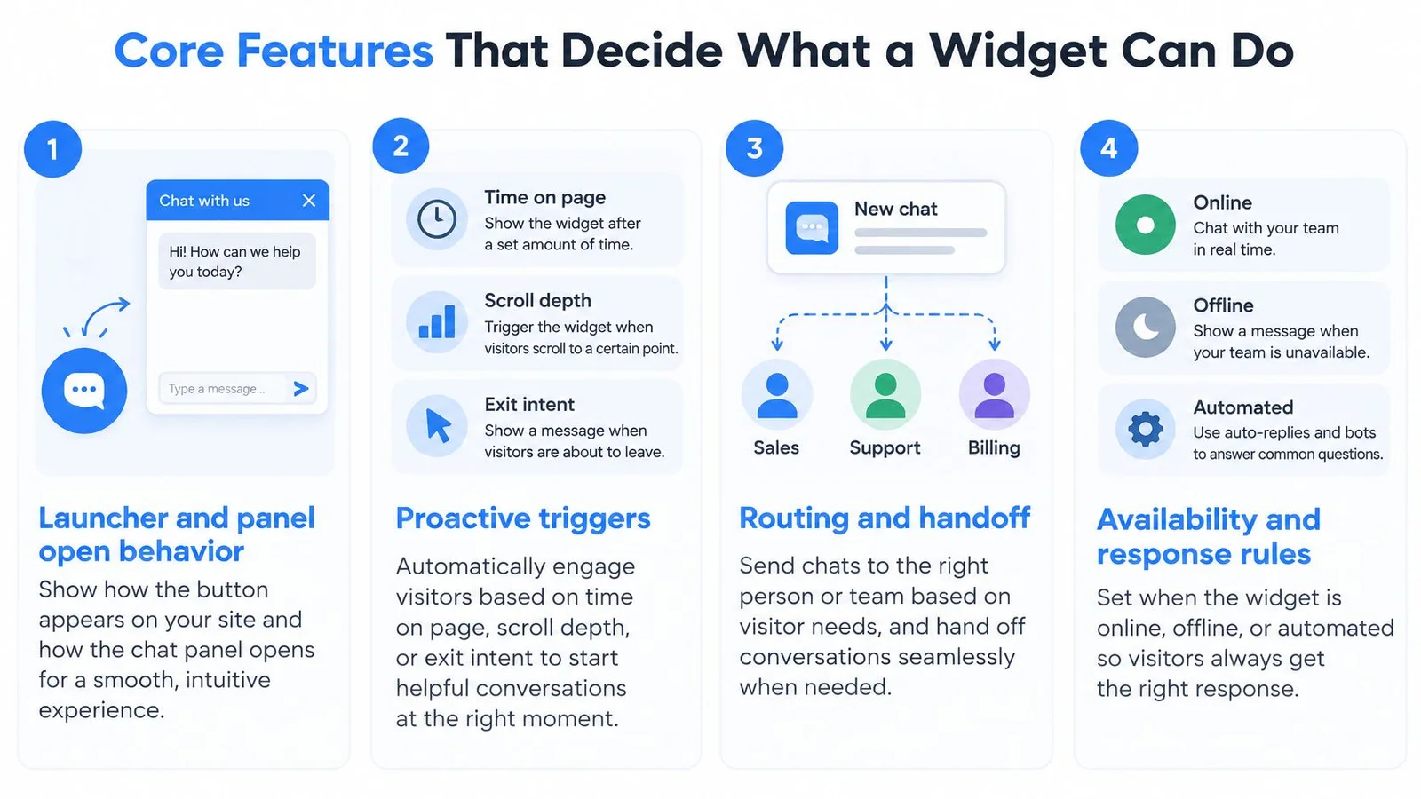
The visitor meets the launcher first. A clear button, labeled Chat or Ask a question, should open the panel with a click, a tap, or the keyboard. If the button has no name, a screen reader user never finds it.
Triggers, pages and answers
Proactive triggers fire after time on page, scroll depth, or exit intent. On a pricing page, a prompt after a long pause can help. A greeting in the first two seconds usually annoys people who haven't read a word yet.
You can require, ask for, or skip a name and email. Requiring both cuts the number of people who reply. Skipping both gets more questions and fewer leads you can follow up.
Page targeting uses URL include and exclude rules. The pricing page can get a sales prompt. The blog can get a newsletter prompt. Checkout, login, and internal tools stay clean. The same placement judgment you'd use when reading SiteSelf's WordPress map widget comparison applies here. A launcher that covers the buy button is in the wrong place.
The answer source should be your site content, plus extra context for facts that aren't on the page, such as a pricing exception or an enrollment date. Human handoff should pass the saved transcript so the person doesn't ask the visitor to repeat themselves. On a phone, the panel has to reflow and leave the main call to action visible.
Accessibility is part of conversion
A 2025 Digital Trust Index assessment found that 13 of 15 tested chatbots failed at least one accessibility check. For 12 of them, screen-reader use was difficult or impossible because the widget couldn't be opened reliably or responses weren't announced. The same assessment found that 93% of 266,000 European homepages failed at least one automated accessibility check.
| Feature | Requirement |
|---|---|
| Launcher opens the panel with the keyboard | Must have |
| Escape closes the panel and focus returns to the page | Must have |
| Screen reader announces new messages | Must have |
| Zoom and reflow without overlap | Must have |
| Sufficient contrast without relying on color alone | Must have |
| Labeled controls and reduced motion option | Must have |
| Non-chat fallback such as a contact form or email | Must have |
| Mobile layout that keeps the main call to action visible | Must have |
| Human handoff with saved transcript | Must have |
| Proactive triggers such as time on page, scroll depth or exit intent | Optional |
| Name and email fields that can be required, optional or skipped | Optional |
Must-have items are the ones that let someone finish the task. Optional items are useful once the basics work.
When Chat Drives Conversions and When It Serves Support
The same widget can sell or serve. The page decides which job matters.
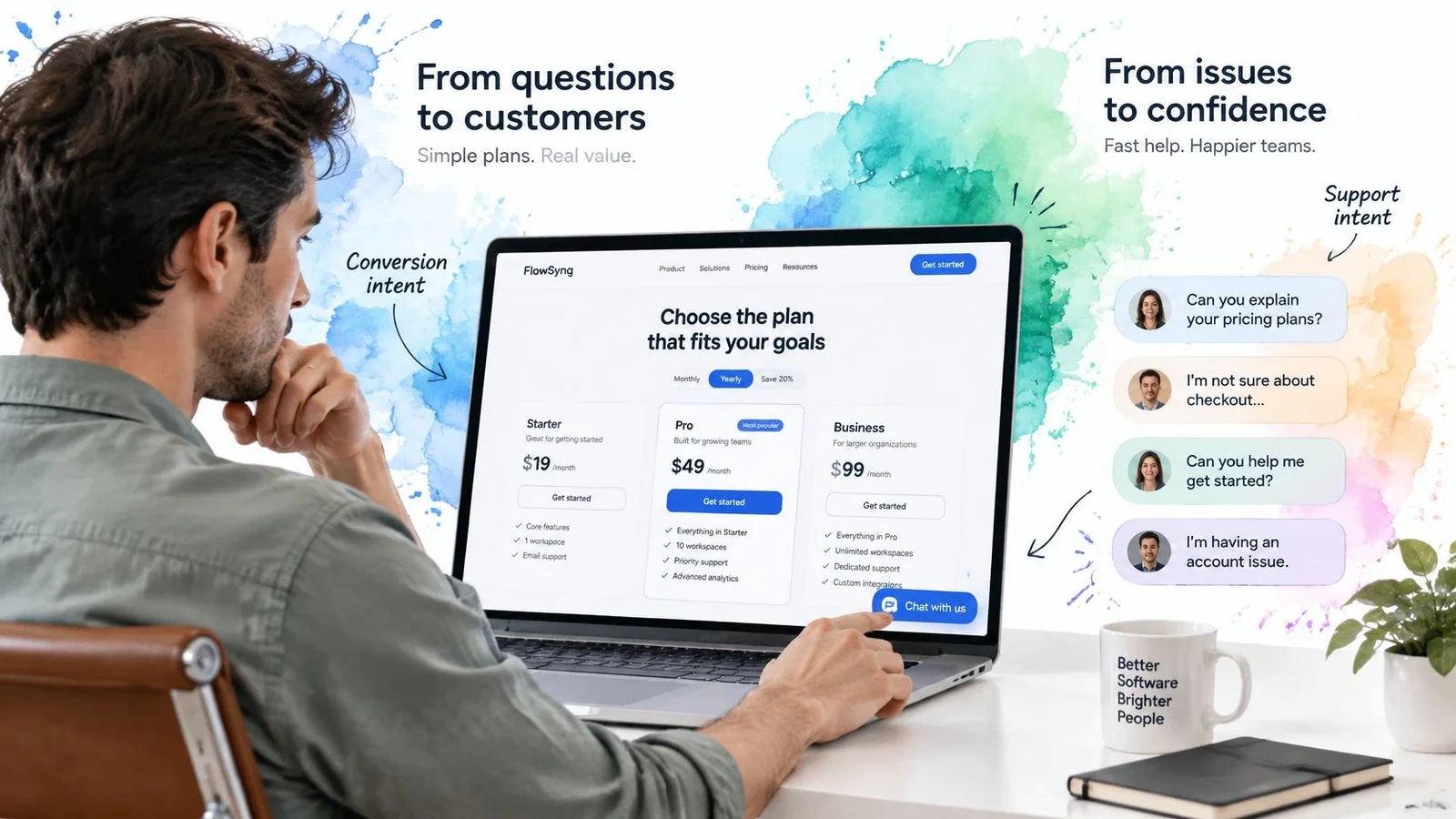
Say a SaaS visitor on the pricing page asks whether the plan covers ten seats. That's a conversion question. Answer it before they leave, and don't pitch a demo they didn't ask for.
A course buyer asks when the next cohort starts and whether there's a refund. The deadline and the money-back rule are the blockers. A vague "check the FAQ" sends them back to the tab they were about to close.
On a webinar registration page, someone asks whether the session will be recorded. That's a sign-up barrier, not a support ticket. A one-line yes, with where the replay lands, removes the hesitation. An interactive chatbot on that page can answer the replay question while other registrants' questions stay visible, which is how FOMOchat turns a quiet form into a short conversation people can scan before they commit.
A logged-in customer asks how to reset a billing password. That's support. A sales prompt on that screen is noise. Route it to the help path and keep the selling language off the account page.
What buyers already expect
Research summarized by J.D. Power, as reported by SuperOffice, found that 42% of customers preferred live chat as an online contact method, compared with 23% for email and 16% for social media or forums. Separate benchmarking in that same reporting put satisfaction at 82% for live chat, versus 61% for email and 44% for telephone. Another compilation in that reporting said more than 41% of customers expected live chat on a company website, rising to 50% among visitors on mobile devices.
Those figures don't guarantee a conversion lift. Speed without a correct answer still loses the sale. Relevance is the difference between a helpful reply and a script that ignores the question.
Sell on pre-purchase pages. Serve on account and support pages. Mixing the two makes both worse.
If the service page itself is the product, it helps to optimize service pages for better conversions before you add another prompt on top of a confusing layout. Chat can't rescue a page that never states the offer.
How to Install and Configure a Chat Widget
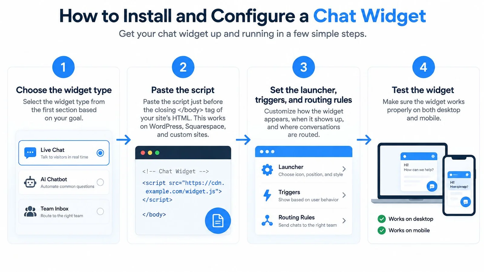
Setup is short. Testing is the part people skip. The whole configuration usually takes about five minutes once you know the goal. Checking it on real pages takes longer, and that check is what keeps the widget off the wrong screens.
- Choose the type that matches the page goal. A pre-purchase page needs answers that remove doubt. A support page needs resolution, not a pitch.
- Paste the script just before the closing
</body>tag. That's the only code step, and it works on WordPress, Shopify, Squarespace, and Wix wherever a script tag can be added. A fuller walkthrough of placement is in this guide to embedding a chat widget. For the broader install patterns, see embedded chat for website and practical notes on live chat for websites. - Set URL include and exclude rules. Show the widget on pricing, course, or registration URLs, and hide it on checkout, login, and internal pages so those screens stay focused.
- Decide what to collect. You can require, ask for, or skip the visitor's name and email. Requiring details lowers the number of conversations, so skip them when the goal is questions, not a lead list.
- Load the knowledge from your site, then add what's missing. Extra context covers pricing exceptions, cohort dates, and policies that aren't written on a public page.
- Confirm the embed loads asynchronously. The widget shouldn't hold back the first paint of the page. A launcher that delays the layout makes the page feel slower before anyone chats.
- Test on desktop and mobile in a private browser window. An editor preview can show the widget even when visibility rules would hide it on that URL, so the private window is the honest test.
Why the private window matters
Cache, consent banners, and script blockers can hide a widget that looked fine in the editor. Open the live URL, accept cookies if your banner gates scripts, and try the keyboard path. Tab to the launcher, open it, send a test question, and press Escape. Then repeat on a phone width and confirm the buy or register button is still visible.
If the widget doesn't appear, check that the flow is turned on, the domain in the rule matches the live URL including any subdomain, and an exclusion rule isn't covering that path. Change one setting, reload, and check again.
Disclosure, Escalation and Trust in AI Chat
A fast answer doesn't persuade anyone who feels misled. Instant replies only help when the visitor can tell who is speaking, where the fact came from, and how to reach a person.

Rules you can apply this week
Say the representative is AI. A short line in the header, such as "AI assistant trained on our site," stops people from guessing. Hiding that status to sound more human backfires when the answer is wrong.
Show a source or a confidence note next to facts taken from the website. Mark generated suggestions as suggestions. "Based on the pricing page" is different from "you might also like." Readers can use the first. They can't audit the second.
Don't invent testimonials, live visitor counts, or activity that isn't happening. A sample group conversation can teach, but only if you label it as a sample. People accept a demonstration. They don't accept a fake crowd.
Offer an obvious path to a human. A visible button, or the phrase "talk to a person," should hand off the full conversation. If the visitor has to retype the problem, the handoff failed. Guardrails that block invented facts are covered in this explanation of how guardrails work.
In a 2025 Liveops survey of 1,000 U.S. holiday shoppers, 45% said AI failed to understand their problem, 55% had to escalate an AI-handled issue to a human, and only 22% said companies clearly disclosed when AI was being used, while 69% believed brands should always disclose it. Separate 2025 research from PwC, reported in that same release, found that 86% of consumers considered human interaction moderately or very important, and 93% said mishandling personal data would cause a brand to lose their trust.
Trust is a conversion variable. Disclosure, honest labels, and a real escalation path belong in the same review as signups.
The short walkthrough below shows how a clear handoff looks when the automated reply isn't enough.
Metrics That Show Whether the Widget Works
Opens and clicks don't show value. Each metric below answers a different question, and reading the wrong one will make a weak widget look successful.
| Metric | What It Shows | How to Read It |
|---|---|---|
| Interaction to Next Paint | Delay from a visitor action to the next visible update | Use the 75th percentile of visits, not the average |
| Chat-opened rate | Share of visitors who open the widget | Compare the same page with and without the widget |
| Escalation rate | Share of AI conversations passed to a human | Rises when answers fail or visitors are stuck |
| Correction rate | Share of answers visitors dispute or correct | Tracks answer accuracy over time |
| Conversion rate, chat vs comparison group | Signups, enrollments or registrations | Only meaningful against a matched comparison group |
| First response time | Delay before a human agent replies | Applies to live and hybrid chat only |
Speed of the click itself
The launcher, the composer, and the expand control are part of the page. Google's Interaction to Next Paint guidance defines INP as the delay from a click, tap, or key press to the next rendered update, across the full visit. The recommended target is 200 milliseconds or less. Values from 200 to 500 ms need improvement, and values above 500 ms are poor. Google's good rating has to hold for at least 75% of page visits, so use the 75th percentile, not the average. Compare pages with and without the widget, and segment by device.
Conversation quality and sales
Chat-opened rate tells you whether people notice the launcher. A low rate on mobile often means the button is covered or easy to miss. Placement of the support chat icon matters as much as the copy inside the panel, and when the widget also shows group questions, treat that as a social proof widget signal, not just another open count.
Escalation rate rises when answers fail or visitors get stuck. Correction rate tracks how often people dispute a reply. Both should sit next to conversion, not behind it.
Conversion rate for people who opened chat is only meaningful against a matched comparison group. Chat users often already planned to buy, so a raw gap flatters the widget. First response time applies only when a person is in the path.
Review each number monthly, per page template and device. Conversation analytics make it easier to read individual threads instead of a single click total. Change one setting at a time so you know what moved the number.
Pick One Widget Type and Test It for Two Weeks
Pick one page, one widget type, and one goal before you install anything. If the goal is sales, start on pricing, a course sales page, or webinar registration. If the goal is service, start on a support or account page. Match the type to the question people ask most on that URL.
Week one is the baseline. Record chat-opened rate, escalation, corrections, conversion, and first response time on that page with the widget off, or hidden by a URL rule. Note 75th percentile INP on desktop and mobile.
Week two is the comparison. Turn the widget on with disclosure and a visible path to a person. Check mobile behavior in a private window. Compare visitors who opened chat with a matched group who didn't. Read escalations and corrections beside conversions, and change one setting at a time.
One practical option is FOMOchat, a social-proof-enabled widget with an AI representative trained on your website content. You go live by pasting a single snippet, and the chat is live in under five minutes. If you later cancel, the widget stops showing and your data is preserved.
Keep the widget on a page only where conversion or resolution improves and the escalation rate stays manageable.
FOMOchat is an AI-powered website chat widget that pairs an assistant trained on your site with group conversations visitors can read while they decide. It fits pricing pages, course launches, and webinars where a fast, sourced answer and visible questions from others reduce hesitation. Visit FOMOchat to preview a widget on your own pages and see whether that mix belongs in your two-week test.