
Before you can figure out how to increase website conversion rate, you have to understand what’s actually happening on your site right now. It all starts with a foundational audit: a diagnostic phase you absolutely cannot skip. This step ensures every change you make is based on real user behavior, not just a hunch.
Starting Your CRO Journey with a Foundational Audit
So many people make the mistake of jumping straight into A/B testing headlines or button colors without a clear reason why. It’s like trying to find your way through a new city without a map. A proper conversion audit is that map. It gives you the data and insights you need to stop guessing and start making strategic, evidence-based improvements.
This isn't about looking for one single "magic bullet" to fix everything. Instead, you're systematically uncovering all the little points of friction, moments of confusion, and hidden roadblocks that keep visitors from converting. By pulling together different kinds of data, you start to build a complete picture of your user experience.
Seeing What Your Users See
Quantitative data from tools like Google Analytics tells you what is happening. You can see which pages have high bounce rates or where users drop off in your funnel. But that data never tells you why. That's where qualitative tools come into play.
- Heatmaps: These are fantastic. They create a visual overlay showing exactly where people click, how they move their mouse, and how far down the page they scroll. A heatmap might instantly reveal that everyone is clicking on a non-clickable image, signaling a major UX flaw.
- Session Recordings: This is like looking over your user's shoulder. Watching anonymized recordings of real people navigating your site lets you see their frustration in real-time as they struggle with a confusing form or can't find the information they need.
The combination of what and why is incredibly powerful. For example, your analytics might show a shocking 70% drop-off on your checkout page. But it’s the session recordings that reveal the discount code field is broken on mobile, causing user after user to give up and leave.
This simple flow shows how the best audits bring together these different data sources.
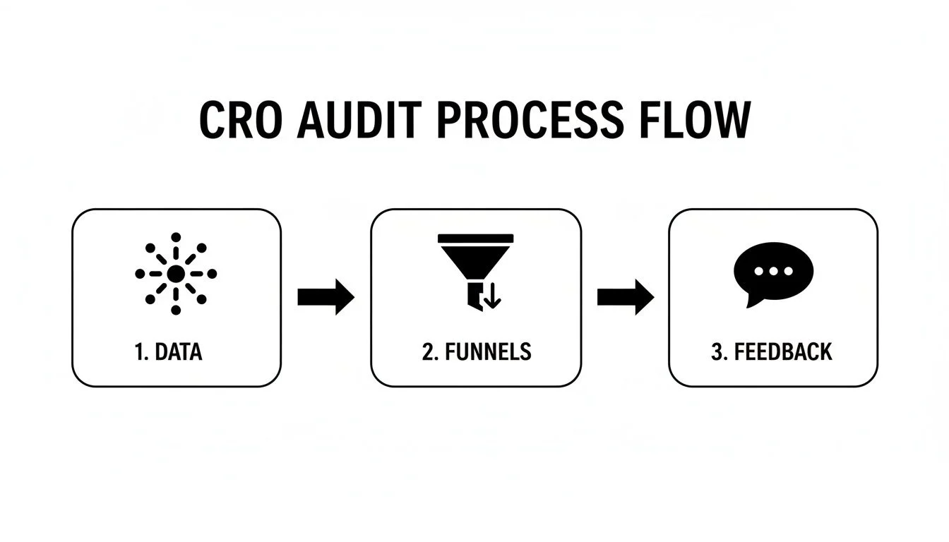
The real takeaway here is that a successful audit isn't just one thing. It's the integration of behavioral data, funnel analysis, and direct user feedback that gives you the full diagnostic picture.
Analyzing Your Conversion Funnels
Your conversion funnel is simply the path a visitor takes to complete a goal. Whether that’s signing up for a webinar, starting a trial, or buying a product. Digging into this path is critical because it tells you exactly where you're losing people.
Let's imagine a typical SaaS trial sign-up funnel:
- Homepage: A visitor learns about the product.
- Pricing Page: They check out the plans and features.
- Sign-up Form: They start to enter their details.
- Confirmation Page: Goal complete!
If you discover that 90% of visitors who reach the pricing page never even start the sign-up form, you've just found a massive bottleneck. The problem could be anything from unclear pricing to a lack of trust signals. But now, your audit has given you a high-impact area to focus on.
A foundational audit isn't just about collecting data; it's about translating that data into actionable insights. Pinpointing the single biggest drop-off point in your funnel often reveals the most significant opportunity for immediate improvement.
Gathering Direct User Feedback
The final piece of the audit puzzle is the most human one: actually hearing from your users. You need to understand their motivations, questions, and objections in their own words. If you're looking for practical ways to do this, reviewing guides on collecting visitor information can offer some great strategies.
Here are a few simple methods for gathering this feedback:
- On-Site Surveys: Use a pop-up or exit-intent survey to ask a simple, targeted question. You’d be amazed at the insights you can get from just asking, "What stopped you from signing up today?"
- Customer Interviews: Talk to your recent customers. Ask about their buying journey, what questions they had, and what other options they were considering.
- Support Tickets & Chat Logs: Your support team is a goldmine of information. Analyzing their conversations can quickly uncover recurring user complaints and points of confusion that need fixing.
Once you combine this direct feedback with your quantitative and behavioral data, your audit is complete. You now have a solid, evidence-based list of problems to solve, which sets the stage for creating impactful hypotheses and truly learning how to increase your website's conversion rate.
From Data to Dollars: How to Build Hypotheses That Actually Work

You’ve done the hard work of auditing your site and now have a list of friction points: the places where users get stuck, frustrated, or confused. That's a great start, but data alone doesn't boost conversions. The real magic happens when you turn those problems into high-impact, testable solutions.
This is where you build a bridge from diagnosis to action. A strong hypothesis isn’t just a wild guess; it’s an educated, strategic statement that connects a specific change to a predicted outcome, all backed by the user insights you just uncovered. Without this, you’re just throwing spaghetti at the wall. That’s a surefire way to waste time and get muddled results.
The Anatomy of a Powerful Hypothesis
The best way to turn your ideas into something genuinely testable is to use a simple, repeatable formula. This structure keeps you honest by forcing you to connect every change to a real user problem and a measurable goal.
Here’s a framework that I’ve seen work time and time again:
"By changing [The Thing You're Testing], we believe [This Group of People] will do more of [The Desired Action] because [The Reason Why]."
Let's put it into practice. Say your audit revealed that a whopping 70% of mobile users are dropping off at your checkout page. You dig into the session recordings and see them rage-tapping a tiny "Apply Discount" link that’s barely functional on a small screen.
Using the framework, you could craft a hypothesis like this:
"By making the 'Apply Discount' link a much larger, more obvious button for mobile users, we believe we can increase checkout completions by 15% because the session recordings clearly show this is a major point of frustration causing them to abandon their cart."
See how clear that is? It's specific, measurable, and directly linked to a validated problem. You know exactly what you're changing, who it affects, what you expect to happen, and why.
Brainstorming and Prioritizing Your Best Bets
With this structure in mind, start turning all your audit findings into potential experiments. Did your heatmaps show everyone ignoring your main call-to-action? Is customer feedback telling you your homepage value proposition is as clear as mud?
Your brainstormed list might include things like:
- A/B Test a new headline: Craft a headline that more clearly states the core benefit of your product, addressing a common question you found in user surveys.
- Simplify the navigation: Cut down a confusing menu to reduce the clicks needed to reach your most important pages.
- Add trust signals: Place security seals and customer testimonials on the payment page to tackle the trust issues you spotted in exit-intent polls.
Before you know it, you’ll have a long list of great ideas. The problem? You can't test them all at once. Ruthless prioritization is the name of the game.
Using a Framework to Pick Your Winners
A simple but incredibly effective model for this is the PIE framework. It helps you score each idea based on three key factors: Potential, Importance, and Ease. Just assign a score from 1 to 10 for each.
| Criteria | What It Means | The Question to Ask |
|---|---|---|
| Potential | How big of an impact could this change make? | Is this a tiny tweak or a massive needle-mover for our primary conversion goal? |
| Importance | How valuable is the page or traffic affected? | Are we testing on our highest-traffic landing page or a forgotten blog post? |
| Ease | How hard is this to actually build and launch? | Can we do this in an afternoon, or does it need weeks of a developer's time? |
Once you've scored each idea, just average the numbers to get a final PIE score. The ideas with the highest ratings shoot to the top of your to-do list. This isn't rocket science, but it’s a proven way to ensure you’re focusing your energy on the experiments most likely to deliver a real return, fast.
Designing and Running Experiments That Actually Work
Alright, this is where the rubber meets the road. All your research and brilliant hypotheses mean nothing until you test them in the real world. A clean, effective experiment is the heart of any CRO program because it’s how you turn educated guesses into hard data.
Without a structured testing process, you’re just throwing ideas at the wall and hoping something sticks. A proper A/B test (or split test) takes the guesswork out of the equation. It scientifically pits your new version (the "variation") against the original (the "control") to see which one gets more people to do what you want them to do.
This methodical approach is non-negotiable if you want to know how to increase website conversion rate for the long haul. Every test is a lesson, teaching you a little more about what makes your audience tick.
Setting Up Your A/B Test for Success
First things first, you need the right tool for the job. Platforms like Google Optimize, Optimizely, or VWO are great because they let you set up experiments without having to bother a developer for every little tweak.
Once you’ve picked your platform, you’ll define which page you're testing and then build your variation. This could be something as simple as rewriting a headline or as involved as a total redesign. The trick is to isolate a single significant change per test. That way, you know exactly what caused the shift in performance.
Next up, you have to define your goals. This is absolutely critical, so don't skip it.
- Primary Metric: This is your north star: the one conversion action you’re trying to move. For a SaaS page, that's probably "trial sign-ups." For a webinar, it's "registrations."
- Secondary Metrics: These give you the full story. You might track clicks on a pricing table, video plays, or even scroll depth. They help you understand why one version won, not just that it did.
For example, maybe your new headline doesn't boost sign-ups directly, but you see a 30% increase in users scrolling down to the features section. That’s a huge insight, telling you the new copy is grabbing attention and pulling people further down the funnel.
Understanding the Numbers That Matter
Running an experiment isn’t a "set it and forget it" activity. You need to grasp a few core concepts to make sure your results are actually trustworthy, and the big one is statistical significance.
Put simply, statistical significance tells you how likely it is that your results are due to your changes and not just random luck. Most optimizers aim for a confidence level of 95% or higher. This means you can be 95% certain that if you ran the test again, you'd see a similar outcome.
Don’t call a test early just because one version is surging ahead. A premature result can be a false positive. You need to let it run long enough to gather enough data and account for normal user behavior changes, like the difference between weekday and weekend traffic.
Before you launch, use your tool’s built-in calculator to figure out the sample size and test duration you’ll need. As a rule of thumb, you often need at least a few hundred conversions per variation to feel confident in the results. If your site has lower traffic, that might mean running the test for a few weeks. Be patient.
High-Impact Areas for Your First Experiments
Not all tests are created equal. If you want to see results quickly, start with the high-impact areas that directly influence a visitor’s decision.
Here are a few proven places to kick things off:
- Copywriting: Test your main headline and sub-headline. Pit a benefit-driven headline against a feature-focused one. Tweak your call-to-action (CTA) button copy: is "Start Your Free Trial" more compelling than "Get Started for Free"?
- User Experience (UX): See what happens when you simplify your sign-up form. A classic test by Imagescape found that removing just one field from a form boosted conversions by 11%. Or test moving your primary CTA above the fold.
- Pricing Pages: Experiment with how you present your plans. Try adding a "most popular" badge to one of your tiers or test showing annual pricing (with a discount) by default instead of monthly.
By focusing on these high-impact areas first, you're much more likely to score a meaningful win early on. And remember, every test, win or lose, gives you valuable data that sharpens your understanding of what your customers truly want.
Bring Your Pages to Life with Social Proof and Real-Time Engagement

Once you have your experiments mapped out, it's time to layer in one of the most powerful psychological drivers in marketing: social proof.
Let's be honest, people are pack animals. When we're on the fence about a decision, we instinctively look around to see what everyone else is doing. It’s a shortcut our brains use to feel safe.
Modern CRO isn't just about clean design and fast load times. It's about building a dynamic, trustworthy environment that feels alive. A visitor landing on a quiet, static page is left alone with their doubts. But when they see clear signs that other people are buying, signing up, and getting results, that hesitation starts to melt away.
Building a Foundation of Digital Trust
Before you get fancy, you have to cover the basics. These are the non-negotiables for any business that wants to be taken seriously. Think of them as the baseline layer of trust that reassures visitors you're a legitimate operation.
If you're missing these, you're starting the race with your shoelaces tied together.
- Customer Testimonials: Don't just slap these on a dedicated page; place powerful quotes from happy customers right next to your main calls-to-action. The more specific, the better. A testimonial that mentions a tangible result or a specific problem solved is infinitely more credible than a generic "they're great!"
- Case Studies: For B2B or big-ticket purchases, case studies are your best friend. They tell a story, showing a potential customer a clear path from their current pain point to a successful outcome with your solution.
- User Reviews and Star Ratings: E-commerce sites and online course platforms live and die by their ratings. Displaying stars prominently doesn't just communicate quality at a glance; it helps people filter and make decisions without getting overwhelmed.
These elements are fantastic, but they're also passive. They tell a story about what happened in the past. To really move the needle, you need to create a sense of what’s happening right now.
Creating a Live and Buzzing Atmosphere
Imagine walking down a street and seeing two restaurants. One is completely empty. The other is buzzing with people, laughter, and energy. Which one do you want to walk into?
The same principle applies to your website. You can create this "busy restaurant" effect with tools that show real-time activity. This builds both trust and a powerful sense of urgency, which is exactly what FOMO (Fear Of Missing Out) is all about.
The whole idea here is to shift a solitary browsing session into what feels like a shared, communal experience. When a visitor feels like they're part of an active group, their personal anxiety about making the wrong choice drops dramatically.
This approach is especially powerful in high-trust industries. For instance, on a landing page for an online course or a SaaS tool, adding live social proof and interactive elements can boost conversions by 30-50%.
That's a massive lift, especially when you consider the baseline. Let's look at some numbers.
Conversion Rate Benchmarks by Industry
The average conversion rate for lead generation is just 2.9% across 14 different industries. This table highlights just how much room for improvement there is, especially in sectors where trust is a major barrier to conversion.
| Industry | Average Conversion Rate | Potential Lift with Social Proof |
|---|---|---|
| Education | 2.6% | High (builds community trust) |
| B2B Services | 2.2% | High (overcomes skepticism) |
| Finance & Insurance | 2.5% | Moderate (trust is critical) |
| Healthcare | 2.7% | High (reassures anxious visitors) |
| SaaS | 2.2% | Very High (shows product validation) |
As you can see, even a small bump can make a huge difference, and social proof is one of the fastest ways to get there.
The Power of AI-Driven Engagement
This is where things get really interesting. For high-intent pages (think webinar registrations, product launches, or demo requests), advanced tools can make a real difference. An AI-powered widget like FOMOchat takes social proof to the next level by simulating a helpful, active community right on the page.
Instead of just showing a generic "Jane from Ohio just signed up," it can display realistic, multi-person conversations that tackle common questions and objections in real-time. Better yet, an AI rep, trained on your website's content, can jump into these chats to provide instant, accurate answers.
This multi-pronged approach hits several key objectives at once:
- It answers questions before they're asked: The AI addresses common doubts proactively, slashing friction and keeping people on the page.
- It builds communal proof: Visitors see that other people have the same questions, which normalizes their concerns and makes them feel understood.
- It creates a sense of presence: The page no longer feels like a static brochure. It feels like a live event, making the visitor feel like they’re part of something happening now.
For example, on a webinar sign-up page, the widget might show a conversation where one simulated user asks if the session will be recorded and another asks about the speaker's background. The AI then chimes in with the answers. This not only delivers key information but also proves you have a vibrant, engaged audience. If you want to see how this works under the hood, you can learn more about generating these realistic AI conversations.
Analyzing Your Results and Scaling the Wins
An experiment is only as good as the action you take from it. So, your A/B test has run its course, and now you’re sitting on a pile of data. The real work starts here: figuring out what it all means, confidently calling a winner, and understanding the impact on your business.
This is where the rubber meets the road. Did your hypothesis actually pan out? It’s so easy to get swept up in early results that look promising, but trust me, patience is your best friend. Calling a winner too soon can lead you down the wrong path, implementing a change that was just a statistical fluke.
Most testing platforms will flag when you've hit 95% statistical significance. That’s the industry benchmark. It means you can be 95% sure the outcome isn't just random noise. Don't even think about stopping the test until you've hit that number and have enough conversions to make the result meaningful.
Interpreting Your Test Data
When the results are in, your primary metric is the first thing you'll check. If your goal was to drive more trial sign-ups and the new version delivered a 12% lift with 98% confidence, congratulations: you have a clear winner. But don't pop the champagne just yet.
The real magic is in the secondary metrics. They tell you the why behind the win. Did that new design also get more clicks on your features section? Did it cut down on bounces from the pricing page? These supporting data points paint a much richer picture of user behavior and can spark ideas for your next round of tests. You can get a better handle on this by digging into your analytics dashboard.
A winning test doesn't just give you a better-performing page; it gives you a deeper understanding of your customer. Every result, positive or negative, is a lesson in what motivates your audience.
When a Test Is Inconclusive or Fails
So, what happens if the test is flat? Or worse, your shiny new variation tanks? First off, don't panic. This isn't a failure; it's a critical learning opportunity.
An inconclusive result tells you that the change you made wasn’t big enough to move the needle. That’s valuable feedback. It means you can stop wasting time on that specific idea and pivot to a hypothesis with more potential.
A losing test can be even more insightful. Let’s say your new, benefit-driven headline lost to the old, feature-focused one. You just learned something huge about your audience. They might be more technical and care more about specs than promises. That insight is pure gold, and you can apply it everywhere, from ad copy to email campaigns.
Rolling Out Wins and Continuous Monitoring
Once you have a statistically significant winner, it’s time to scale that success. The first move is simple: roll out the winning variation to 100% of your traffic. This makes sure every visitor gets the better experience and you start seeing the benefits of your work right away.
But you're not quite done. After going live, you need to monitor the page. Keep a close watch on your primary conversion metric for a few weeks. This is your reality check: it confirms that the lift you saw during the test holds up in the wild and protects you from any unforeseen side effects.
This whole cycle creates a powerful feedback loop. The lessons from one test become the foundation for the next hypothesis. Every win, loss, or draw sharpens your customer understanding, helping you make smarter and smarter decisions over time. This is how you build a genuine culture of optimization, where small, consistent gains add up to massive growth.
Common CRO Questions Answered
Once you get your hands dirty with conversion rate optimization, you’ll inevitably run into some practical questions. It's a common feeling. You start a test, the data starts rolling in, and you suddenly wonder if you're on the right track. Let's walk through a few of the most common hurdles I see people face and get you some clear, actionable answers.
Getting bogged down in the details (like how long to run a test or what to do when the results are flat) is normal. My goal here is to give you the confidence to push past those sticking points and make smart, data-backed decisions.
How Long Should I Run an A/B Test?
This is easily the question I get asked the most, and the real answer isn't a simple number of days. It all boils down to two things: how much traffic you get and what your current conversion rate is. The actual goal isn't to hit a time limit; it's to collect enough data to reach statistical significance, which is generally set at a 95% confidence level.
Whatever you do, don't just run a test for a flat seven days and call it quits. Your test needs to run for at least one complete business cycle (usually one or two weeks) to smooth out the natural ups and downs in how people behave on a Tuesday versus a Saturday.
One of the biggest mistakes you can make is stopping a test the second one version pulls ahead. Early results are often misleading. You have to let the test run its course to get a big enough sample size and be sure the outcome is real, not just a random fluke.
Most A/B testing tools have calculators built right in that will give you a solid estimate. Just plug in your traffic and baseline conversion rate. Trust the math and have a little patience.
What If My Test Results Are Inconclusive?
It's a frustrating moment, but it happens all the time: your test ends, and the results are completely flat. Neither your original nor your new version showed a statistically significant lift. This doesn't mean you failed; it means you just learned something valuable.
An inconclusive result usually points to one of two things:
- Your change was too small. Swapping a button from light blue to a slightly darker shade of blue probably isn't going to move the needle. This is your cue to be a bit bolder with your next hypothesis.
- You tested something visitors don't care about. If you spent weeks tweaking a part of your page that people tend to ignore anyway, your test will likely come back flat. That's a huge insight into what your users actually prioritize.
Think of these "failures" as a chance to get a better read on your audience. Go back to your heatmaps and session recordings. I bet you'll spot a more meaningful problem to tackle in your next experiment.
Why Are My Mobile Conversions So Low?
This is a classic disconnect for so many businesses: mobile traffic is through the roof, but conversion rates are miles behind desktop. Ever wonder why your webinar signups sputter out despite a great pitch? A lot of it comes down to mobile usability.
Bringing mobile conversions up to par with desktop can lift your overall rates from the global e-commerce average of 2-4% toward the top performers, like food & beverage, which hits 4.9%. Looking ahead to 2025, desktop is projected to hold a 4.8% conversion rate, but mobile will still lag at 2.9% despite getting 73% of all traffic. That's a massive gap caused by friction. You can dive deeper into these numbers and discover industry conversion rate data on Speedcommerce.com.
For SaaS marketers and course creators, this is where tools like interactive AI chat widgets can transform results, answering questions instantly and embedding social proof right where people need it.
To fix the mobile gap, you have to think beyond just having a "responsive" design. It's about the mobile context. People on their phones are often distracted, multitasking, and have zero patience for a clunky experience.
- Simplify Your Forms: Get ruthless. Cut every single field that isn't absolutely essential. Use autofill and make your buttons and fields easy to tap.
- Be Obsessed with Speed: Mobile users will not wait for a slow page to load. Compress your images and streamline your code. Do whatever it takes.
- Give Instant Answers: People on mobile won't hunt for information. An AI chat widget can step in with immediate help, stopping them from bouncing off your page in frustration.
When you start fixing these specific friction points in the mobile journey, you’ll be amazed at how quickly you can close that conversion gap.
Ready to turn your website's visitors into customers? FOMOchat creates a buzzing, trustworthy environment on your pages with AI-powered social proof and real-time support. See how easy it is to lift your conversions at https://fomochat.com.