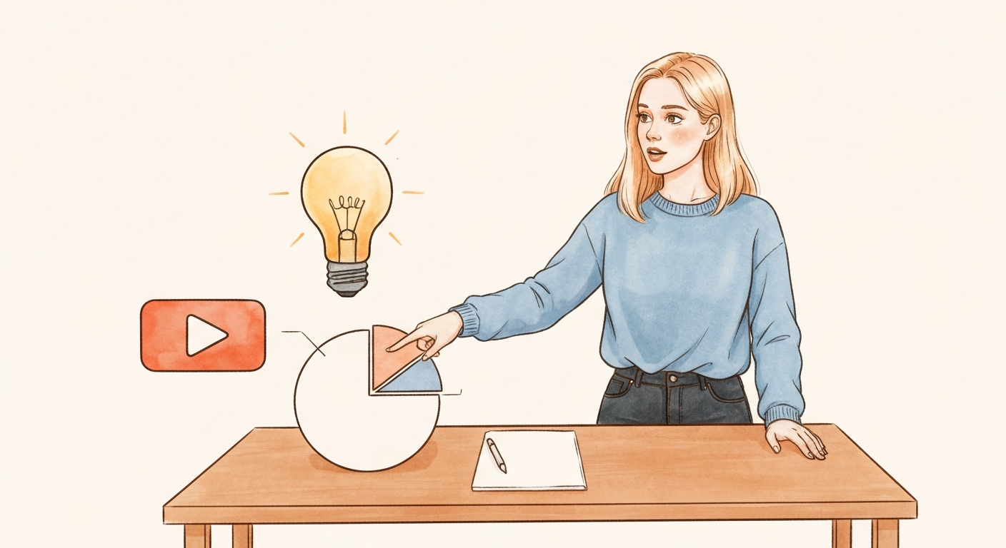

Let's be honest. We've all been there. Trapped in a presentation that feels more like a monologue. Slide after slide of dense text, with the speaker talking at you, not with you. Those days are officially over.
Audiences today don't just prefer interaction; they expect it. The old one-way broadcast model has given way to a demand for a dynamic, two-way dialogue.
Why Interactive Presentations Are No Longer Optional
Think about what happens when you’re just listening. Your mind wanders. But the moment you're asked to do something, click a button, vote in a poll, answer a question. Your brain has to switch gears. It moves from passive listening to active participation.
This small shift is incredibly powerful. When you actively participate, you process information on a much deeper level. The result? You actually remember what was said.
It’s not just a feeling; there’s data to back it up. The Learning Pyramid theory suggests that a standard lecture has a dismal 5% information retention rate. But when you introduce group discussion and interaction, that number skyrockets to 50%. That’s the difference between being forgotten and being remembered.
The Shift in Audience Expectations
This isn't just about keeping people from falling asleep. It's a fundamental change in how we consume information, driven entirely by our daily digital habits. We’re constantly liking, swiping, and commenting on social media. We play games on our phones. We customize our online experiences.
We’ve been trained to be active participants, not passive observers. So when a presentation doesn't offer a way to get involved, it feels dated and out of touch.
For businesses, the impact of this shift is huge and directly affects the bottom line:
- SaaS Demos: A prospect who can interact with a feature, even through a simple poll, is far more likely to grasp its value than someone who just watches a video on loop.
- Online Courses: Students who are quizzed along the way don't just learn the material better; they feel more connected to the content and the instructor.
- Webinar Pitches: When marketers use live Q&As and feedback tools, they can tackle objections on the spot, building trust and shortening the path to a sale.
The Rise of AI-Powered Interactivity
This growing demand for interactivity has lit a fire under the tech world. The market for AI presentation tools is absolutely booming, projected to jump from $2 billion in 2025 to a massive $10 billion by 2033.
This explosion isn't just about fancy new software. It reflects a major strategic pivot. Marketers and educators are now using AI-driven experiences to truly captivate their audiences. In fact, studies show that adding simple interactive elements like polls and quizzes can boost information retention by up to 75%, effectively turning passive viewers into active participants. You can dive deeper into the AI presentation tools market to see just how fast this trend is growing.
Ultimately, knowing how to build an interactive presentation isn't a "nice-to-have" skill anymore. It’s a core competency for anyone who needs to grab attention, communicate clearly, and drive action in a world drowning in content. It’s the difference between being heard and being ignored.
Lay the Groundwork for a Truly Interactive Experience
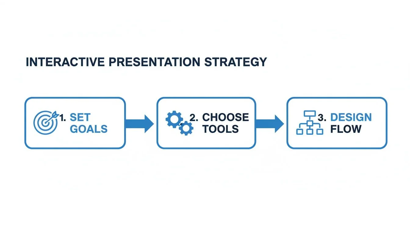
Before you jump into designing slides or picking out flashy tools, let's talk strategy. An interactive presentation without a clear goal is just noise. To make a real impact, you have to start with a plan that defines exactly what you want to accomplish.
Forget vague ideas like "boosting engagement." You need to get specific with measurable, business-focused goals. For instance, a software company might set a goal to reduce drop-off by 30% right when they reveal their pricing. An educator creating an online course could aim to increase completion rates by 15% by using quizzes to lock in key lessons.
When you have a concrete target like this, it acts as your guide. Every poll, quiz, or chat you add should directly support that main objective. This keeps your efforts sharp and effective.
Map Out Your Audience’s Journey
With your goal set, it's time to put yourself in your audience's shoes. Think through their experience from start to finish. Where are they likely to get bored, confused, or start checking their phones? This is all about anticipating their needs before they even realize they have them.
Treat your presentation like a conversation.
- Anticipate their questions: If you know your pricing always raises eyebrows, that's the perfect spot to add an interactive element.
- Pinpoint moments of confusion: Is there a technical feature that usually requires a second look? That’s your cue to add a poll or a quick "check for understanding" quiz.
- Preempt boredom: Long, data-heavy sections are notorious for losing people. Break it up with a quick question to pull their attention back.
By mapping out these potential friction points, you can design a dialogue that feels responsive and keeps everyone locked in.
I see so many people make the mistake of saving all their Q&A for the very end. But by then, you might have already lost half the room. Weaving in short, interactive Q&A moments or feedback prompts at critical junctures keeps the energy up and lets you handle objections as they arise.
Storyboard the Interactive Flow
Now, it’s time to sketch it all out. A storyboard is just a visual outline of your presentation, slide by slide, showing where and how each interaction will happen. Think of it as your blueprint.
You don't need to be a designer for this. Simple boxes and stick figures work just fine. The real goal is to see the presentation flow from your audience’s point of view.
Here’s what a simple storyboard sequence might look like:
- Slide 5 (The Problem): Play a short video showing a common customer struggle.
- Interaction 1 (Poll): A poll slides in: "How much time do you waste on this every week?" This gets them nodding along and gives you real data to work with.
- Slide 6 (The Solution): Introduce your product, using the data from the poll to make your point hit harder.
- Interaction 2 (Live Q&A): As you explain a key feature, a live chat widget like FOMOchat appears, showing a real-time question and your answer. This builds major trust. If you're new to this, learning about collecting visitor information can make these interactions even more personal and effective.
This process forces you to be intentional about the why and when of each interaction. It ensures the whole experience feels natural and helpful, not just a series of random interruptions. This is the last, most important planning step before you actually start building.
Choosing the Right Tools for Audience Interaction
Okay, you’ve mapped out your audience and know exactly what makes them tick. Now for the fun part: picking the tech that will actually bring your interactive presentation to life.
I’ve seen a lot of presentations get bogged down by clunky software. The goal here is to build a tech stack that’s so smooth, your audience doesn't even notice it’s there. They should be focused on the experience you're creating, not fumbling with the tools.
So, where do you start? Don't get distracted by shiny new features. Instead, think about the specific job you need each interaction to do. Are you trying to check for understanding? Build a sense of community? Or maybe guide people down different learning paths?
From Passive Viewers to Active Participants
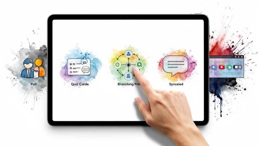
The quickest way to turn a lecture into a conversation is with tools designed for immediate feedback and engagement. These are perfect for breaking the ice, keeping energy levels high, and making everyone feel like they're part of the show.
- Polls and Surveys: These are the bread and butter of interaction. I love using a quick poll to kick things off ("How much do you already know about this?"). It instantly gauges the room and can even let the audience vote on what you cover next.
- Quizzes: Fantastic for making sure your key points are actually landing, especially for training or educational content. After you've explained a complex idea, a simple one-question quiz can confirm everyone is on the same page before you move on.
- Live Q&A: Don’t make people hold their questions until the end. Dedicated Q&A tools let you pull in questions as they arise, which helps you address confusion in the moment and keeps the entire session dynamic.
These work best when they feel spontaneous. For instance, after you share a surprising stat, a poll asking, "Did that number shock you?" can spark a great discussion and give you real-time insight into what your audience is thinking.
Creating a Comparison Table for Your Tools
Deciding between these options really comes down to what you're trying to achieve. One tool might be great for quick feedback, while another is better for in-depth learning. To make it easier, I've put together a simple table that maps different tools to their best-fit scenarios.
Interactive Tool Comparison for Different Goals
| Tool Type | Primary Goal | Best Use Case | Example Tool/Feature |
|---|---|---|---|
| Polls & Surveys | Gauge opinion, quick feedback | Kicking off a webinar, voting on content, checking audience sentiment. | Slido, Mentimeter |
| Quizzes | Knowledge retention, assessment | Training modules, educational workshops, post-topic check-ins. | Kahoot!, Typeform |
| Live Q&A | Address concerns, increase clarity | Webinars, product demos, all-hands meetings, town halls. | FOMOchat, Slido |
| Branching Paths | Personalization, self-guided learning | Onboarding flows, sales presentations, online courses. | Genially, Articulate 360 |
| Synced Chat | Social proof, real-time community | Product demos, live events, high-stakes webinars. | FOMOchat, Twitch |
This table should give you a solid starting point for building a tech stack that directly supports your presentation's goals, whether you're trying to educate, persuade, or simply entertain.
Tools for Personalized Journeys and Social Proof
This is where things get really interesting. Some tools go beyond simple engagement and help you create a truly tailored and persuasive experience.
Branching scenarios, for instance, are a standout features. They let you build "choose your own adventure" presentations. A course creator could use this to let students skip ahead or dive deeper based on their existing knowledge. For a SaaS demo, you could guide prospects down different feature paths depending on their company size or biggest challenge.
The most powerful interactive presentations create a shared experience. Tools that integrate chat and social proof are critical for this. They don't just show that other people are watching; they show that other people are engaging, asking questions, and getting value.
This is where integrations that sync with your video are so effective. Imagine you’re doing a product demo. Right when you get to the pricing slide, a chat widget appears, showing questions other people have asked about ROI, along with your team’s answers. You can explore how FOMOchat works to see how AI-powered chat can be trained on your content to provide instant, credible answers and build social proof on the spot.
With this approach, you're not just presenting; you're facilitating a community event where objections are handled transparently, building massive trust along the way.
Designing the Interaction Itself
Just dropping a poll into your slides isn't enough. The how is just as important as the what. A clunky, confusing interaction can frustrate your audience and completely derail your presentation. The design needs to be intuitive.
Always provide crystal-clear instructions. Never assume people will know what to do. Simple, direct calls to action like "Vote Now!" or "Ask your question below" make a world of difference. The interaction should feel like a natural part of the flow, not a jarring interruption.
The hardware you use matters, too. The market for interactive displays is exploding, projected to grow from $52.27 billion in 2025 to $105.53 billion by 2035. SaaS companies are running webinars on touch-enabled panels that allow for real-time whiteboarding and have been shown to cut meeting times by 28%. In the education space, entrepreneurs have seen 45% higher webinar attendance by using portable interactive whiteboards, praised for their flexibility.
Ultimately, a great interactive experience makes the technology disappear. It empowers your audience, makes them feel smart and in control, and creates a memorable event they'll be talking about long after it's over.
Time to Build: Creating Your Interactive Content
You've got your strategy and your tools picked out. Now for the fun part: moving from the blueprint to the actual build. This is where your ideas for a two-way conversation with your audience start to take shape. It’s less about writing slides and more about crafting genuine moments of connection.
Every poll, quiz, and graphic you create is a chance to engage. The real goal is to make each interactive piece feel like it belongs, like it was designed to be there all along.
Crafting Questions That Actually Spark Conversation
The success of your interactive elements comes down to the questions you ask. Let’s be honest, a bland question gets a bland response. Ditch the generic yes/no polls and start thinking about prompts that get people thinking.
Here are a few ways I like to frame questions:
- Focus on the Pain. Instead of, "Do you have this problem?" try something like, "Which of these challenges is costing you the most time each week?" This immediately gets people to connect your topic with their own real-world struggles.
- Gauge the Room. A simple, "How familiar are you with this topic on a scale of 1-5?" can be a standout features. It lets you adjust your talking points on the fly so you're not boring the experts or losing the beginners.
- Look to the Future. Ask, "If you could snap your fingers and solve one of these issues tomorrow, which would it be?" This shifts the energy toward solutions and perfectly tees up your product or service as the answer.
Want to take it a step further? You can even create AI video quizzes to embed questions directly into your video content, making the learning experience feel much more dynamic.
Designing Your Visuals and Assets
With your questions nailed down, it's time to build the visual assets. This means everything from the background graphics for your polls to the short video clips you might use to kick off a discussion. Make sure everything feels like a cohesive part of your brand. The interactive elements shouldn't look like they were just dropped in from somewhere else.
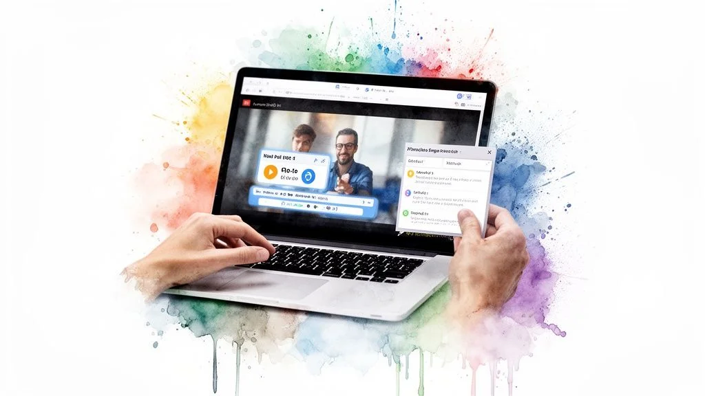
A big part of this is prepping for video. If you’re using pre-recorded videos, you need to map out precisely when and where your polls or quizzes will pop up. For live webinars, this means having all your interactive prompts queued up and ready to launch at the perfect time. Getting the timing right is a huge part of the experience, which is why learning how to handle things like https://fomochat.com/help/syncing-chat-with-video is so important for a smooth delivery.
The most powerful presentations are becoming fully immersive experiences. The immersive marketing market, a key driver for interactive presentations, is forecasted to explode from $9.03 billion in 2025 to $89.45 billion by 2034. Webinar hosts are now crafting virtual worlds where viewers co-create the narrative, leading to 50% higher engagement than static formats. Discover more insights about the rise of immersive marketing on Fortune Business Insights.
Implementation and The Final Check
Okay, your content is written and your assets are designed. The last major step is implementation. This is where you’ll embed your interactive elements into your webinar platform, landing page, or online course. Thankfully, most modern tools make this pretty easy, usually with a simple copy-and-paste embed code.
But before you even think about going live, you have to test everything. Seriously. A broken poll or a quiz that won’t load can completely derail your presentation and tank your credibility.
Run through this quick pre-flight checklist:
- Browser Sanity Check: Open your presentation in Chrome, Safari, Firefox, and Edge. Does every button, poll, and animation work as expected in all of them?
- Test on Every Device: Pull it up on a desktop, a tablet, and your phone. Is the layout clean? Are the buttons big enough to tap easily on a small screen?
- Simulate a Slow Connection: Use your browser's developer tools to throttle your internet speed. Does the presentation still load in a reasonable amount of time, or will users on weaker connections be left staring at a loading screen?
This final, thorough check is what separates the amateurs from the pros. It ensures every single person in your audience gets the seamless, engaging experience you worked so hard to build.
Measuring Engagement and Optimizing for Better Results
So, you've built your interactive presentation. Great! But the real work begins after you hit "go live." An interactive deck is a living thing, and you can only make it better by understanding how people actually use it.
This is where you stop guessing and start knowing. It’s about connecting the dots between the goals you set at the very beginning and what your audience actually did. Forget vanity metrics like view counts; we're digging for the story your data is telling.
What to Track (Besides Just Views)
A high view count is nice, but it doesn't mean anyone was paying attention. To get a real sense of your presentation’s pulse, you need to look at the metrics that show active participation.
Here’s what I always keep a close eye on:
- Poll Participation: What percentage of your audience actually voted? If a poll on a specific topic gets 80% engagement, you’ve hit a nerve. That’s a topic to expand on next time.
- Quiz Scores: Are people really getting your main points? If everyone bombs a question about a key feature, it's a clear signal that your explanation wasn't as clear as you thought.
- Interaction-Specific Conversions: This is huge. Did running that "pain point" poll right before your CTA lead to more signups? Tying conversions directly to these moments proves their value.
- Chat and Q&A Themes: Don't just answer questions, analyze them. The live chat is a goldmine for spotting recurring objections, confusing points, and what your audience is most excited about.
These numbers give you a play-by-play of your presentation's performance. They show you exactly where your audience leaned in and where they started to drift.
Pinpointing Drop-Offs and Digging into Feedback
Ever watch your attendee count slowly tick down during a presentation? It’s a terrible feeling. But it’s also incredibly useful data. If you see a big chunk of your audience leave at the 15-minute mark, you need to find out why. Is that when you dive into a dense, data-heavy slide? Is it when you introduce pricing?
A drop-off point isn't a failure. It's an opportunity. It’s a bright, flashing sign showing you exactly where you need to add an interactive element to re-engage your audience, answer a silent question, or build more trust before moving on.
Once you spot a trouble spot, dive into the qualitative feedback. The questions people ask in the chat or the comments they leave are your "why." They explain the numbers. For a clearer picture of what to look for, exploring an analytics dashboard can show you exactly how to track these user interactions.
A/B Testing Your Way to Higher ROI
The best presenters I know are constantly experimenting. You should be, too. A/B testing is simply a structured way of trying out different interactive ideas to see what gets a better reaction. It’s how you methodically improve your return on investment.
You could test almost anything. For example:
- Poll vs. Open-Ended Question: Does a multiple-choice poll get more responses, or does an open-ended question deliver more valuable insights?
- Q&A Timing: Try placing a Q&A session before you talk about pricing, and then try it after. Does one approach lead to higher conversion rates by addressing concerns upfront?
- Call-to-Action Wording: Does changing "Sign Up Now" to "Start Your Free Trial" make a measurable difference in clicks?
Run one version for half your audience and the other for the second half. Compare the data. These small, informed tweaks will compound over time, making every presentation you give more effective.
Of course, optimizing goes beyond just the interactive elements. To really nail this, you should also be implementing virtual meeting best practices for unbeatable engagement. This holistic approach ensures every single part of your presentation is fine-tuned for the best possible outcome.
Seeing Interactive Presentations in Action
Theory is one thing, but seeing how these ideas play out in the real world is where it all clicks. Let's break down a few examples I've seen that really showcase how a little bit of interaction can deliver huge results. These aren't just hypotheticals. They're proven strategies you can borrow from.
The SaaS Demo That Anticipates Objections
I once worked with a B2B software company that had a classic demo problem. They’d lose a chunk of prospects right when the pricing slide appeared in their recorded demo. To fix this, we embedded a chat widget that was perfectly synced to the video's timeline.
Just as the presenter started talking about cost, a small chat bubble would appear, showing a conversation where another "visitor" asked about the ROI. The company's AI-powered chat then delivered a crisp, data-backed answer on the spot.
It was a simple but powerful move. It addressed the biggest sales objection right as it was forming in the viewer's mind and used a bit of social proof to build confidence. The result? They saw a 22% decrease in viewers dropping off at that critical point in the video, which led directly to more scheduled calls with the sales team.
Personalized Learning Paths for an Online Course
Another great example comes from an online educator I know. She was teaching a complex marketing course, but her students were all over the map in terms of skill level. Beginners were getting lost, and advanced users were getting bored.
She completely rethought her core lessons by adding branching quizzes at the end of each module. After watching a lesson, students would answer a few quick questions.
- Aced the quiz? You were automatically forwarded to a bonus lesson with more advanced tactics.
- Struggled with the concepts? The system sent you to a short review video to reinforce the fundamentals.
- Passed comfortably? You just moved on to the next module as planned.
This simple "choose your own adventure" approach was a standout features. It stopped being a generic lecture and started feeling like a personal tutoring session. Student engagement went through the roof, and course completion rates jumped by a massive 40%.
Gathering Live Feedback During a Product Webinar
A marketing team was getting ready to launch a new product feature and wanted their launch webinar to be more than just a presentation. They needed to pull immediate, honest feedback from their most dedicated users to help guide the next development sprint.
Instead of waiting for a Q&A at the end, they peppered the webinar with live polls. They asked smart questions as they went, like, "Which of these new tools would you use first?" and "On a scale of 1-5, how much time would this feature save you each week?"
This gave the product team instant, measurable data straight from the people who mattered most. They could literally watch which features were hitting the mark and which ones weren't landing as expected. The polls kept everyone hooked and turned a one-way broadcast into a genuinely productive conversation.
Frequently Asked Questions
As you get into building interactive presentations, a few common questions always pop up. Let's clear the air on some of the big ones so you can get started with confidence.
How Much Does It Cost to Create an Interactive Presentation?
Honestly, the cost can be anything from zero to several hundred dollars a month. It really just depends on what you’re trying to accomplish.
If you just want to liven up a team meeting with a quick poll, the free version of a tool like Slido will do the job perfectly. But if you’re building something more sophisticated, think complex branching scenarios for training or AI-powered chat for a sales webinar. You'll be looking at the premium plans on more advanced platforms.
The real question is about return on investment. If a paid tool helps you boost webinar conversions by 15%, it pays for itself almost immediately.
Can I Make My Existing PowerPoint or Google Slides Interactive?
Yes, absolutely. And you should! There’s no need to toss out your existing slide decks and start over from scratch.
Many of the best interactive platforms are designed to plug directly into PowerPoint and Google Slides.
This is a massive time-saver. I’ve often taken a polished, client-ready deck and layered in polls, Q&As, and short quizzes to make it more dynamic. It's the most efficient way to breathe new life into assets you've already spent hours creating.
For presentations that live on your website, you can also embed interactive widgets right alongside your slides. It gives you the best of both worlds.
What Is the Most Important Element for Success?
Without a doubt, it’s purpose. Every single interactive element you add needs a reason to exist. It has to serve your audience and your main goal. Don't just add a poll because you can.
Before you drop in any interactive feature, stop and ask yourself:
- Does this quiz actually help my audience remember a key benefit of my product?
- Will this live Q&A help me get ahead of common sales objections before they can derail the conversation?
That kind of strategic, purpose-driven thinking is what separates a forgettable gimmick from a truly effective interactive experience that actually gets results.
Ready to turn your static presentations into engaging, conversion-driving experiences? FOMOchat uses AI-powered chat and social proof to answer visitor questions instantly and build trust. Get started with FOMOchat for free.