
If you've ever found yourself staring at a high cart abandonment rate, you know the frustration. You did everything right to get a visitor to your site, they loved a product enough to add it to their cart, and then... nothing. They vanish. The key to fixing this isn't some secret formula; it's about being transparent with costs, making the checkout process dead simple, and earning your shoppers' trust.
Why Shoppers Leave and What It's Costing You
An abandoned cart is so much more than a single lost sale. It represents a near-miss, a customer who was this close to converting. It's a clear signal of strong interest, but it also highlights a point of friction somewhere in that final mile of their journey. Your job isn't to figure out what's "wrong" with the customer, but to pinpoint and smooth out the bumps in your checkout flow.
The financial toll of this is staggering. The average cart abandonment rate across all industries hovers around a jaw-dropping 70.19%. Consider this: for every ten customers who add an item to their cart, seven walk away. The number one reason? Unexpected costs. A full 55% of shoppers bail when they see high shipping fees or taxes pop up at the last second.
This isn't just a minor leak; it's a massive drain on potential revenue. Globally, eCommerce businesses lose an estimated £2.96 trillion every year from abandoned carts. The good news? A huge chunk of that is recoverable.
Getting Inside the Shopper's Head
It helps to remember that shoppers don't always use the cart with the firm intention to buy right now. In reality, it serves multiple purposes, acting as a kind of temporary workspace. For many, the cart is a tool for:
- Price Comparison: They're adding items to see the all-in total (including shipping and taxes), so they can stack it up against your competitors.
- Wishlisting: It's a "maybe" pile. They're saving things they like for later consideration, almost like a temporary bookmark.
- Budgeting: Sometimes, seeing the final number is what helps them decide if the purchase makes sense for them at that moment.
Every abandoned cart is a conversation that got cut short. The customer was almost there but needed a little more information, a touch more reassurance, or just an easier path to the finish line. This issue is deeply connected to your site's overall user experience; a high bounce rate often points to similar friction points much earlier in the customer journey. If that sounds familiar, you might want to check out our guide on how to reduce bounce rate.
An abandoned cart isn't a "no." It's a "not yet." Shifting your perspective from seeing it as a failure to viewing it as a massive growth opportunity is the first step toward recovery.
The Real Cost to Your Business
The damage from cart abandonment goes well beyond the immediate loss of a sale. It creates a ripple effect that touches nearly every part of your business, from your marketing budget to your analytics.
Here are the hidden costs you might not be thinking about:
- Wasted Acquisition Spend: You paid good money on ads, SEO, or content marketing to get that visitor to your site. When they leave without buying, that investment goes right down the drain.
- Lower Customer Lifetime Value (LTV): A failed first purchase makes it significantly harder to build a lasting relationship with a customer. You've lost the chance to turn them into a repeat buyer.
- Skewed Analytics: A high abandonment rate can muddy your conversion data, making it incredibly difficult to figure out which parts of your marketing funnel are actually working.
For anyone selling a product or service online, whether you're a course creator, a SaaS company, or a classic eCommerce store, these lost conversions are especially painful. But by digging in and addressing the root causes, you can not only reclaim that lost revenue but also build a stronger, more resilient business.
Finding and Fixing Friction in Your Checkout Flow
The final checkout is the moment of truth. This is where your most interested shoppers, the ones who have already decided they want your product, can get spooked and vanish. A clunky, confusing, or surprising checkout process is often the culprit, but figuring out exactly where things are going wrong can feel like guesswork.
The secret is to stop guessing. You need to see the checkout process through your customers' eyes, and for that, data is your most powerful tool.
Analytics platforms are your best friend here. Instead of relying on gut feelings, you can use real user data to build an actionable roadmap for improvement. The goal is simple: make the path from cart to confirmation so smooth that your customers don't even have a chance to second-guess their purchase.
Using Analytics to Uncover Hidden Barriers
First things first, you need to dig into your website analytics. Tools like Google Analytics have features like Funnel Visualization or Goal Flow that let you track users step-by-step through your entire checkout. This is gold because it shows you precisely where the biggest drop-offs are happening.
Do you see a massive exodus after the shipping page? That’s a huge red flag pointing to sticker shock from unexpected costs. Are people bailing when asked to create an account? You've just found a major friction point that a guest checkout option could solve instantly.
For a more granular view, heatmap and session recording tools are indispensable. I'm a big fan of tools like Hotjar or Clarity. Heatmaps show you where people are clicking (and, just as importantly, where they're trying to click on non-clickable elements). Session recordings are even better. It's like looking over your customer's shoulder as they navigate your site. You might watch someone get stuck in a loop, struggle with a confusing form field, or rage-click a broken button.
Common Friction Points to Hunt For
Once you're armed with this data, you can start hunting for specific problems. After auditing hundreds of ecommerce sites, I can tell you that the same issues pop up time and time again as conversion killers.
Think of this as your diagnostic checklist for your checkout flow:
- Forced Account Creation: This is a classic. Nearly 1 in 5 users will ditch their cart if you make them create an account. Adding a prominent guest checkout option is one of the quickest and most impactful wins you can get.
- A Long and Complicated Process: Your checkout should feel like a quick sprint to the finish line, not a marathon of filling out forms. Every extra field and every additional step you can cut will boost your completion rate.
- Lack of Payment Options: People want to pay how they want to pay. If you aren't offering popular digital wallets like PayPal or Apple Pay, or flexible Buy Now, Pay Later services, you're practically inviting a chunk of your audience to shop elsewhere.
- A Terrible Mobile Experience: The majority of online shopping happens on a phone. A clunky, non-responsive mobile checkout is simply unacceptable today. Buttons must be easy to tap, forms should auto-populate where possible, and the entire experience needs to be flawless on a small screen.
Don't make assumptions about what's working. The data always tells the true story. A high drop-off rate on a specific page is a direct message from your customers that something is broken. It’s your job to listen and fix it.
Segment Your Data for Deeper Insights
To really understand what's going on, you have to look beyond the big-picture numbers. Segmenting your analytics data is where you'll uncover some of the most powerful insights. It helps you see if certain groups of users are struggling more than others.
Try breaking down your abandonment data by these segments:
- Device Type: Is your abandonment rate way higher on mobile than on desktop? That's a clear signal to prioritize mobile UX optimization immediately.
- Traffic Source: Are visitors coming from a specific Facebook ad campaign abandoning carts at an alarming rate? The ad's promise might not match the reality of your pricing or product, creating mismatched expectations.
- New vs. Returning Visitors: If new visitors are dropping off far more often than returning customers, it could point to a lack of trust signals or an intimidating first-time user experience.
When you combine the "what" from your quantitative analytics with the "why" from qualitative session recordings, you can turn a vague problem like "high abandonment" into a clear, prioritized list of UX fixes. Tackling these friction points is a crucial step in turning more browsers into buyers. For even more strategies, you can learn how to improve ecommerce conversion rates in our detailed article.
Building Unshakable Trust at Checkout
When a customer hits "add to cart," they're showing serious buying intent. But that journey from a simple click to the final "complete purchase" is a fragile one, often filled with last-minute doubts and second thoughts. This is where trust becomes your most valuable asset, and even a hint of uncertainty can send a shopper running for the exit.
The biggest trust-killer in e-commerce? Surprise fees. Those unexpected shipping costs, taxes, or handling fees that magically appear on the final screen are the number one reason people abandon their carts. The antidote is a strategy of radical transparency that starts long before a customer even thinks about checking out.
Eliminate Sticker Shock with Total Transparency
Price transparency isn’t just about showing a number; it’s about managing expectations from the get-go. Instead of ambushing shoppers at the final step, you need to weave cost calculations throughout the entire shopping experience.
A simple but incredibly effective way to do this is with a shipping calculator right on the product or cart page. Letting customers pop in their zip code early removes the single biggest unknown from the equation. Suddenly, shipping costs transform from a nasty surprise into a known variable, empowering shoppers to make a confident decision.
Here are a few practical ways to be more upfront:
- Show taxes and fees early. If your platform allows it, display an "all-in" estimated price in the mini-cart or on the main cart page.
- Offer clear shipping tiers. Don't just show one high price. Provide options like "Standard (5-7 days)" and "Express (1-2 days)" with their associated costs.
- Feature your return policy prominently. A clear, no-hassle return policy is a massive trust signal. Make it easy to find and even easier to understand.
When you're upfront like this, you're doing more than just showing a price. You're showing customers you respect them enough not to play games. That simple act fundamentally shifts the dynamic and builds a real foundation of trust.
Displaying Trust Signals at Critical Moments
Beyond pricing, shoppers need constant reassurance that their personal and financial information is safe with you. These visual cues, often called trust signals or security badges, are most powerful when they appear exactly when a customer feels most vulnerable, like the moment they're asked to enter their credit card details.
A well-placed security badge isn't just a graphic. It’s a non-verbal promise to your customer that you take their privacy and security seriously. It’s a split-second moment of reassurance that can be the difference between a sale and an abandoned cart.
But just plastering logos all over your site isn't the answer. Placement is everything. A dozen badges in your footer are far less effective than one or two strategically placed signals where they have the most psychological impact.
Here's a quick guide to placing high-impact trust signals where they'll do the most good, calming nerves and encouraging customers to follow through.
High-Impact Trust Signals and Their Placement
| Trust Signal | Optimal Placement | Why It Works |
|---|---|---|
| Security Seals (SSL, Norton) | Directly beside credit card and personal information fields. | Alleviates security concerns at the exact moment of data entry. |
| Payment Logos (Visa, PayPal) | Visible near the "Add to Cart" button and on the payment page. | Quickly shows customers you accept their preferred payment method, reducing friction. |
| Customer Testimonials | On product pages and sprinkled throughout the checkout flow. | Provides third-party validation that others have had a positive experience. |
| Clear Return Policy Link | In the site header/footer and linked near the final purchase button. | Reduces perceived risk by assuring customers they have an easy way out if needed. |
By thinking about the customer's mindset at each step, you can use these signals to proactively address their concerns before they even fully form.
Using Social Proof to Build Confidence
One of the most powerful psychological tools at your disposal is social proof. When shoppers see that other people are buying from you, it validates their own decision and creates a powerful sense of safety. This is especially potent during the checkout process, a time when buyer's remorse can start to creep in.
Imagine a shopper is hesitating on the payment page. Suddenly, a small, unobtrusive notification from a tool like FOMOchat pops up: "Sarah from Austin just purchased this item." This isn't just a random alert; it’s a powerful psychological nudge.
It instantly tells the hesitant shopper three crucial things:
- This store is active and legit. Real people are buying things right now.
- This product is desirable. Someone else wants it, which reinforces its value.
- The checkout actually works. Another person just successfully completed it.
This technique helps slash cart abandonment by creating a subtle sense of urgency and community. By showing that others are taking the same action, you make the decision to complete the purchase feel less like a risk and more like joining a group of smart, satisfied customers. For real examples of how social proof works across different industries, our social proof examples guide is worth a read.
Guide Buyers with Social Proof and Live Support
Today's shoppers are sharp. They've seen it all, and they don't want to be sold to. They want to be guided toward a decision they feel good about. This is where you can get smart with a bit of psychology. When a potential customer is wavering at checkout, simply seeing that other people have already bought the same thing can be the nudge they need.
This powerful validator, which we call social proof, taps into a basic human need to feel like we're making a smart choice along with everyone else. It quietly answers that nagging little voice asking, "Am I about to make a mistake?" When the proof comes from other real buyers, it carries so much more weight than any marketing copy you could ever write.
Put Dynamic Social Proof to Work
Static star ratings on a product page are table stakes now. The real magic happens with dynamic social proof, which shows what's happening on your site in real time.
Imagine a shopper hovering over the "X" on their browser tab, ready to leave their cart behind. A small, subtle notification pops up: “Someone in Dallas, Texas just bought this 5 minutes ago.”
That tiny alert accomplishes a few things almost instantly:
- It proves your store is alive and well, actively shipping orders.
- It introduces a soft, natural sense of urgency.
- It confirms the product is in demand and desirable.
Tools like FOMOchat are designed specifically for this. They turn what can be a lonely, second-guessing experience into something that feels more like joining a community of happy customers. You’re making the decision feel less like a risk and more like a smart move others have already made.
Here's the underlying truth: you're not just selling a product; you're selling confidence. You’re telling that hesitant buyer, "Hey, you're not the only one who wants this. Plenty of others have already taken the plunge and are happy they did."
Give Instant Answers with Live Support
Sometimes, cart abandonment has nothing to do with trust and everything to do with a simple, unanswered question. Maybe a shopper needs to know your return policy, wants to confirm shipping times to their zip code, or has a quick technical question. If they can’t find the answer in a few seconds, they’re gone.
This is why having live support is no longer a "nice-to-have." It’s a must. Offering a chat window, whether powered by a person or a sharp AI, gives shoppers an immediate lifeline to resolve those final doubts.
And don't assume everyone wants to talk to a person. Recent data shows a staggering 68% of consumers actually prefer using AI assistants to get quick answers while shopping. People want information now, and they don’t want to hunt through FAQ pages or wait hours for an email reply.
Figure Out Your Live Support Strategy
You don’t have to hire a 24/7 support team overnight. There are a few different ways to approach this, and you can pick what makes sense for your brand and budget.
| Support Type | Best For | Key Benefit |
|---|---|---|
| Human-Powered Chat | High-touch brands with complex products. | Offers genuine empathy and can tackle nuanced, multi-part questions. |
| AI Chatbots | Stores with high traffic and common questions. | Provides 24/7 availability and instant answers to repeat questions. |
| Hybrid Approach | Businesses looking to scale support smartly. | Uses AI for first-line questions, then hands off to a human agent. |
For instance, you can train AI-powered chat solutions on your website's content, product details, and store policies. They can instantly answer everything from "Do you ship to Canada?" to "Is this compatible with my other gear?" For someone just a click away from abandoning their cart, that immediate, correct answer is often the final push they need. This kind of responsive support is also a cornerstone of good landing page optimization best practices in our guide.
By weaving together the subtle reassurance of social proof with the active problem-solving of live support, you create a powerful safety net. This duo addresses both the emotional uncertainty and the practical questions, giving your buyers the confidence they need to click "Complete Purchase."
Turning Abandoned Carts into Second Chances
Just because a shopper leaves doesn't mean the conversation is over. A well-timed and thoughtfully crafted recovery campaign can bring a surprising number of those "almost" customers back to finish what they started. This isn't about blasting generic reminders; it's a strategic process of re-engagement that gives you a powerful second chance at a sale.
Effective recovery campaigns are all about timing and relevance. The right message at the right moment can be the difference between a recovered sale and a permanently lost customer. Most of the winning campaigns I've seen follow a simple, three-part cadence that balances being helpful with creating a little urgency.
The Proven 3-Step Recovery Sequence
Think of your recovery emails or texts as a series of gentle nudges, not a hard sell. Each message has a specific job to do, moving from a simple reminder to a more compelling offer. This multi-touch approach chips away at hesitation without ever feeling pushy.
Here’s a timeline that consistently gets results for email and SMS follow-ups:
- The First Nudge (1-4 Hours Later): This first message should be light and helpful. I always assume the shopper simply got distracted or hit a technical snag. The only goal here is to make it incredibly easy for them to pick up right where they left off.
- The Second Reminder (24 Hours Later): Now, you can start to be a little more persuasive. This is the perfect time to remind them of the product's benefits, maybe sprinkle in some social proof like a 5-star review, or create a subtle sense of scarcity.
- The Final Offer (48-72 Hours Later): This is your last real shot. If the first two messages didn't bring them back, it's time to bring out a stronger incentive. A small discount or a free shipping offer can often be the final push someone needs to get over price sensitivity.
By spacing out your messages, you stay top-of-mind without becoming annoying. It's a channel that punches way above its weight. Abandoned cart flows deliver more revenue than any other type of automated email, with an average revenue per recipient of $3.07.
A great recovery email doesn’t just say, "You left this behind." It reminds the customer why they wanted it in the first place. Reconnect with their initial excitement and make finishing the purchase feel like the obvious next step.
Personalization That Actually Works
The days of just dropping in a [First Name] tag and calling it "personalized" are long gone. Real personalization digs deeper into the why behind the abandoned cart, making your message feel like it was written just for that shopper. This is how you stand out in a crowded inbox and genuinely reduce cart abandonment.
Instead of a one-size-fits-all approach, you need to segment your recovery campaigns based on real customer data. This lets you tailor your messaging, timing, and even your offers to be far more effective.
Here are a few powerful ways I’ve seen segmentation work:
- By Cart Value: A shopper abandoning a $500 cart has a totally different mindset than someone leaving a $25 item. For those high-value carts, consider a bigger incentive like expedited shipping or a more personal, plain-text email.
- By Customer History: Is this a first-time visitor or a loyal fan? A new shopper might need more trust-building, like links to your return policy or customer testimonials. A loyal customer, on the other hand, might respond well to an exclusive offer that acknowledges their history with your brand.
- By Product Category: The reasons for abandoning a laptop are different from abandoning a t-shirt. Tailor your follow-up content to head off potential objections for that specific product. For a complex item, you could include a link to a helpful guide or FAQ page.
For example, a customer who abandons a subscription-based coffee product should get a different flow than someone who abandons a one-time purchase of a mug. The subscription follow-up could highlight long-term savings and convenience, while the mug follow-up could focus on its unique design and glowing reviews.
Never Stop Testing and Improving
Finally, your cart recovery strategy should never be a "set it and forget it" play. The only way to know what truly clicks with your audience is to test, test, and test again. Use A/B testing to experiment with different elements of your campaigns and let the data be your guide.
You don't have to test everything at once. Start by testing a few high-impact variables:
- Subject Lines: Try a straightforward approach ("Your Cart is Waiting") against something more creative or urgent ("Your Items Are Selling Out!").
- Incentives: Does a 10% discount outperform free shipping? Test different offers to see what drives the highest conversion rate without wrecking your margins.
- Timing: While the 1-24-72 hour model is a fantastic starting point, your specific audience might respond better to a slightly different cadence. Maybe 30 minutes is the sweet spot for that first email.
By constantly tweaking your approach based on real performance data, you can turn your abandoned cart flow into a reliable and ever-improving revenue engine for your business.
Measuring Your Success and Optimizing for Growth
Tackling cart abandonment isn't a one-and-done fix. It's great to roll out new strategies, but the real magic happens when you know what's actually working. Without a solid way to measure your efforts, you’re essentially flying blind. This is where we move from just plugging leaks to building a system for continuous growth.
Think of it as an ongoing cycle: test, learn, and refine. (Understanding where your checkout sits inside the broader conversion funnel will help you prioritise which metrics to fix first.) Every change you make is an experiment, and every result, good or bad, is a clue. This data-driven mindset is what separates the stores that struggle from the ones that consistently grow.
Defining Your Key Performance Indicators
Before you can start improving, you have to know what you’re measuring. Vague goals like "making checkout better" are useless. You need concrete, specific metrics that tell you the real story about your checkout health and recovery efforts.
Here are the essential numbers you should be watching like a hawk:
- Cart Abandonment Rate: This is your north star metric. It's the percentage of shoppers who add an item to their cart but bail before buying. Your primary goal is to see this number consistently trending down.
- Checkout Conversion Rate: This zeroes in on the checkout flow itself, telling you what percentage of people who start the checkout process actually finish it. A low number here points to friction in your final steps.
- Average Order Value (AOV): Keep a close eye on this. You need to make sure your incentives, like discounts or free shipping offers, aren't just driving sales at the expense of your profit margins.
- Recovered Revenue: This is the bottom-line impact of your recovery campaigns. It’s the total dollar amount you've clawed back directly from your abandoned cart emails and SMS messages.
Tracking these KPIs gives you a clear dashboard of your performance. You'll see the direct financial impact of every change you make.
The Power of A/B Testing Everything
Once you have your metrics dialed in, it’s time to start experimenting. A/B testing (or split testing) is your best friend here. It’s simple: you create two versions of something (an email, a button, a checkout page) and show each version to a different group of users to see which one performs better.
I've seen it a thousand times: you can never assume you know what your customers want. The most successful brands are the ones that are constantly testing their assumptions and letting the data call the shots.
And don't think you need to test massive, sweeping changes. Sometimes the smallest tweaks can deliver the biggest wins.
For example, the timing of your recovery emails is a huge variable. Here’s a typical flow you could use as a baseline for your own tests.
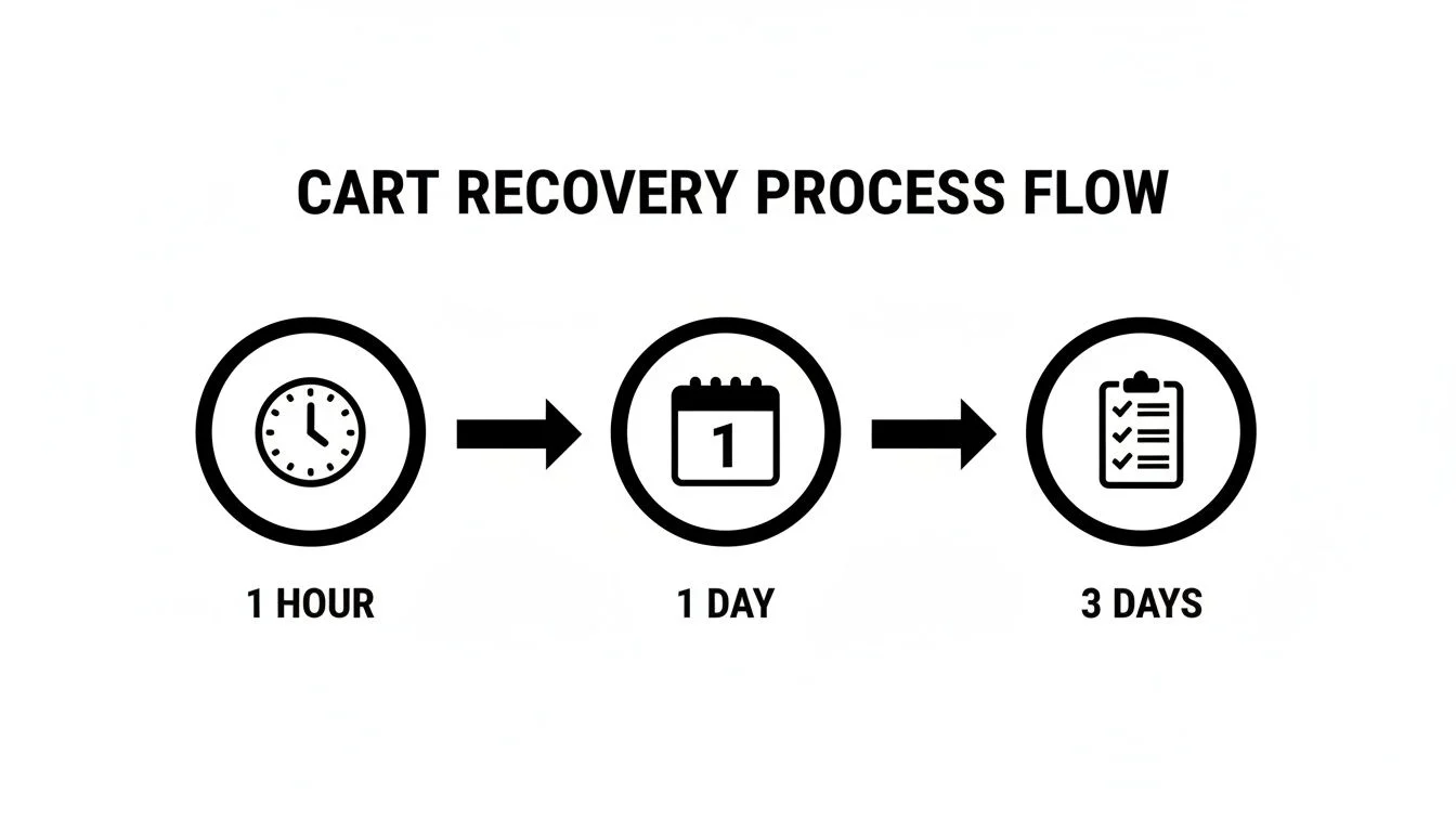
This is a solid starting point, but what if your audience responds better to a more aggressive sequence? You could test this against a flow that sends the first email in 30 minutes and the second in 12 hours. The only way to know is to test.
Here are a few high-impact elements to start A/B testing right away:
- Checkout Button: Test the color, the size, and especially the text. Does "Complete Purchase" outperform "Pay Now"?
- Recovery Email Subject Lines: Pit a straightforward "You left something behind" against a subject line that creates urgency ("Your cart expires in 24 hours!").
- Incentives: Does 15% off work better than free shipping? Test different offers to find that perfect balance between winning the sale and protecting your profits.
- Social Proof Placement: Try moving your customer testimonials or those real-time purchase pop-ups to different places in your checkout flow. Maybe they work better right below the "Add to Cart" button.
By testing one variable at a time, you can figure out exactly what moves the needle. Over time, these small, data-backed wins stack up, turning your checkout into a highly optimized machine that captures more revenue, day in and day out.
Turning browsers into buyers often comes down to answering their last-minute questions and building confidence at the final step. FOMOchat uses an AI-powered chat widget and dynamic social proof to address objections, provide instant answers, and show hesitant shoppers that they’re making a smart, validated decision. Learn how you can reduce cart abandonment and increase conversions at https://fomochat.com.