

Before you can even think about fixing a high bounce rate, you have to play detective. The real work isn't just about tweaking button colors; it's about getting to the root of why people are leaving your site in the first place. Tackling core issues like painfully slow load times, a clunky mobile experience, or a disconnect between your ads and your landing page is where you'll see the biggest wins.
So, Why Is Your Bounce Rate So High?
A "bounce" is simple: someone lands on a page and leaves without doing anything else. No clicks, no form fills, no navigation. But the reason they bounced is the million-dollar question. If you don't figure that out, you're just guessing.
Not all bounces are bad, either. Someone might land on your blog, find the one specific answer they needed in the first few sentences, and leave completely satisfied. That’s a win! On the flip side, a visitor might hit your homepage, get totally lost by your navigation, and bolt in frustration. That’s the kind of bounce that keeps us up at night. The trick is learning to tell these two scenarios apart.
The Big Shift: From Bounce Rate to Engagement Rate
If you're using modern tools like Google Analytics 4 (GA4), you've probably noticed they're pushing a different metric: Engagement Rate. Think of it as the opposite of bounce rate. It’s a much smarter way to look at things.
GA4 considers a session "engaged" if the visitor stays for more than 10 seconds, triggers a conversion, or views at least two pages. A session only gets marked as a bounce if it fails on all three counts. This forces you to focus on the positive (what's working) instead of just staring at a negative number.
Finding the Bounce Rate Data in GA4
Even with the new focus, bounce rate is still a handy diagnostic tool. It's just not front-and-center in GA4 anymore. You have to add it to your reports manually.
Here’s how to do it:
- In your GA4 property, go to Reports > Engagement > Pages and screens.
- Look for the little pencil icon (Customize report) in the top-right corner and click it.
- On the right-hand panel, choose Metrics.
- Click Add metric and search for "Bounce rate."
- Select it, then drag it near the top of your list so it's easy to see. Hit Apply.
Now you can see exactly which pages are the biggest offenders. Don't just look at the site-wide average; hunt for the outliers. Which pages have a bounce rate that's way higher than the rest? That's your starting point.
I see people make this mistake all the time: they fixate on the overall site bounce rate. That number is almost useless on its own. The real insights come when you segment your data. Compare bounce rates by traffic source (is your paid traffic bouncing more than organic?), device (how does mobile compare to desktop?), and page type (are your landing pages performing worse than your blog?). This is how you find the real story.
The Usual Suspects: Why Visitors Really Leave
Okay, you’ve found a page with a sky-high bounce rate. Now what? The cause almost always boils down to a handful of common issues. It's worth remembering that the average bounce rate is somewhere between 41-55%, but it can get ugly fast.
A staggering 61% of users admit they'll ditch a site for a competitor if they can't find what they want right away. And since you have a mere 0.05 seconds to make a good first impression, there’s no room for error. If you want to go deeper, these eye-opening website statistics really drive home how critical that initial experience is.
To get you started, here's a quick cheat sheet for diagnosing what’s wrong. Think of this table as your initial investigation plan.
Quick Diagnosis Checklist for High Bounce Rate
This checklist helps you connect common problems with the specific data you should be looking at in your analytics.
| Potential Cause | Key Metric to Analyze | Example Scenario |
|---|---|---|
| Slow Page Load Speed | Page Load Time (in GA4 or PageSpeed Insights) | An e-commerce category page takes over 5 seconds to load, causing impatient mobile shoppers to leave. |
| Poor Mobile Experience | Bounce Rate by Device (Mobile vs. Desktop) | Your blog's text is too small to read on a phone, and buttons are hard to tap, frustrating mobile visitors. |
| Content Mismatch | Bounce Rate by Landing Page & Source/Medium | An ad promising a "50% Off Sale" leads to a homepage with no mention of the discount, confusing and losing the visitor. |
| Unclear Call to Action (CTA) | On-page heatmaps and scroll depth data | A landing page has a vague "Learn More" button buried at the very bottom, giving visitors no clear next step. |
By walking through these common culprits, you can stop guessing and start making targeted fixes based on what your user data is actually telling you.
Finding the Real Reasons Visitors Leave Your Site
Pinpointing high-bounce pages in your analytics is just the first step. That data tells you what is happening, but it rarely explains why. To really get to the bottom of the friction points sending visitors packing, you have to go deeper and see how people actually interact with your site.
Think of yourself as a user experience detective. You're looking for the story behind the numbers. Are people rage-clicking on something that isn't even a button? Are they scrolling right past your most important call to action without a second glance? These are the crucial insights that standard analytics reports just can't give you.
Moving Beyond Standard Analytics
To get this level of insight, you need tools that show you the human behavior behind the data. This is where heatmaps and session recordings come in. They are genuinely transformative tools for any site audit.
- Heatmaps give you an aggregated picture of where users click, move their mouse, and how far they scroll. They're brilliant for spotting patterns, like seeing that almost no one is clicking on your main navigation.
- Session Recordings are literally videos of individual user visits. You can watch their mouse movements, see where they get stuck, and witness their frustration firsthand when something goes wrong.
Honestly, watching just a few session recordings for a high-bounce page can be an eye-opening experience. I can't tell you how many times I've found a broken link I never knew about or realized a "simple" form was actually confusing the heck out of people.
This visual approach helps you sort problems into three main buckets, which makes it much clearer where to focus your efforts first.
The flowchart below breaks down a simple decision tree for digging into the root cause of your high bounce rate.
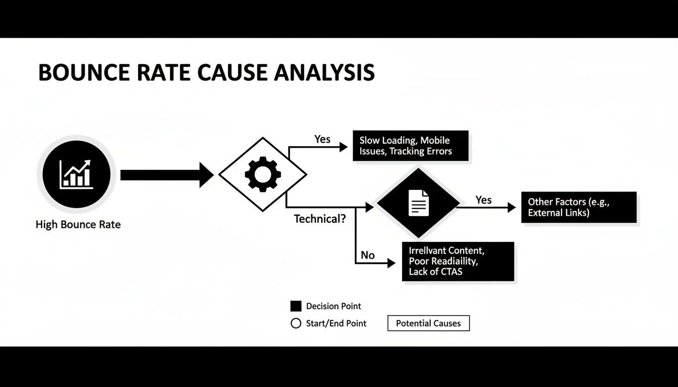
As you can see, the workflow is straightforward. Once you spot a high bounce rate, you start by hunting for technical glitches, then move on to content issues, and finally, user experience problems to find the real culprit.
Uncovering Technical Glitches
Technical problems are often the low-hanging fruit. They're usually the easiest to fix and can have a massive impact on your bounce rate because they create instant frustration, causing people to leave without a second thought.
Use your diagnostic tools to look for signs of technical trouble:
- Broken Elements: Are people clicking on links that go to 404 error pages? Do images fail to load?
- Layout Issues on Specific Devices: Your site might look perfect on your big desktop monitor but be a total mess on a smaller smartphone screen. Use your browser's developer tools to check different screen sizes.
- Slow-Loading Scripts: Is a third-party chat widget or ad script making the whole page hang? Page speed tools can help you sniff out these performance hogs.
One of the most common mistakes I see is assuming a site works the same for everyone. A user on an older Android phone with a spotty connection will have a very different experience than you do on your high-speed office Wi-Fi. Always test for the lowest common denominator.
Identifying Content and Promise Mismatches
This is a big one. It's probably one of the most frequent causes of a high bounce rate. This happens when the promise you make in your ad, social media post, or search result doesn't match what the visitor actually finds on the landing page.
Imagine someone clicks an ad for a "50% off winter coats" sale. If they land on your generic homepage with no clear mention of that sale, their immediate reaction is confusion, maybe even a little annoyance. They feel misled, and they're gone.
To diagnose this, dive into your user flow reports in analytics. Look at the traffic coming from specific campaigns or referral sources. If one source has a ridiculously high bounce rate, there's a good chance your messaging is misaligned. Make sure your headline, hero image, and opening copy directly mirror the language from the link that brought them there. Getting this right is a fundamental step when learning how to increase website conversion rate, as a consistent message builds trust from the very first click.
Auditing the User Experience Journey
Finally, you have to look at the overall user experience (UX) of your high-bounce pages. This means putting yourself in your visitor's shoes and trying to see your site through their eyes.
Is the path you want them to take obvious?
- Confusing Navigation: Can people easily find what they’re looking for? Is your menu a cluttered mess of options?
- Unclear Calls to Action (CTAs): Is it immediately obvious what the next step is? A vague "Learn More" button is rarely as effective as a specific, action-oriented "Download Your Free Guide." If CTAs aren't converting, our guide on how to write a call to action that actually converts covers the principles in detail.
- Poor Readability: Huge walls of text are a major turn-off online. Use short paragraphs, clear subheadings, bullet points, and bold text to make your content scannable. Remember, people rarely read online; they scan.
By systematically working through these technical, content, and UX audits, you'll move from just knowing your bounce rate is high to understanding exactly why. That clarity is what empowers you to make targeted, effective changes that convince your visitors to stick around.
Tackling Slow Page Speed and a Clunky Mobile Experience
Let's be blunt: if your site takes more than a couple of seconds to load, you’re practically showing visitors the door. We live in an age of instant gratification, and page speed isn't some minor technical checkbox. It's a massive part of the user experience. A slow site is a frustrating site, and frustrated people don't hang around.
This gets amplified on mobile, where users are often on the go, dealing with spotty connections. Their patience is even thinner. Honestly, ignoring page speed and how your site works on a phone is one of the fastest ways to send your bounce rate through the roof.
The data doesn't lie. Websites that load in 2 seconds have an average bounce rate of just 9%. Let that drag on to 5 seconds, and you’re looking at a 38% bounce rate. When you consider that 53% of mobile users will ditch a site that takes over 3 seconds to load, you realize this isn't negotiable.
First, Find Out What’s Slowing You Down
Before you can fix anything, you need a diagnosis. Thankfully, you don't need to be a developer to figure this out. A free tool like Google's PageSpeed Insights does the heavy lifting for you. Just pop in your URL, and it will give you a performance score and a prioritized list of what to fix.
You’ll get a report that highlights key metrics like "Largest Contentful Paint" (LCP) and "Interaction to Next Paint" (INP). These aren't just jargon; they measure what a real user feels when they’re waiting for your page to load and become usable. This report is your action plan.
Practical Fixes to Speed Things Up
Once you have your report, it's time to get your hands dirty. The good news is that many of the most common speed-killers are surprisingly straightforward to handle.
- Shrink Your Images: This is almost always the biggest offender. Huge, unoptimized images will cripple your load time. Use a tool like TinyPNG or a plugin on your site to compress image files without making them look terrible. It's a quick win.
- Turn On Browser Caching: Caching tells a visitor's browser to save parts of your site, like your logo, images, and style files. When they come back, their browser doesn't have to re-download everything. This makes the site feel lightning-fast for repeat visitors.
- Stop “Render-Blocking” Resources: PageSpeed Insights might tell you some scripts or CSS files are "render-blocking." This means they're trying to load before your main content, forcing users to stare at a white screen. You can often "defer" these so the important stuff on the page shows up first.
My two cents: Don't just test your homepage. Run these speed tests on your most valuable pages: the blog post that gets all your traffic, your product pages, and your key landing pages. A fast homepage is great, but if the page that’s supposed to make you money is a snail, you're losing customers at the final hurdle.
Don't Forget the Mobile Experience
A fast mobile site is great, but it also has to be usable. Mobile-first design isn't just a buzzword; it's essential for keeping people from bouncing.
A bad mobile experience is more than just slow loading. It’s text that’s too tiny to read, buttons that are impossible to tap with a thumb, or having to scroll sideways to see everything. Each one of these is a reason for someone to give up and leave.
To make sure your site is genuinely mobile-friendly, stick to these fundamentals:
- Use Responsive Design: This is non-negotiable. Your website layout needs to automatically adjust to fit any screen, from a small phone to a big desktop monitor. It ensures everyone has a good experience.
- Make Buttons Tappable: Every link and button should be big enough to tap easily without zooming in or hitting the wrong thing by accident. Aim for a tap target of at least 48x48 pixels.
- Focus on Readability: Use a clean, legible font and make sure it's big enough to read comfortably on a small screen. High contrast between your text and background color is just as important.
When you nail both speed and usability, you create a smooth, welcoming experience that encourages visitors to stick around and see what you have to offer. This is a core pillar of our landing page optimization best practices guide, because you can't convert a visitor who has already left.
Aligning Your Content with What Users Expect
When someone lands on your page, there's a silent, split-second negotiation happening. They clicked a link (from a Google search, a social media post, or a paid ad) because it made a promise. Your page has just a few moments to prove they're in the right place. If it doesn't, they're gone. That disconnect is the heart of content mismatch, and it's a huge driver of high bounce rates.
Any gap between the promise you made and the reality of your page creates instant frustration. Think about it: you click a link for an "easy gluten-free bread recipe" and land on a dense article about the history of wheat. You're not going to stick around to see if the recipe is buried three pages down. You’ll hit the back button without a second thought. This exact scenario plays out millions of times a day, annoying users and crushing engagement metrics.
Crafting Headlines That Match Search Intent
The first thing a visitor sees is your main headline, your H1 tag. It's their primary confirmation that they've made a good click. It absolutely must mirror the language and intent of whatever brought them there. If your Google title tag promises "A Comparison of the Top 5 CRM Tools," your on-page headline better not be a generic "Welcome to Our Software."
This alignment has to be almost surgically precise. Even small changes in wording can make a big difference.
- Weak Alignment: Someone searches "how to fix a leaky faucet" and your page headline is "Expert Plumbing Solutions." It’s in the right ballpark, but it's not a direct answer.
- Strong Alignment: The same search leads to a page titled "A Step-by-Step Guide on How to Fix a Leaky Faucet." This immediately confirms the user’s goal and reassures them they’ve found what they need.
One of the most common mistakes I see is when marketing teams get too clever with headlines. They try to be witty or creative, but they completely miss the search query. A user doesn't care about your wordplay; they care about solving their problem. Your headline should be a clear, simple promise that you have their answer.
Hooking Readers with Your Opening Paragraph
Okay, so the headline did its job. Now the opening paragraph has to convince them to actually read. This is your chance to show you understand their problem and signal that a solution is on its way. Ditch the long, rambling intros. Get straight to the point in the first two or three sentences.
A great opening does three things, fast:
- Acknowledges the user's problem or question head-on.
- Validates their click by confirming this page has the solution.
- Sets the stage for what they're about to learn or find.
For example, for an article titled "How to Reduce Bounce Rate," a solid intro would be: "Seeing a high bounce rate in your analytics can be frustrating. It's a clear sign that visitors aren't finding what they expect. This guide will give you the practical steps to diagnose the real cause and implement fixes that make people want to stick around."
Making Content Scannable with Visual Hierarchy
The truth is, nobody reads a wall of text online. They scan. If your content is just a dense block of paragraphs, you're building a friction wall. Visitors can't quickly pinpoint the specific info they need, so they give up and leave. Using a strong visual hierarchy is like giving them a map to your content.
Here’s how to make your content inviting and easy to scan:
| Formatting Element | How It Reduces Bounces |
|---|---|
| Descriptive Subheadings (H2s & H3s) | These act like signposts, breaking up the content and letting users jump to the section that matters most to them. |
| Short Paragraphs | Stick to 1-3 sentences per paragraph. The extra white space makes the content feel less intimidating and much easier to process. |
| Bullet Points and Numbered Lists | This is the perfect way to present steps, features, or key takeaways. They stand out from the text and are incredibly scannable. |
| Bold Text | Using bold text strategically pulls the reader's eye to the most critical phrases and data points on the page. |
By structuring your content this way, you're putting the user in control. You're allowing them to consume the information on their terms, which makes for a far better experience, with a much lower chance they'll bounce. It transforms a page from a chore to a resource.
Use Social Proof to Build Instant Trust

When a new visitor hits your site, their trust meter is at zero. They're skeptical, understandably. They’re looking for a quick reason to believe you’re legitimate or an even quicker reason to hit the back button.
This is where social proof becomes your best friend. It’s a simple psychological shortcut: people tend to follow the actions of others. By showing new visitors that people just like them have already trusted you and had a great experience, you instantly disarm their skepticism. It’s one of the fastest ways to stop a bounce in its tracks.
Why Seeing Others Engage Matters
Static testimonials and company logos are table stakes these days. While helpful, today's savvy visitors expect something more dynamic, more real. They want to see that your site is a living, breathing place where things are happening right now.
Think about it from a customer's perspective. Someone lands on your online course page. They're interested but hesitant. Suddenly, a small notification pops up: "Jessica from New York just enrolled." That tiny alert immediately makes your course feel more desirable and less of a risk. It creates a powerful sense of shared experience.
The core idea is simple: nobody wants to be the first one to try something. By showing that others are actively engaging, you're telling a new visitor, "It's safe to be here. Other people trust us, and you can, too." This single shift in perception can be the difference between a bounce and a conversion.
This is especially critical for online stores. Learning how to properly display social proof is a key part of how you can improve your e-commerce conversion rate, as it directly answers the visitor’s unspoken question: "Do other people actually buy this?"
Different Types of Social Proof for Different Goals
Not all social proof is created equal. The right tactic really depends on your audience and what you're trying to sell. A B2B software company might get more mileage from in-depth case studies, while an e-commerce brand will see better results from real-time sales notifications.
There are a few effective flavors to consider (for concrete examples of each, see our social proof examples guide):
- Customer Testimonials & Reviews: The classic for a reason. Genuine feedback, especially with names and photos, adds a layer of authenticity that’s hard to ignore.
- Case Studies & Success Stories: For more complex B2B services, detailed stories of customer success provide deep, persuasive evidence of your value proposition.
- Real-Time Notifications: Showing recent sales, sign-ups, or registrations creates a powerful sense of urgency and popularity (FOMO is real!).
- "Wisdom of the Crowd" Signals: Highlighting stats like "Over 10,000 satisfied customers" or logos like "Featured in Forbes" draws credibility from large numbers and trusted brands.
To help you choose, here's a quick breakdown of how different methods work to keep visitors on your page.
Comparing Social Proof Methods to Reduce Bounces
The key is to select the social proof that best aligns with your business model and your customers' mindset. This table can help guide your decision.
| Social Proof Tactic | How It Reduces Bounces | Best For |
|---|---|---|
| Real-Time Notifications | Creates urgency and shows the product/service is popular right now. | E-commerce, SaaS sign-ups, webinar registrations |
| Customer Reviews/Ratings | Builds immediate trust by showing unbiased feedback from real users. | Product pages, local services, and anywhere with a direct sale. |
| Case Studies | Provides in-depth validation for complex decisions, answering "will this work for me?" | B2B software, high-ticket consulting, and agency services. |
| Trust Badges/Logos | Borrows credibility from well-known brands (e.g., "As seen on," security seals). | Checkout pages, landing pages, and homepages. |
Ultimately, a mix of these tactics often works best, reassuring visitors at different stages of their journey.
From Passive Proof to Interactive Trust
The next level of social proof isn't just showing what others have done. It's letting visitors see their own questions being answered in real-time.
This is where a tool like FOMOchat can make a real difference here. It simulates a live group chat right on your page. Visitors see realistic AI personas asking the exact same questions they have about pricing, features, or shipping. An AI representative, trained on your site's content, provides instant answers for everyone to see.
This approach transforms a static landing page into a dynamic, communal experience. It proactively addresses friction points and builds trust by showing you're transparent. When people see their concerns being validated and answered publicly, their confidence soars, and the impulse to bounce fades away.
Got Questions About Bounce Rate? We've Got Answers.
When you're trying to figure out why visitors are leaving your site, you're bound to run into a lot of questions. Getting a handle on bounce rate is one of the first big hurdles, but once you clear it up, you'll have a much better framework for improving your site's engagement.
Let's walk through some of the most common questions I hear from teams trying to diagnose and fix their bounce rate.
What’s a Good Bounce Rate, Anyway?
This is the million-dollar question, and the honest answer is: it depends. A "good" bounce rate isn't a single number; it's completely tied to the context of your industry, the page's purpose, and even the traffic source.
For instance, e-commerce sites typically aim for a bounce rate between 20% to 45%. That makes sense, right? People are there to shop around, clicking from product to product.
Now, look at a blog. It's not uncommon to see bounce rates from 65% to 90%, and that can be perfectly fine. If someone Googles a question, lands on your article, finds the answer in the first few paragraphs and leaves satisfied. Your page did its job. They left satisfied.
The best way forward is to stop comparing yourself to some fuzzy industry average and start benchmarking against your own past performance. The real goal is steady improvement. Zero in on the bounce rate for your most valuable pages (key landing pages, service pages, product pages) and work on bringing that number down over time.
How is Bounce Rate Different from Exit Rate?
This one trips a lot of people up, but the difference is critical for getting your analysis right. They measure two totally separate user actions.
Bounce Rate: Think of this as the percentage of people who landed on a page and left without doing anything else. No clicks, no navigation, no interaction. It was a one-and-done visit.
Exit Rate: This tells you the percentage of time a specific page was the very last one someone saw before leaving your site. They could have visited ten other pages before it, but this was their final stop.
A high exit rate isn't always a bad thing. Your "Thank You for Your Order" page should have a high exit rate. But if a page halfway through your checkout funnel has a high exit rate? That’s a red flag telling you something is scaring people away.
I Made a Change. How Long Until I See Results?
It’s tempting to check your analytics every five minutes after a change, but you need to give it time. How long you should wait really depends on what you changed and how much traffic your site gets.
Some fixes give you quick wins. If you dramatically improve your page speed, for example, you could see a positive impact within a few days. Users have a better experience right away, and search engines pick up on that pretty quickly.
For changes involving content, design, or your calls to action, you need a longer runway. The gold standard is to run an A/B test for at least one to two weeks. This gives you enough data to know if your results are a real trend or just a random fluke. Look for patterns over time, not daily spikes.
Can a High Bounce Rate Actually Hurt My SEO?
Yes, but it's more of an indirect hit. Google has said that bounce rate isn't a direct ranking factor they plug into their algorithm. However, a high bounce rate is a massive symptom of poor user engagement, and that is something search engines care about deeply.
Think of it this way: if a user clicks your link in the search results, takes one look at your page, and immediately hits the "back" button to go back to Google (a behavior often called "pogo-sticking"), you've sent a powerful signal. You told Google that your page didn't satisfy that user's query.
If that happens enough, Google's algorithms will conclude that other pages are a better match for that search term, and your rankings will likely suffer. So, while you're not being penalized for the bounce rate number itself, you're being dinged for the poor user experience it represents. Reducing your bounce rate is just good, fundamental SEO.
Turn skeptical visitors into confident buyers by showing them they're not alone. FOMOchat uses AI-powered social proof to build instant trust, answering visitor questions in real-time and creating a dynamic, engaging experience that keeps them on the page. See how it works at https://fomochat.com.