A visitor has read two paragraphs, checked the price, and is deciding whether to stay. A popup that appears too early, offers little value, or hides its close button can interrupt that decision and drive the visitor away.
These seven websites use popups in different ways. The useful lesson is the tactic behind each one: timing, offer, tone, or interaction. On a product page, adapt the tactic to the questions visitors need answered. For a webinar, match it to the registration decision. A social-proof chat widget can offer context or support without covering the page, though it may be less suited to a message that needs a firm, immediate response. If the unanswered question is the real blocker, an embed chat widget or best website chat widget pattern can answer it without another modal.
Popups have been around for decades. During the first seven months of 2002, advertisers delivered approximately 11.3 billion pop-up-ad impressions, according to Nielsen/NetRatings data reported by the Wharton School. The number shows how widely the format spread. The practical takeaway is to borrow the tactic that fits the visitor's task and leave out what adds friction.
1. PostHog
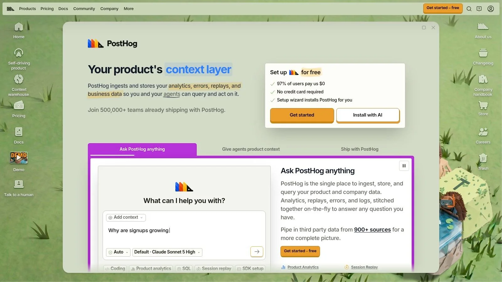
PostHog's website uses a compact slide-in for its cookie notice, and that's the tactic. The notice sits to the side, leaves most of the page visible, and keeps the brand's conversational tone in a functional message most companies write in legal boilerplate. You can still read the headline. You can still see the product.
That restraint matters for SaaS. A technical visitor on a docs or pricing page is scanning for precision, and a blocking modal tells them you don't trust your own content to hold attention. A slide-in that doesn't cover the page works as assistance, not interruption.
How to Adapt This Tactic
Use this format for notices, lightweight announcements, and soft prompts on product pages. Don't force it to do heavy lead capture. A cookie notice is not a lead magnet, and PostHog's humor won't suit every compliance context or audience.
- Keep the page visible: Let visitors keep reading while they decide.
- Carry your voice into functional copy: Don't switch to generic wording for notices.
- Match weight to job: Save blocking formats for moments where you need a decision.
For a webinar page, I'd borrow the slide-in shape for a low pressure reminder after someone has scrolled past the agenda, then compare it against an exit intent popup that only fires when they're leaving. The trade-off is clear. You'll likely get fewer raw clicks from a quieter format, but you'll also annoy fewer people who were about to convert anyway. Test which cost matters more on your page.
2. CoSchedule
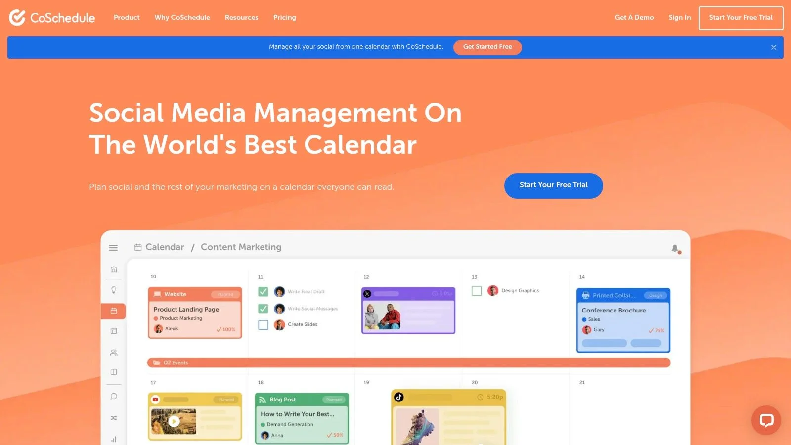
The offer does the work here. CoSchedule's website pairs its signup prompt with access to a free calendar, so the visitor knows exactly what they get for handing over an email. That's a different proposition from "join our newsletter" or "get updates," which asks for trust you haven't earned yet.
For product led SaaS, this pattern is clean. The free tool sits close to the paid product, so the popup feels like a sample, not a detour. A visitor evaluating marketing workflow software can picture using the calendar today.
Set expectations before you copy it. In Popupsmart's dataset of 28,674 campaigns run between January 2024 and September 2026, the median conversion rate among pop-ups requesting an email address or phone number was 0.83% of displays, while the top 10% reached at least 3.87%, according to Popupsmart's campaign dataset. A concrete offer helps you chase that upper range, but it doesn't guarantee it.
Practical rule: If you can't name the useful thing the visitor gets in the next two minutes, your popup is asking too early.
If you're learning how to add pop ups to a SaaS site, start with a template, calculator, or free tier that's already built. Don't invent a vague ebook to justify the form.
The trade-off is lead quality. A free calendar will attract people who want the free thing and nothing else. Track activation, not just signups, or you'll celebrate a list that never buys.
3. HubSpot
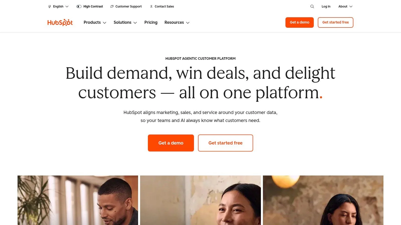
HubSpot's website doesn't rely on one modal. It combines lead generation prompts with chat style help, so a visitor can ask a question, discover a product, or take a conventional call to action. For B2B teams selling something people need to understand before they buy, that mix makes sense.
Think about a pricing page visitor who's stuck on tiers. A static discount popup doesn't help them. A guided conversation that answers "which plan includes this" can move them forward without forcing a form fill. That's the tactic to steal, assistance placed next to promotion. A website chat widget keeps that help in-context, and FOMOchat can show shared questions so visitors see they aren't the only ones comparing plans.
Where This Gets Messy
Multiple prompts compete. When chat, banners, and popups appear close together, the page feels busy, and you can't tell which element influenced the conversion. HubSpot can absorb that complexity with a large team and heavy traffic. A smaller SaaS site usually can't. Prefer one primary interrupt plus, if needed, a quiet social proof widget rather than stacking banners, chat, and modals on the same scroll.
That points to a question most popup guides skip, what is the maximum interruption budget a page can tolerate before total funnel performance declines. The Popupsmart guide to website popup examples is a useful starting point for formats, but your own page budget has to be tested against downstream outcomes like activation and revenue per visitor, not popup clicks alone.
If you're working on web popup design, I recommend picking one primary prompt per page. For webinars, let chat answer logistics questions and keep registration as the single hard call to action. Don't run both at full volume.
4. 10xTravel
Say you're a publisher with strong informational traffic and weak email capture. 10xTravel's website shows the simplest version of the fix, a straightforward popup promoting a specific free travel resource tied directly to the advice the visitor is already reading.
The relevance is built in. Someone reading about points and travel planning doesn't need to be sold on why a travel resource might help. The popup just names the resource and asks for signup. That clarity is why publisher popups can work despite interrupting the reading flow.
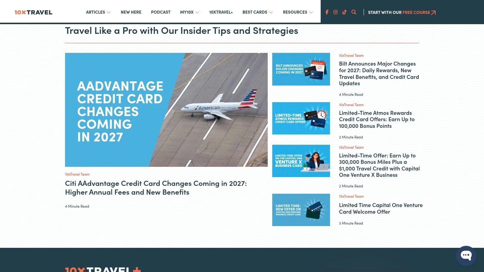
Keep your measurement honest if you copy this. In a five-month real-world popup trial with 83,146 impressions, 2,733 visitors signed up for a 3.29% signup rate, while 76.13% dismissed the popup with the close button, according to the AMST popup case study. A focused minority converting is the normal shape of this tactic.
- Report dismissals alongside signups: Raw lead counts hide the friction you're creating.
- Segment by page and source: A single aggregate rate can conceal weak mobile or paid traffic results.
- Make closing effortless: If the exit is hard to find, readers leave the article, not just the popup.
The trade-off is intent range. This offer won't appeal to someone who isn't planning travel, and that's fine. For a course creator, the equivalent is a specific checklist tied to the lesson topic, not a generic promise of future emails.
5. Universal Yums
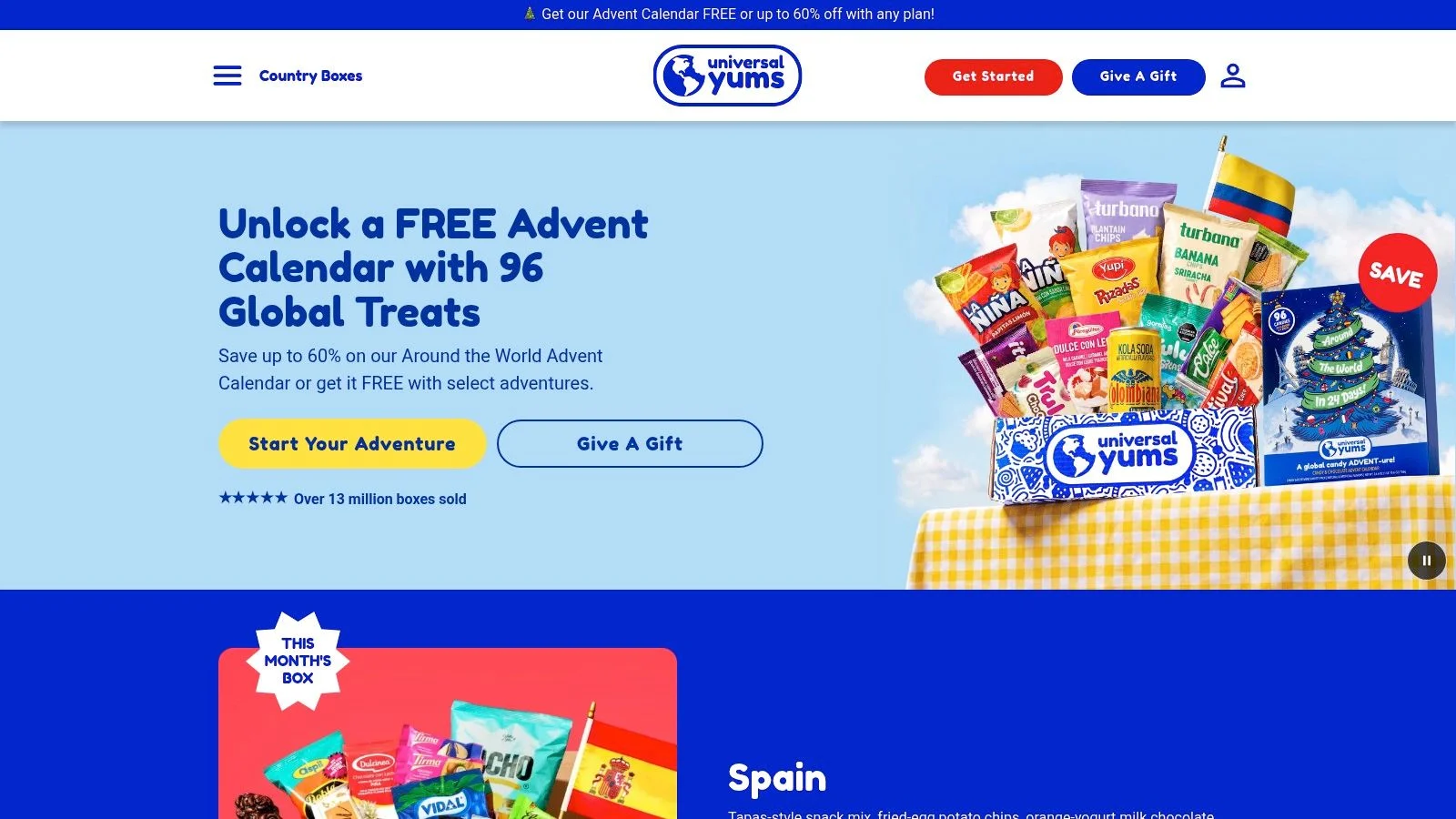
Instead of opening with an email form, Universal Yums opens with questions about snack preferences. The quiz style popup gives the visitor something to do, and each answer makes the eventual recommendation feel more personal than a blanket discount.
This works because the first step is easy. Tapping a preference costs less than typing an email address, and once someone has answered two questions, they've invested a little effort. The brand also learns something useful about taste, which a plain signup form never captures.
When a Quiz Earns Its Steps
A quiz only justifies itself if the payoff is real. If the result is a generic product page everyone sees, visitors feel tricked and you've added steps for nothing. Build the recommendation logic first, then build the popup around it.
A question is a better first step than a form field, but only if the answer changes what you show next.
For SaaS and courses, adapt this as a two question qualifier. Ask about team size or skill level, then route people to the right plan, lesson path, or webinar session. That same logic works inside a social proof chat widget, where visitors see others asking the same qualifying questions and can join in. It's the same "help me choose" moment with less blocking.
The trade-off is completion risk. Every extra step loses people. Keep it to a few taps, show progress, and don't ask for the email until you've given something back.
6. Dr. Squatch
Dr. Squatch treats the popup as entertainment. Its playful, character led presentation and gamified mystery offer carry the brand voice straight into the signup moment, so the prompt feels like part of the shopping experience rather than an ad pasted on top of it.
For consumer brands, memorability is the point. A standard email modal is forgettable seconds after you close it. A popup that makes someone smile, and lets them play for an incentive, gives them a small story attached to your brand. That's worth something in a crowded category.
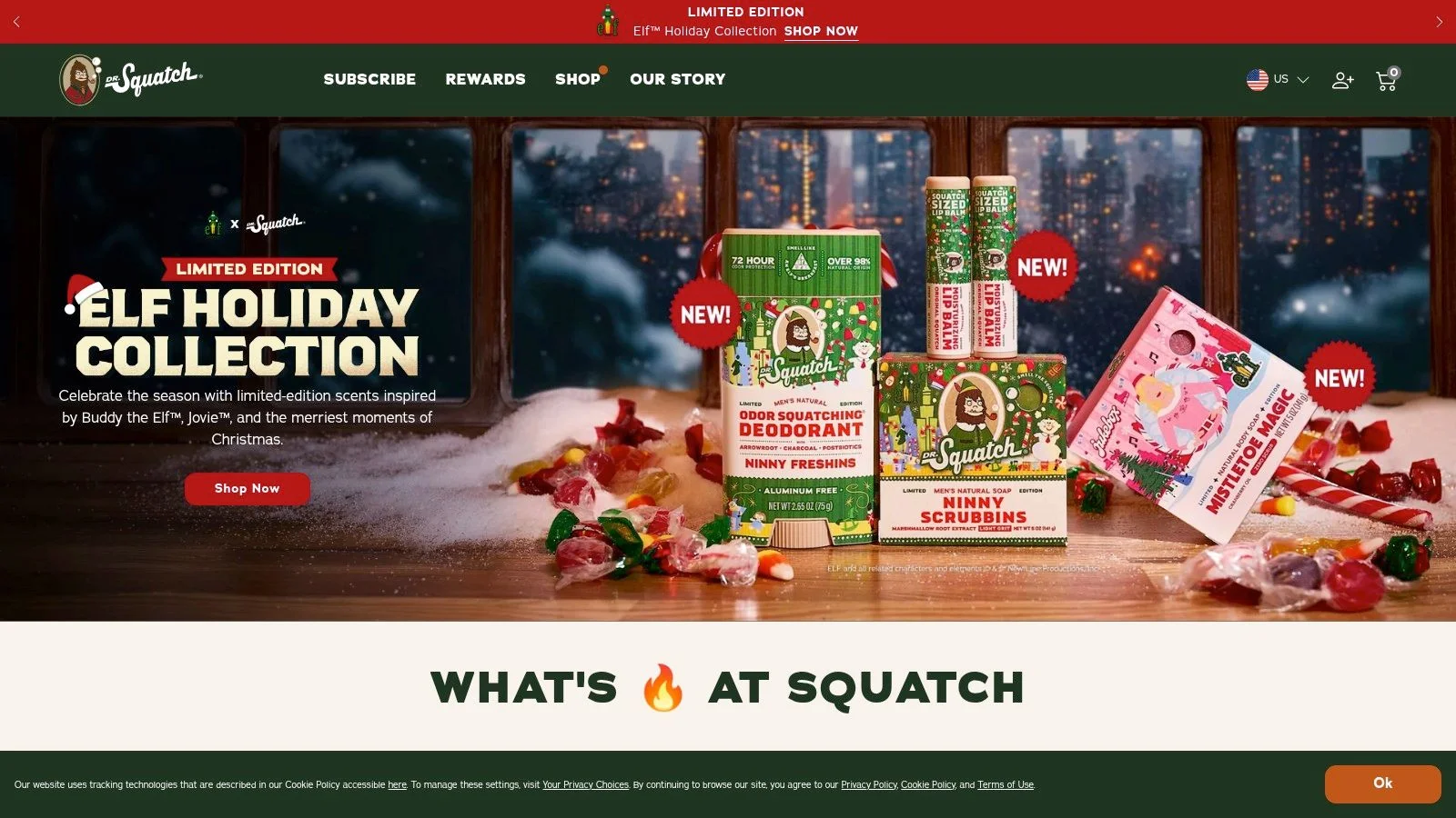
Don't copy the tone without the audience. Humor and mystery can backfire fast:
- Professional buyers get skeptical: A mystery offer leaves people unsure what they'll receive.
- Gamification competes with product facts: If visitors remember the game but not the product, you've wasted the visit.
- Playfulness needs consistency: A fun popup on a dull site reads as a gimmick.
If you're testing a sales pop up for a serious product, I'd steal the energy but drop the mystery. State the offer plainly, keep the brand voice in the headline, and let the interaction be a simple choice between two relevant options.
For a webinar, a light choice based moment can still work, such as picking which topic you care about most. Just don't make attendees play a game before they can register.
7. Taylor Stitch
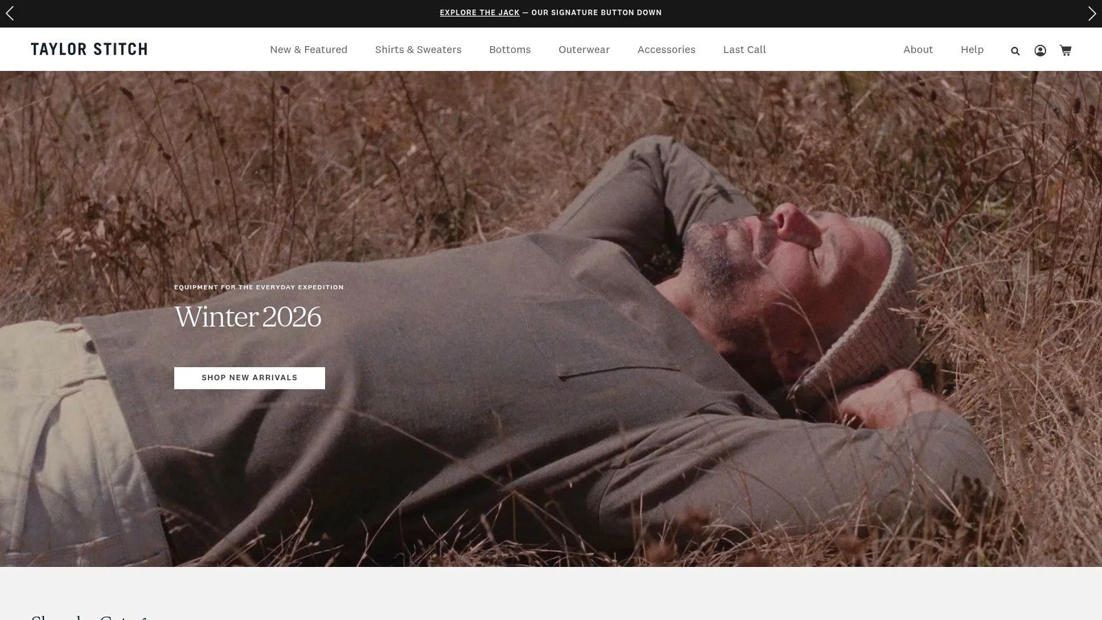
Timing is the whole lesson here. Taylor Stitch's website is cited for a signup popup that appears after a visitor scrolls partway down the homepage, so the opening screen stays focused on the brand and the products. The visitor gets to browse first. The ask comes later.
That's the right instinct for ecommerce. Someone who has scrolled has shown real interest, and they're judging your products in those first seconds. Covering that moment with a form is how you train people to close without reading.
Delaying the interruption and choosing a page where the promotion is contextually relevant can improve response while reducing abandonment risk, according to a large-scale field experiment on popup timing and page context that measured both click-through and site exits. Timing and placement aren't polish. They're the variable.
How I'd Test This Pattern
Compare your current trigger against a scroll trigger, and segment new versus returning visitors. Watch bounce rate and session exits alongside conversion rate, because a popup can win clicks while damaging the shopping journey.
The trade-off cuts both ways. A scroll trigger still interrupts engaged browsers, and visitors who don't scroll far enough never see the offer at all. On a product page, I'd test firing after someone views sizing or reviews. On a webinar page, I'd wait until they've passed the speaker bio. Let demonstrated interest, not a stopwatch, open the door.
How the seven websites differ in popup type, offer, and best use
| Item | Popup type | Primary offer | Best for |
|---|---|---|---|
| PostHog | Compact cookie slide-in | Cookie notice | On-brand notices for SaaS and technical brands |
| CoSchedule | Signup popup | Free calendar | Promoting useful SaaS resources and tools |
| HubSpot | AI chat and marketing prompts | Guided help and product discovery | B2B lead generation and demand generation |
| 10xTravel | Signup popup | Free travel resource | Travel publishers growing subscribers |
| Universal Yums | Quiz-style popup | Snack preference quiz | Preference-based product recommendations |
| Dr. Squatch | Gamified popup | Mystery offer | Playful consumer brands encouraging engagement |
| Taylor Stitch | Scroll-triggered signup popup | Signup offer | Ecommerce teams testing popup timing |
Turning Popup Examples into a Test You Can Run
Choose one pattern, such as Taylor Stitch's delayed scroll trigger or Universal Yums' preference quiz, and compare it with your current popup for two to four weeks. Keep the offer constant, change one variable, and set a success measure before launch. A delayed trigger tests timing; a quiz tests whether asking visitors about their preferences helps them choose.
Set guardrails before the test. Track the primary conversion alongside bounce rate, session exits, unsubscribes, and downstream outcomes such as SaaS activation, webinar attendance, or first purchases. For a practical test plan, turn user goals into testing scenarios so each variant addresses a visitor need rather than a design preference.
Break results down by device, traffic source, new versus returning visitors, and page type. A popup that works on desktop blog traffic may interrupt mobile shoppers on a product page. Overall averages can hide that difference.
When a Chat Widget Fits Better Than a Popup
Some visitors need answers and reassurance more than another prompt. On a product page or webinar, FOMOchat can show a simulated group chat of questions and answers while real visitors ask their own questions. An AI company rep trained on your website content answers them. The widget takes one line of code to install, and URL-based visibility rules let you test it on selected pages. Compare that against the add pop ups patterns above before you ship both on the same URL.
Decision rule: Use a popup when the goal is one clear action. Use visible conversation when unanswered questions or uncertainty are holding visitors back.
Keep the test focused: one page, one tactic, and a comparison with no popup. That gives you a clearer read on whether the interruption earns its place.
If visitors hesitate because they cannot see whether others share their questions, FOMOchat adds an AI-powered social proof and support chat to product pages, launches, courses, and webinars. Visitors can see a simulated group conversation and get answers from an AI rep trained on your website content. Setup takes about five minutes and requires pasting one line of code. Preview Mode is free, with 100 lifetime visitors, all features available, and no credit card required. Test it on one high-intent page and compare signups with your current popup.