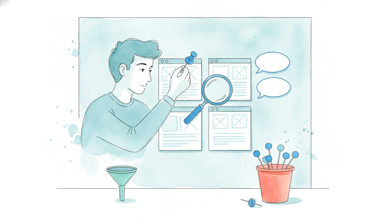
Stop collecting screenshots and calling them strategy. An attractive landing page might clarify an offer, but visual polish alone doesn't prove that visitors will sign up, buy, or register. A useful swipe file turns each example into a testable hypothesis about attention hierarchy, trust, objections, forms, and calls to action. This list examines seven landing-page resources, plus FOMOchat, as practical tools for SaaS marketers and course creators. The focus is on observable page elements, not assumed performance. Screenshots can show what a page does. They can't prove why it converted unless the publisher discloses the traffic, test conditions, baseline, and result. For a broader foundation, compare these annotations with Tagada's landing page guide.
1. FOMOchat, AI group chats for conversion-focused landing pages
A landing page can answer common objections without adding another testimonial row or support popup. FOMOchat places an AI-trained company representative inside interactive, multi-person group conversations. Visitors can ask questions, review responses to common concerns, and observe social-proof-style exchanges while assessing a product, course, launch, or webinar.
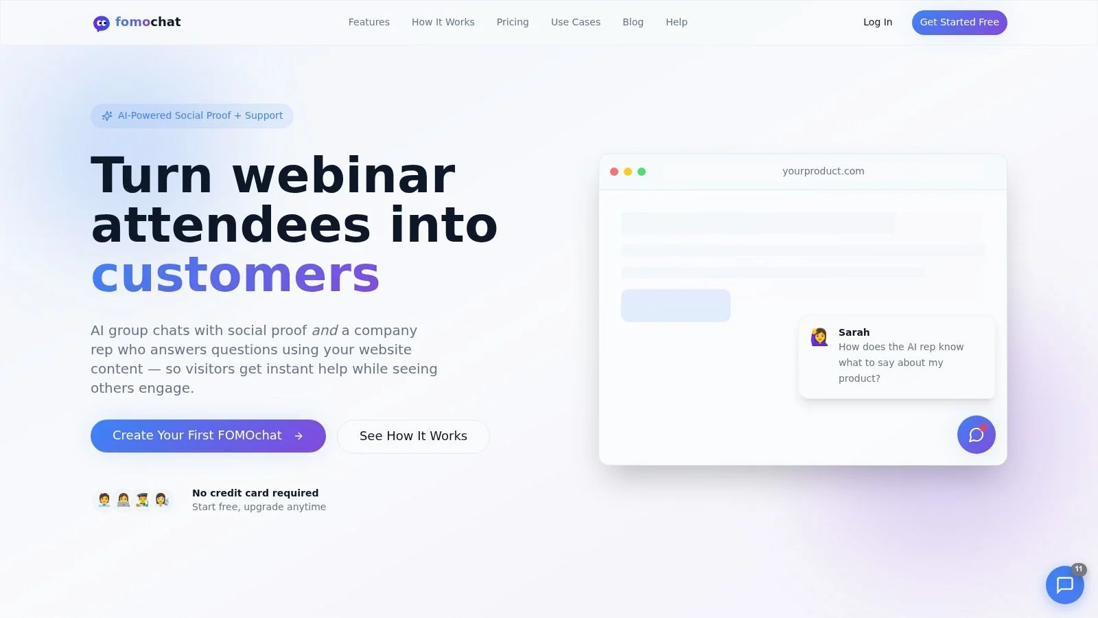
Conversion objective and friction point
The clearest conversion objective is reducing hesitation after a visitor understands the broad offer but still has practical questions. SaaS buyers may need information about setup, integrations, security, or product fit. Course prospects may question the curriculum, available support, or expected workload. Webinar registrants may want to confirm relevance before submitting an email address.
The widget keeps those questions beside the primary CTA. Visitors do not need to leave for a knowledge base or support page. FOMOchat can train its AI representative on site content, with facts, guardrails, and confidence qualifiers that help keep responses aligned with the brand. Teams can also include or exclude the widget on selected URL patterns, allowing separate tests on product, pricing, and campaign pages.
Practical rule: Treat the widget as an objection-handling layer, not conversion proof. Track completed signups, enrollments, demos, or registrations, and report chat activity as a supporting behavior.
Proof mechanism and experiment
The group-chat format turns social proof into an interactive page element. A conversation can surface a question that matches a visitor's concern, while the AI representative provides an immediate response. For video or webinar pages, conversations can sync with the timeline so a reaction or objection appears near the claim it addresses.
That mechanism may improve relevance, but the page itself cannot establish whether it improves conversion. Teams need a controlled comparison with a defined primary outcome.
Implementation requires a small embed rather than a page rebuild. Teams configure personas and context, generate conversations, and adjust branding, positioning, colors, and tone. Paid-plan analytics can support iteration. The practical experiment is narrower than placing the widget everywhere: test widget placement and conversation purpose on one focused landing page, such as an AI SaaS demo page or course enrollment page. Compare a conversation addressing the main objection with one offering general product information, then evaluate the chosen conversion event.
For a closer look at the format, review this guide to group chat for websites. FOMOchat is available through its official website.
Pros
- Objection handling: The representative can answer page-specific questions without sending visitors elsewhere.
- Timed relevance: Video and webinar synchronization can place responses near important moments in the pitch.
- Controlled messaging: Facts and guardrails help limit unsupported answers.
- Low-friction rollout: A small embed makes a focused test practical.
Cons
- Authenticity risk: Synthetic conversations may feel staged if personas and dialogue lack credibility.
- Measurement limits: Analytics and optimization features vary by plan, so teams should define the conversion event before launch.
2. Unbounce
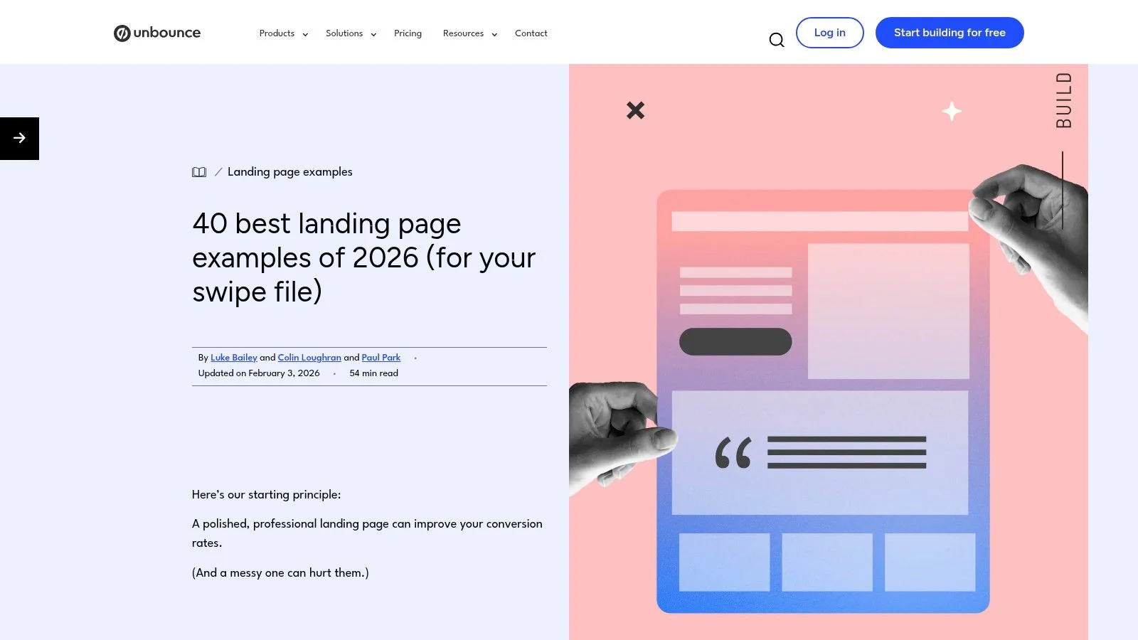
The Unbounce landing page examples collection works best as an annotated swipe file for marketers who need page-level ideas quickly. Its examples span SaaS, ecommerce, events, and signup flows, with explanations of headlines, forms, layouts, proof, and CTA choices. The useful distinction is that it usually explains an observable tactic instead of presenting a screenshot without context.
For SaaS teams, look for examples that reduce the first commitment. A one-field form, a click-through CTA, or a multi-step form can each be appropriate, depending on the visitor's intent and the information required. Course and webinar teams can borrow the same logic by separating the first low-risk action from later qualification.
The collection also offers a useful warning against treating a design pattern as a universal rule. In a documented 2013 career-college experiment, the original page converted 3.12% of visitors and the winning variant converted 13.64%, a reported relative improvement of 336%. The test estimated a 95.2% probability that the challenger would outperform the original, but the result doesn't mean every redesign will produce the same lift. It shows why a controlled comparison is more useful than a visually impressive screenshot. The original experiment details explain the distinction between relative lift and absolute conversion rate.
What to extract
- Message continuity: Match the landing-page promise to the campaign that sends the visitor.
- Form design: Test whether asking for less information first improves completion without damaging lead quality.
- CTA specificity: Replace generic action language with the next value event, such as starting a trial or choosing a course date.
The resource is free and practical, but many examples sit close to the Unbounce ecosystem, and several don't disclose performance data. Use it to generate hypotheses, then validate those hypotheses on your own traffic. A relevant companion is this guide to conversion rate optimization for landing pages.
3. CXL
CXL's guide to high-converting landing pages is less of a gallery and more of a CRO reference. That makes it useful when a team has already collected enough screenshots and needs to decide what to test first. Its examples connect copy, hierarchy, friction, experimentation, and personalization rather than treating design as the primary variable.
A SaaS marketer can use the guide to diagnose a page by decision stage. An evaluation-stage visitor may need product proof, implementation detail, or a direct demo path. A visitor arriving from a broad educational campaign may need a clearer problem definition before a sales CTA makes sense. Course creators face a similar split between people browsing a topic and people comparing enrollment options.
One case study cited in the supplied research reports a SaaS page moving from 2.1% to 5.4% after replacing a generic CTA and adding structured proof, an approximately 157% relative improvement. The same report attributes the change to copy and proof architecture rather than a visual redesign. It also describes a reduction in implied cost per demo from about $690 to $269, based on an average CPC of $14.50 and the simplifying assumption that traffic quality and qualification stayed constant. These figures belong to that case, not to a general benchmark. For typical numbers, our landing page conversion rate benchmark breaks rates down by industry. See the SaaS conversion case study for the stated conditions.
The experiment to run
Start with the page's primary promise and CTA. Test a button that describes the next-value event, then place proof around the objections that block that event. For a course, that might mean changing “Enroll now” to a benefit-specific action and adding proof about support or curriculum fit. For SaaS, it might mean changing “Learn more” to a demo or trial action and placing relevant customer context beside it. Our guide on how to write a call to action has more button wording ideas.
The guide is strong for methodology and immediate test planning. Its weakness is format. It isn't the fastest resource for a stakeholder who wants to scan dozens of visual layouts. Use CXL when the question is why should we test this element, not just what should the page look like.
4. Shopify Blog
The Shopify landing page design examples are useful when a page has too many competing jobs. The selection emphasizes clarity, visual focus, and one dominant conversion goal. That framing translates well beyond ecommerce. A product launch, course opt-in, or webinar registration page also needs to tell visitors what the offer is and what to do next without making them choose among unrelated paths.
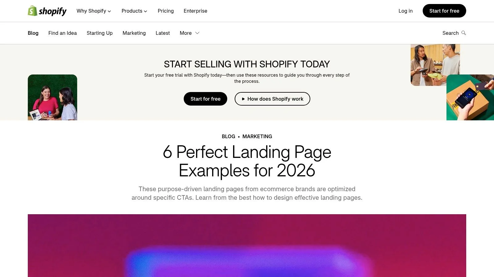
The tactical value is speed. The examples have concise rationales, so a marketing team can align on a hero structure or CTA direction without reading a long CRO teardown. The tradeoff is that the set is smaller and leans toward ecommerce, which means SaaS teams should translate the tactic rather than copy the surface design.
A dedicated landing page has historically outperformed a general homepage in one reported comparison, with the dedicated page producing a 73% higher conversion rate. That result supports the principle of matching one audience, one message, and one action, but it isn't a promise for every campaign. The landing-page comparison evidence also reports a video test where the no-video page converted at 6.5%, embedded video at 11%, and lightbox video at 13%. Those outcomes show that presentation and placement matter, not that every page needs video.
A mobile-first test
Shopify's single-goal principle should be tested on the narrowest screen first. Remove secondary navigation, inspect the first CTA, and check whether the offer remains understandable before a visitor scrolls. Then compare a page with one dominant action against a version that adds a secondary path for visitors who aren't ready to buy.
Use these actionable landing page design tips to extend the exercise, and review landing page optimization best practices when deciding where proof or objection handling belongs. The resource is easy to share with stakeholders, but its examples don't establish that the design itself caused a conversion outcome.
5. Lapa Ninja
Lapa Ninja is the visual research tool in this list. Its archive contains more than 7,300 landing-page designs, a count stated by the resource itself, making it useful for finding patterns across hero sections, testimonials, FAQs, pricing blocks, and forms. The number describes the gallery catalog, not the performance of those pages.
Its tags make rapid scanning practical. A course creator can look for education or event pages, while a SaaS team can isolate product, pricing, or signup layouts. The best use is comparative: collect several hero patterns that solve the same job, then identify the shared conversion mechanism. For example, don't save a hero because its gradient looks polished. Record whether it makes the audience, outcome, proof, and next action visible.
What the gallery can't tell you
Lapa Ninja attaches limited performance context to most examples. You generally won't know the traffic source, device mix, baseline conversion rate, experiment duration, or whether the page was a campaign endpoint or a homepage. That makes the gallery strong for creative range and weak for causal evidence.
A practical annotation should capture:
- Conversion objective: Demo, signup, purchase, enrollment, or registration.
- Friction point: Unclear value, long form, weak proof, or unanswered objection.
- Proof mechanism: Customer story, product demonstration, credentials, or community signal.
- Testable change: One variation your team can build without copying the whole layout.
For teams using WordPress, the related guide to creating landing pages in WordPress adds implementation context. Keep the gallery in the inspiration phase, then move quickly to a hypothesis and an experiment. A beautiful pattern is a starting point, not a result.
6. Land-book
Land-book offers a more curated way to study landing-page sections. Its landing category, full-page views, and section-level browsing let marketers isolate heroes, pricing areas, testimonials, or other components instead of studying an entire page as one undifferentiated design.
That section-level focus is valuable for SaaS pages with complex buying journeys. A team may not need to copy a competitor's entire page. It may need a better way to introduce an integration, explain a pricing tier, or place proof next to a demo CTA. Course creators can use the same approach for curriculum previews, instructor credibility, or payment reassurance.
The filters also help teams work within real production constraints. Search by page type, section, motion, or headline style, then compare examples that could plausibly be built in the team's stack. The marketplace and designer directory add a sourcing angle for teams that need implementation help, while the optional Pro tier provides deeper filters and downloads.
The experiment to run
Choose one decision point rather than redesigning the whole page. For example, keep the hero and form constant while testing a testimonial section that emphasizes learner identity against one that emphasizes course outcomes. For SaaS, test proof organized by customer context against proof organized by feature.
The gallery doesn't generally attach conversion metrics to its entries, so don't describe a curated section as “proven” without your own data. Its strength is pattern isolation, which makes it easier to create a clean experiment. Its limitation is the same as most visual libraries: you can observe hierarchy and wording, but you can't infer performance from appearance.
7. Landing.Gallery
Landing.Gallery narrows the field to landing pages, which makes it more efficient than broad web-design galleries for campaign teams. Entries are manually reviewed and tagged by page type and technology, including tools such as Webflow and Framer. The catalog notes more than 1,600 entries, but that figure describes the library and doesn't establish any conversion result.
The technology tags give this resource a practical advantage. A SaaS team can find pages built within a likely implementation environment instead of saving a layout that depends on unavailable components. A webinar host can filter for registration patterns, while a course creator can look for sales-page structures that fit a no-code workflow.
Match the page to the build constraint
Use the gallery to separate visual inspiration from delivery risk. If the example depends on heavy motion, video, or a custom interaction, note that dependency before approving the pattern. A design that looks persuasive on desktop may introduce loading or interaction friction on mobile, particularly when teams add chat, animation, video, and social proof at once.
The supplied evidence reports desktop conversion at about 4.3% versus 2.2% on mobile, even though mobile receives more traffic. It also reports that pages loading in one second can convert roughly three times as well as pages loading in five seconds. These are benchmark summaries, not a guarantee for a specific page. Read the landing-page performance evidence before adding another conversion element. Our checklist on how to improve page performance covers the usual speed culprits.
Test the implementation detail independently. Compare widget visibility, page speed, and mobile abandonment before claiming that a new proof component caused a lift. Landing.Gallery helps you find a realistic pattern. Your analytics must determine whether that pattern earns its place.
7 Conversion-Focused Landing Pages Compared
| Solution | 🔄 Implementation Complexity | ⚡ Resource Requirements | 📊 Expected Outcomes | 💡 Ideal Use Cases | ⭐ Key Advantages |
|---|---|---|---|---|---|
| FOMOchat: AI Group Chats for Conversion-Focused Landing Pages | Low, code‑light embed; persona & guardrail tuning needed | Low–moderate: content setup and tuning; optional paid analytics | Improved conversions via timed social proof and real‑time objection handling ⭐⭐⭐⭐ | Product pages, webinars, course launches, signup flows | Realistic group chats; on‑brand AI reps; video/webinar sync; fast testability |
| Unbounce (40 landing pages roundup) | None, guidance/readable examples | Low: marketer time to extract and adapt ideas | Direct, testable recommendations for A/B tests and copy/layout tweaks ⭐⭐⭐ | Marketers wanting concrete, example‑based tests and swipe files | Annotated “why it works” notes; broad industry examples; free access |
| CXL (research-backed guide) | None, long‑form study and reference | Moderate: time to build test plans from guidance | Systematic CRO plans and data‑driven experiments; measurable lift potential ⭐⭐⭐⭐ | CRO teams, demand gen, teams focused on rigorous testing | Research citations; practical heuristics; vendor‑neutral methodology |
| Shopify Blog (Landing Page Design) | None, concise reads, quick to apply | Low: quick stakeholder alignment and small design edits | Clear, single‑goal page designs that reduce distraction; practical wins ⭐⭐⭐ | Launch pages, event registration, single‑goal opt‑ins | Concise deconstructions; emphasis on clarity; editor‑selected current examples |
| Lapa Ninja (large inspiration gallery) | None, browse & collect visuals | Low: time to scan; design/dev effort to implement ideas | Strong visual inspiration and pattern discovery; limited performance insight ⭐⭐ | Design-led exploration, hero/section layout ideation, swipe files | Massive catalog (7,300+); fast visual research; free browsing |
| Land-book (section-level gallery) | None, curated browsing; Pro for advanced tools | Low–moderate: may require Pro for deep filters/downloads | High‑quality section patterns ready for replication; limited metrics ⭐⭐⭐ | Teams isolating specific sections (heroes, pricing, testimonials) | Section views, robust filters, template marketplace |
| Landing.Gallery (landing‑only library) | None, targeted browsing with tech tags | Low: browsing; dev time to reproduce examples | Relevant, tech‑matched examples for realistic implementation ⭐⭐⭐ | Teams needing apples‑to‑apples examples by tech (Webflow, Framer) | Landing‑only scope; tech tags; curated, recent examples |
Turn the Swipe File Into a Testing Roadmap
The seven resources solve different research problems. Unbounce is strongest when you want annotated examples and recognizable conversion patterns. CXL is better when the team needs a CRO rationale and a testing method. Shopify helps simplify pages around one goal. Lapa Ninja provides breadth, Land-book isolates sections, and Landing.Gallery adds implementation context. FOMOchat is different because it supplies an interactive layer for answering objections and displaying social proof on the page itself. That's the real gap between a conversation and a notification popup: a "someone just signed up" toast can't answer the question that's stopping a buyer, which we unpack in why social proof notifications don't work for complex products.
Start with the conversion job. A SaaS demo page may need to create confidence in implementation, while a course page may need to make the outcome and support structure tangible. A webinar page may need to preserve message continuity from the ad and explain who should attend. Don't begin by choosing a visual style. Begin by writing the action the visitor should take and the reason they might refuse.
Then annotate the page around six questions:
- Goal: What single action should the page prioritize?
- Hero: Can the visitor identify the audience, offer, and outcome immediately?
- CTA: Does the button describe the value of the next step?
- Friction: Which field, distraction, or unanswered question could stop action?
- Proof: Does the evidence match the visitor's concern and decision stage?
- Sequence: Does each section answer the next question in the buying process?
A/B testing provides the historical foundation for this discipline. The career-college experiment cited earlier demonstrates that a large relative change can occur when a control has substantial friction, but it doesn't establish a universal redesign formula. The same principle applies to the webinar example in the supplied research, where a campaign reportedly converted about 60% of cold paid-ad traffic into registrations against a cited industry range of roughly 15% to 25%. The implementation emphasized one CTA, a specific promise, audience qualification, benefit-led copy, proof, a short form, reduced navigation, fast loading, and mobile-first design. See the education webinar campaign account for the stated context. For more registration-page patterns, browse our webinar landing page examples.
Choose one change at a time when possible. Document the hypothesis, audience, traffic source, primary conversion, and guardrail metric before launch. A higher form completion rate isn't automatically better if qualified demos fall. More chat engagement isn't automatically better if registrations stay flat. Count the signups, not the chatter.
Accessibility belongs in that measurement plan, not in a final polish pass. The 2025 WebAIM Million analysis found detectable WCAG failures on 94.8% of the top one million homepages, as reported in the supplied accessibility evidence. Check keyboard navigation, focus states, contrast, labels, captions, error recovery, reduced motion, screen-reader usability, and a clear fallback when an interactive widget isn't available. A page that converts only for visitors who can see animation, hear video, or use a mouse isn't a complete example.
FOMOchat can be an optional test layer for product pages, course sales pages, launches, and webinars. Use it when the main uncertainty involves questions that can be answered in context, then compare the relevant completed conversion against a controlled version without the widget. The goal isn't to imitate a screenshot. It's to turn a plausible page tactic into evidence your team can trust.
FOMOchat adds an AI-trained company representative, interactive group conversations, and configurable social proof to product, course, launch, and webinar pages. Use its code-light embed and page-level targeting to test objection handling beside your CTA, then measure signups, enrollments, demos, or registrations. Visit FOMOchat to create a conversion-focused chat experience and start testing.