
When you decide to build a landing page, you’ve got a few ways to go about it in WordPress. You can use a page builder plugin, stick with the default block editor, or find a theme designed for it. For most people, a drag-and-drop page builder is the fastest way to get something live without touching any code.
Why WordPress Is Perfect for High-Converting Landing Pages
Before we get into the step-by-step, let's talk about why so many of us rely on WordPress for pages that need to convert. It all comes down to one thing: flexibility. You're never boxed into a single system. You have total control to build, test, and tweak every part of the page.
This freedom means you can build exactly what you need for the job. Whether you're setting up a simple signup page for a webinar or a detailed sales page for a new product, the massive world of WordPress themes and plugins has you covered. You can start from scratch or grab a template to get a head start.
The Power of the Plugin Ecosystem
The plugin library is where WordPress really shines. These add-ons let you plug in just about any feature you can think of, usually without needing a developer.
This is especially true when you want to create high-converting landing pages in WordPress. Page builder plugins have completely changed the game. Think about it: WordPress powers 43.3% of the entire internet, and a huge number of those sites use these tools to build and grow faster.
The most popular builder, Elementor, runs on over 8 million websites. Its users even report an average conversion rate 23% higher than sites that don't use it. When you realize that just going from 10 to 15 landing pages can increase your leads by 55%, you can see how the speed these tools offer is a serious advantage.
WordPress Landing Page Methods at a Glance
Choosing the right tool from the start can save you a ton of headaches. This table breaks down the three main approaches to help you decide which one fits your skills and goals.
| Method | Best For | Ease of Use | Customization Level |
|---|---|---|---|
| Page Builders | Beginners & marketers who need speed and powerful features without code. | Very Easy | High |
| Gutenberg Editor | Users who prefer the native WordPress experience and want a clean, fast-loading page. | Moderate | Medium |
| Custom Themes | Developers or businesses with very specific design and functionality requirements. | Difficult | Very High |
Ultimately, a page builder offers the best balance of ease and power for most people. However, Gutenberg is becoming more capable with every update, so don't count it out if you value simplicity.
Full Control Over Your Brand and User Experience
Unlike "all-in-one" platforms that limit your design choices, WordPress gives you complete ownership. You're in charge of the entire user journey, from the headline they first read to the button they click to convert.
This control is non-negotiable for serious conversion optimization. It means you can:
- Dial in the design: Make sure every pixel of your landing page aligns with your brand's look and feel to build instant trust.
- Integrate your favorite tools: Easily connect your page to the CRM, email marketing service, or analytics platform you already use.
- Optimize for speed: Go under the hood and implement performance tweaks to make your page load instantly, which is crucial for keeping visitors from bouncing.
The ability to fine-tune every element is what separates a good landing page from a great one. With WordPress, you have the freedom to experiment and figure out what actually works for your audience, which is fundamental to learning how to increase website conversion rate.
This autonomy ensures you never get stuck. As your marketing strategy changes, your WordPress landing pages can change right along with it, giving you the right setup to capture leads and drive sales.
Choosing Your WordPress Landing Page Builder
Before you write a single headline or pick a color, you have to decide how you're going to build your landing page. This is a bigger deal than it sounds. The tool you pick sets the foundation for everything that follows, and making the right call now can save you a world of headaches later.
Your choice really comes down to two main routes: using a dedicated page builder plugin or sticking with WordPress's own Block Editor (often called Gutenberg). Let's break down which one is the right fit for you.
Page Builders: The Fast Track to a Live Campaign
For most people who just want to get a high-converting page up and running fast, a page builder is the way to go. Tools like Elementor or Beaver Builder are designed for exactly this. They give you a visual, drag-and-drop canvas that makes building even complex layouts feel intuitive.
If you're a marketer or business owner who needs to launch a campaign yesterday without waiting on a developer, this is your answer.
Page builders also come loaded with pre-made templates for almost any scenario: webinar signups, ebook downloads, you name it. You can find a design you like, swap in your own content, and go live in a matter of hours. The one thing to keep an eye on is performance; some builders can add extra code, so you'll want to make sure your page stays zippy.
I've worked with countless teams who swear by page builders. In fact, one study found that 78% of users say these tools drastically cut down the time it takes to launch new campaigns. When you're trying to grow quickly, that speed is everything.
Gutenberg: The Lean, Mean, Native Machine
The other option is to use what’s already built into WordPress: the Block Editor, or Gutenberg. Think of this as the "native" approach. There’s no extra plugin to install, which means you're starting with a cleaner, lighter foundation right out of the box.
This path is perfect for anyone who puts site speed and performance above all else.
Gutenberg used to be pretty basic, but it's come a long way. Paired with a modern block-based theme, you can create some seriously sophisticated layouts. There's a bit more of a learning curve compared to a drag-and-drop builder, but the reward is a lightning-fast page with minimal code, a major advantage for your SEO and Core Web Vitals.
This flowchart helps simplify the decision based on what matters most to you.
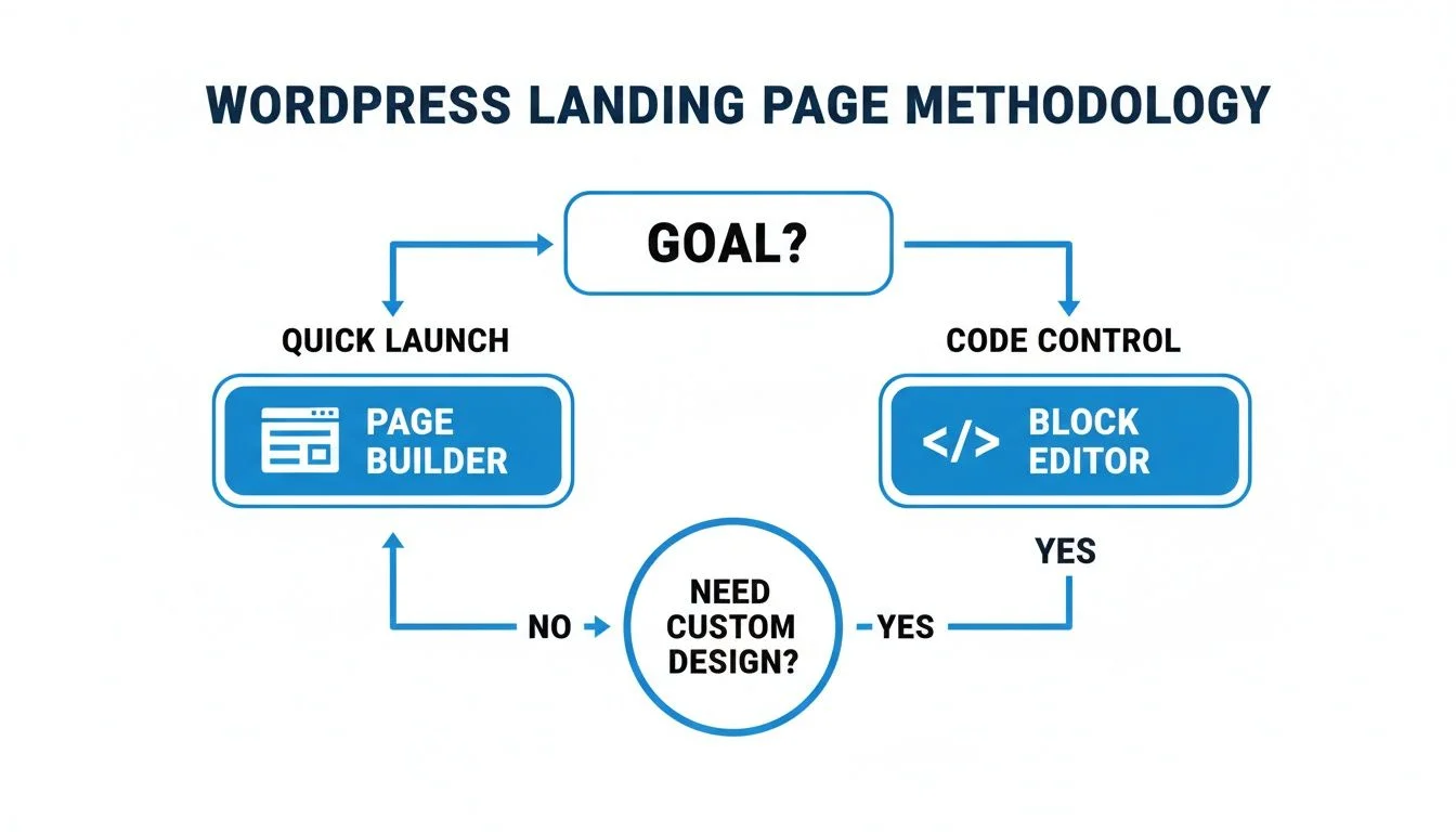
As you can see, it really boils down to whether you need to launch fast or want total control over the code for a super-clean build.
How They Stack Up: A Head-to-Head Look
Let's get practical and compare these two approaches on the features that actually matter for a landing page.
| Feature | Page Builder (e.g., Elementor) | Gutenberg (Block Editor) |
|---|---|---|
| Ease of Use | Very High. The drag-and-drop experience is as easy as it gets. Perfect for non-techies. | Moderate. It’s simple for basic pages, but advanced designs take some getting used to. |
| Template Variety | Excellent. You get massive libraries of pre-built templates for almost any goal. | Good. The selection is growing, but you'll get the best results with a good block theme. |
| Performance | Good to Very Good. Pages can be very fast, but you might need to optimize images and settings. | Excellent. It’s hard to beat for speed. The code is naturally cleaner and lighter. |
| Integrations | Excellent. Most page builders are built to connect with all the popular marketing tools and CRMs. | Good. Integrations are solid, but sometimes require a specific block plugin or a bit of extra work. |
Imagine a marketing team scrambling to get five different promotions ready for a Black Friday sale. They need to move fast. For them, a page builder is a no-brainer. But if you’re a solo founder who knows a bit of code and wants to build a permanent, blazing-fast "Request a Demo" page, Gutenberg is an incredible choice.
There’s no single "best" tool here. It all comes down to your skills, your timeline, and what you’re trying to accomplish. For most folks trying to create landing pages in WordPress that convert, a page builder gives you the perfect blend of power, speed, and simplicity.
Designing Your Landing Page to Maximize Conversions
Okay, you've picked your WordPress tool. Now for the fun part: actually designing a page that gets people to click. A landing page has exactly one job to do, and your design is what makes or breaks its success. This is where we get into the nitty-gritty of turning a visitor into a customer.
You have about five seconds to make an impression. If a visitor lands on your page and can't figure out what you're offering, they're gone. Just like that.
Your value proposition has to hit them right between the eyes. Clear, simple,, and impossible to ignore.
Nail Your Headline and Visual Hierarchy
Everything starts with the headline. It's often the only thing people read, so it has to do the heavy lifting by answering their first question: "What's in it for me?"
Don't be vague. A headline like "Our New Software" tells them nothing. A much better approach is, "Cut Your Project Time in Half with Our New Software." See the difference? One is a statement, the other is a solution.
Once you’ve grabbed their attention, you need to guide their eyes. That’s where visual hierarchy comes in. It’s not about making things pretty; it’s about making them clear. You're telling the user what to look at first, second, and third.
- Size: Make your headline the biggest thing on the page. No contest.
- Color: Use a bold, contrasting color for your call-to-action (CTA) button. It should practically jump off the screen.
- Space: Give your most important elements, like the form or CTA, plenty of breathing room (white space). This naturally draws the eye.
Visual hierarchy isn't just a design term. It's a psychological shortcut that makes it effortless for visitors to understand your message. A cluttered page causes confusion and anxiety. A clean, clear hierarchy creates action.
Getting this right is non-negotiable. Following established landing page design best practices gives you a solid foundation for a page that actually works.
Use Imagery and Layout to Support Your Goal
The images you use are not just decoration. They need to work for you by reinforcing your core message. Selling a course on public speaking? Show a picture of a confident speaker commanding a room, not a generic stock photo of a keyboard. The right image helps your visitor picture themselves succeeding with your help.
Your page layout is just as important. I’ve seen too many landing pages that feel like a random collection of text and images. Think of your page as a short story.
- Above the Fold: This is the opening scene. Your value prop, headline, and main CTA must be visible without any scrolling.
- The Body: This is the middle of the story. Use this space to build your case with social proof (testimonials, reviews), bullet points highlighting benefits, and answers to common questions.
- The Final CTA: End the story with a strong conclusion. For visitors who scrolled down for more info, give them another clear opportunity to convert with a final call-to-action.
A classic layout that just works is the "Z-Pattern." People naturally scan a page from top-left to top-right, then diagonally down to the bottom-left, and finally across to the bottom-right. Place your most important elements along this path: your logo, a key benefit, supporting details, and finally, your CTA button.
For a deeper dive, our guide on landing page optimization best practices will help you tweak every last detail.
When you combine a killer headline, a smart visual hierarchy, and strategic imagery, you’re not just building a page. You're creating an experience designed from the ground up to get that all-important click.
Nailing the Conversion: Your CTA and Form
You’ve done the hard work of designing a beautiful landing page. Now comes the most critical part: the moment your visitor decides to act. This all hinges on your call-to-action (CTA) and the form that follows. This is where a visitor becomes a lead, so let's get it right.
The words on your CTA button are some of the most valuable real estate on the page. I see so many pages fall flat with a generic "Submit" or "Download." Those words are boring. They tell people what they have to do, not what they're going to get.
Write CTA Copy That Actually Motivates
Your CTA needs to connect directly with the value you're promising. Think from your visitor’s point of view. What’s in it for them?
Instead of being generic, try framing the action around the benefit:
- For an ebook: Forget "Download Now." Try "Get My Free Guide."
- For a webinar: "Register" is dull. Use "Save My Spot" instead.
- For a free trial: Ditch "Sign Up" for "Start My Free Trial."
See the difference? Each one creates a sense of ownership and makes the click feel like a personal win. This is a small tweak with a massive impact.
A famous Unbounce study found that changing a CTA from "Start your 30 day trial" to "Start my 30 day trial" boosted clicks by a staggering 90%. That simple switch to the first-person makes the offer feel immediate and personal.
Writing a killer call-to-action is a powerful skill. If you really want to level up, we've got a great guide on how to write a call to action that gets results.
Design Forms People Won't Mind Filling Out
Once someone clicks your amazing CTA, don't scare them away with a monster form. Every single field you add is another reason for them to leave. Your job is to ask for just enough information to get the job done, and not a single field more.
If you’re just asking for a newsletter signup, a single email field is perfect. But what if you're offering a sales demo and need more details? This is where multi-step forms are a lifesaver.
Plugins like Gravity Forms or Fluent Forms let you break a long form into friendly, bite-sized chunks.
Instead of hitting users with ten fields at once, you can:
- Start with the easy stuff, like name and email.
- Once they've entered that, you can ask for company info or other details on the next screen.
By starting with a small request, you get a micro-commitment. People who complete that first easy step are far more likely to finish the whole process. When you create landing pages in WordPress for high-value leads, this simple technique can cut form abandonment by over 30% by making the whole experience feel less like work.
Lastly, make sure your form is hooked up to your email marketing tool or CRM. Nearly all modern form plugins have built-in integrations that make this a breeze. This is the final piece of the puzzle, automating your workflow so every new lead gets captured and nurtured instantly. No more manual data entry, just a smooth, frictionless conversion machine.
Building Instant Trust With Social Proof and Live Chat
A great-looking landing page with a killer call-to-action is a good start, but it often isn't enough. Before anyone gives you their email or pulls out a credit card, they’re asking themselves one simple question: "Can I trust this?" That's where social proof comes in. It’s your secret weapon for turning a visitor’s skepticism into confidence.
You've seen the basics: static testimonials or a simple star rating. Those are fine, but modern landing pages need to feel alive. They need to show real-time activity that builds credibility on the spot.
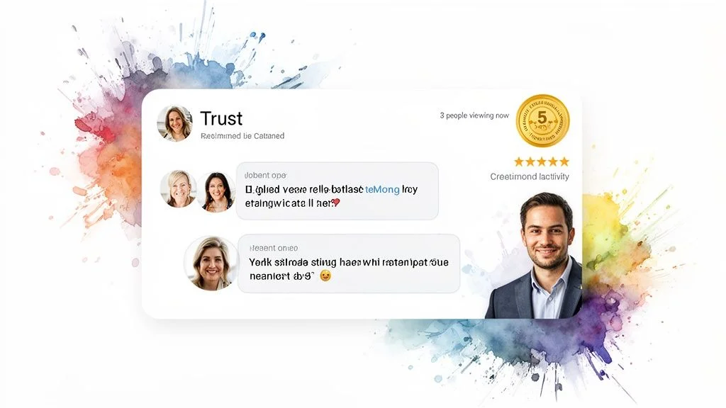
Why Dynamic Social Proof Is a significant shift
Dynamic social proof shows your visitors that other people are taking action right now. This creates a subtle but powerful sense of urgency and validation, what many people call FOMO (Fear Of Missing Out). Think of it as the digital version of walking past a busy restaurant. You automatically assume the food must be good.
Imagine a visitor lands on your webinar signup page. They're on the fence. Suddenly, a small notification pops up: "Jane from Chicago just registered." That tiny signal tells them they aren't the only one interested, and it can be the final nudge they need to sign up.
Tools like FOMOchat amplify this effect by blending social proof with an AI-powered live chat. It’s a brilliant one-two punch that answers questions while simultaneously showing that your offer is in demand, dismantling doubt in real time.
Using AI Chat to Address Objections Instantly
One of the biggest reasons people leave a landing page is unanswered questions. They hit a wall, can't find the info they need, and simply bounce. A smart AI chat widget, trained on your own website content, can solve this problem 24/7.
When you set up a tool like FOMOchat on your WordPress landing page, you can do some pretty cool things:
- Offer instant answers: The AI can handle common questions about pricing, features, or shipping without missing a beat, keeping people engaged.
- Simulate realistic conversations: You can actually create group chats where AI personas ask and answer the very questions your ideal customer is thinking. This tackles objections before a visitor even has to type them out.
- Build credibility: A lively chat, even a simulated one, makes your brand feel more established and popular.
The goal is to proactively ease visitor anxiety and create a sense of community. When you get this right, the results are huge. Some studies have shown that addressing these specific fears can lead to an 80% increase in conversions.
Adding these dynamic elements is a huge performance booster. The average landing page already converts at a respectable 10.76%, but fast, interactive pages blow that away. For example, pages that load quickly and meet Google's Core Web Vitals see 24% less visitor abandonment.
How to Embed and Configure a Social Proof Widget
Adding a tool like FOMOchat to your WordPress landing page is surprisingly easy. You don't need to be a developer.
The process usually looks something like this: First, you'll jump into the tool’s dashboard to customize the widget. This is where you match the colors and fonts to your brand and decide where it will appear on the page.
Next, you "train" the AI. This is as simple as feeding it your website URL, FAQs, and other key information. The AI uses this to provide accurate and helpful answers.
Finally, the tool gives you a small snippet of code. Just copy it and paste it into a custom HTML block in Gutenberg or your favorite page builder. That's it.
By embedding an interactive element like this, you're no longer just telling people to trust you. You're showing them why they should. It’s a critical shift from static claims to dynamic proof. If you want to explore more options in this space, check out our roundup of the best social proof tools for 2026.
Finalizing Your Page for SEO and Performance Tracking
Your landing page is designed and built. Great. But getting it live is just the starting line. If you can't get people to find it and you don't know if it's working, you've just built a beautiful storefront with the doors locked and the windows blacked out.
Let's start by getting your page on Google's radar. This is where a good SEO plugin really pays for itself. Tools like Yoast SEO or Rank Math integrate right into your WordPress editor and act as a checklist, making sure you’ve handled the basics that search engines care about.
You’ll want to pay close attention to a few specific fields:
- SEO Title: This is the clickable headline people see in the search results. It needs to grab their attention and include your main keyword without sounding robotic.
- Meta Description: Think of this as the ad copy for your search result. It’s a short blurb that convinces someone that your page has the answer they're looking for.
- URL Slug: Keep your URL short and sweet. Something like
yourwebsite.com/free-webinaris infinitely better than a messy default likeyourwebsite.com/page-id=123.
Connecting Analytics to Measure What Matters
With the SEO basics handled, it's time to hook up your analytics. If you're not tracking your data, you're flying blind. The go-to tool for this is Google Analytics 4 (GA4).
Getting GA4 installed is usually pretty simple. Most modern WordPress themes and plugins give you a specific field where you just paste your measurement ID, and you're good to go.
Once connected, you can see how many people visit your page, where they came from, and what they do once they arrive. But the real magic happens when you set up conversion tracking. This isn't optional for a landing page. You need to tell GA4 what a "win" looks like: whether that's a form submission or a click on your main call-to-action button.
This simple step changes everything. Your analytics stop being a passive traffic report and become an active tool that tells you whether your landing page is actually doing its job.
Improving Performance With A/B Testing
Now that you have traffic coming in and you’re tracking conversions, you can start making things better. This is done through A/B testing (or split testing), where you create two slightly different versions of your page to see which one converts better. You'd be surprised how much of a difference tiny changes can make.
For instance, you could test things like:
- Different Headlines: Does a benefit-driven headline like "Bake Perfect Sourdough in 7 Days" outperform a simple one like "Learn How to Bake"?
- Varying CTA Buttons: Does a red "Get Started Now" button get more clicks than a green "Sign Up Free" button?
- New Imagery: Does a picture of a smiling customer work better than a polished product shot?
Many WordPress page builders have A/B testing features built right in. If not, you can use a free tool like Google Optimize. The idea is simple: show 50% of your visitors Version A and the other 50% Version B. Then, you let the data tell you which one is the winner. This data-first mindset is the secret behind learning how to create landing pages in WordPress that don't just look good, but actually get results.
As you start building your WordPress landing pages, you’re bound to hit a few common snags or have questions pop up. Getting these sorted out from the beginning will save you a ton of headaches down the road. Let's clear up a few things we hear all the time.
To Plugin, or Not to Plugin?
People often wonder if they absolutely need a plugin to build a landing page. The short answer is no, you don't.
You can definitely build a solid landing page using just the native WordPress Block Editor (also known as Gutenberg). If you pair it with a modern block-based theme, you get a super lightweight and fast-loading page. This approach is perfect if you value performance and want to avoid adding extra tools to your site.
That said, if you need more complex layouts or you're cranking out pages for multiple campaigns, a dedicated page builder like Elementor is often the way to go. They come packed with pre-designed templates and advanced modules that make the whole process much faster.
Our Take: Go with the Block Editor for simplicity and speed. Use a page builder when you need more design firepower and have to launch pages quickly, especially for marketing teams on a tight deadline.
Creating a Distraction-Free Page
One of the golden rules of a great landing page is to remove all exits. That means hiding your website’s main header and footer so visitors have nowhere to go but toward your call to action.
Thankfully, WordPress makes this incredibly simple.
Most modern themes and page builders include a special template for this exact purpose. Look for an option called “Canvas” or “Blank Page” in your page settings. When you select it, the header, footer, and any sidebars will instantly vanish. It’s a one-click trick to give you a clean slate and keep your visitor’s focus right where you want it.
What's a Good Conversion Rate, Really?
Now for the big one: what conversion rate should you be aiming for? The honest answer is that it varies wildly. Your industry, where your traffic is coming from, and what you’re offering all play a huge role.
As a general benchmark, a landing page conversion rate between 2% and 5% is considered pretty solid.
But don’t get too hung up on averages. We’ve seen highly optimized pages in certain niches pull in 10% or more. The most important thing is to establish your own baseline. Track your performance from day one, and then continuously test and tweak your page to beat your own numbers. That's the real path to improvement.
Ready to turn more visitors into customers? Add the power of social proof and instant answers to your WordPress landing pages with FOMOchat. Discover how our AI chat widget can boost your conversions.