
An exit-intent popup is that last-ditch effort to catch a visitor right as they’re about to leave your site. It’s a smart overlay, triggered by their mouse heading for the "close" or "back" button, giving you one final shot to make a compelling offer. Think of it less as an interruption and more as a timely, strategic intervention.
Why Exit Intent Popups Are Still a Conversion Powerhouse
Let’s face it: most people hate popups. They’re notorious for being disruptive, annoying, and showing up at the worst possible time.
But the exit-intent popup is a different breed. It doesn't interrupt a visitor who's deep in an article or comparing products. Instead, it waits for that exact moment of departure, making it a much more respectful, and surprisingly powerful, tool.
This approach taps directly into a core psychological trigger: loss aversion. When someone decides to leave, they’ve already mentally checked out. A well-timed popup introduces a new piece of information or a compelling offer, forcing a split-second re-evaluation. They have to ask themselves what they might be losing by clicking away.
From Annoyance to Opportunity
The real secret is to reframe the interaction. A great exit-intent popup isn't a roadblock; it’s a helpful nudge that offers something genuinely valuable based on what the user was just doing.
Picture these real-world scenarios:
- E-commerce: A shopper abandons a cart full of items. Bam! A popup appears with a 15% discount to seal the deal.
- SaaS: A potential customer browses the pricing page and heads for the exit. A popup offers them a free demo or a compelling case study.
- Blog: A reader finishes a great article. Just as they're about to leave, they're invited to subscribe for more content just like it.
In every case, the offer is contextual and adds value. It’s not just begging for an email address. This isn't a new trick, but it's one that has consistently proven its worth. When these tools first hit the scene, they were seen as a clever way to fight high bounce rates. By 2017, data was already showing that a well-targeted exit-intent popup could realistically deliver a 5-10% conversion uplift. That's a serious boost.
The magic of an exit intent popup isn't in its ability to stop someone from leaving. It’s in its ability to give them a compelling reason to stay, turning a moment of departure into a moment of decision.
Modern tools take this even further with deep customization, letting you tailor the message to specific users and their on-site behavior. This isn't a one-size-fits-all solution. It's a precise marketing intervention. To see just how effective this can be for driving revenue, the results consistently show strong uplift when the offer is well-targeted.
Designing Popups That Delight Instead of Disrupt
The line between a welcome offer and an annoying interruption is razor-thin when it comes to popups. A clunky, generic design is a guaranteed instant close. But a well-designed popup? It can feel like a genuinely helpful, last-minute offer. The goal is to add a little something extra to their experience, even as they're heading for the door.
A clean, uncluttered layout is non-negotiable. Your visitor is already in "exit mode," which means you have literally a split second to get their attention. Think generous white space, a legible font, and a color scheme that pops without clashing with your brand.
Visuals can do a lot of the heavy lifting. A sharp image of the ebook you're offering or a lifestyle shot that fits the discount you're promoting communicates value way faster than a block of text. Just please, steer clear of cheesy, generic stock photos. They instantly cheapen your offer.
Crafting a Headline That Stops the Cursor
The headline is everything. It has one job: to instantly answer the visitor’s unspoken question, "What's in it for me?" This isn't the time for clever wordplay. You need a direct, benefit-driven hook.
I've seen these formulas work time and time again:
- For Discounts: "Wait! Take 15% Off Your First Order" or "Before You Go... Here's a Special Offer." This is classic for a reason, it creates a sense of urgency and offers a clear, immediate reward.
- For Lead Magnets: "Download Your Free [Checklist/Template]?" or "Get the Ultimate Guide to [Topic]." You're highlighting the value of the freebie they're about to get.
- For Newsletter Signups: "Join 10,000+ Readers" or "Get Exclusive Tips Sent Straight to Your Inbox." Social proof and the promise of ongoing value are powerful motivators here.
The body copy needs to be just as brief. A quick sentence or a couple of bullet points should build on the headline's promise. Tell them why they should care. If it's a guide, what specific problem will it solve for them?
The All-Important Call to Action
Now for the final piece of the puzzle: the Call-to-Action (CTA). This is where you tell them exactly what to do next. The button's design and the words you use can make or break your conversion rate.
Your CTA isn't just a button. It's the final handshake. Make it bright, clickable, and packed with action-oriented text that echoes the value. Words like "Get," "Download," or "Claim" beat a passive "Submit" every single time.
Your main CTA button should be impossible to miss. Use a bold, contrasting color that naturally draws the eye. And get specific with the text! Instead of a generic "Sign Up," try something like "Send Me the Guide!" For a store discount, "Apply My Discount" works wonders.
For a little extra psychological nudge, you can add a secondary, less prominent opt-out link like, "No thanks, I'll pay full price." It's a subtle way to reinforce what they're giving up. If you want to dive deeper into this, we have a whole guide on how to write a compelling call to action.
Finally, always, and I mean always, give people an obvious escape hatch. Hiding the 'X' or using sneaky design tricks is a surefire way to frustrate users and tarnish your brand. A great exit intent popup respects the user's choice, which makes them far more likely to engage with you, either now or on a future visit.
Nailing the "Who" and "When": Smart Triggers and Segmentation
Look, a brilliant popup shown to the wrong person at the wrong time is just noise. It's useless. The real magic behind an exit-intent popup that actually works is its relevance, and that comes from smart triggers and sharp audience segmentation. This is where we stop shouting at everyone and start having a conversation with the right person.
The whole point is to match your offer to what the user is doing right now. Think about it: someone bailing on a blog post about email marketing has a completely different mindset than someone abandoning a shopping cart full of products. Hitting them both with the same generic "Join Our Newsletter" popup is a massive missed opportunity.
Instead, we need to create rules that react to where a visitor is and what they've done on your site. This way, the message feels helpful, not just another annoying interruption.
Triggering Popups Based on the Page
The easiest win for making your popups more relevant is to tailor them to the specific page a visitor is about to leave. This simple tweak alone can give your conversion rates a serious boost because the offer lines up perfectly with what's already on their mind.
Here are a few classic examples I've seen work time and time again:
- From a Pricing Page: If someone is looking at your pricing and heads for the exit, cost is likely the issue. This is the perfect moment to offer a free demo, a custom quote, or a powerful case study that makes the value crystal clear.
- From a Blog Post: A reader leaving a blog post is hungry for information. Don't ask for a sale; give them more of what they came for. Offer a content upgrade like a PDF version of the article, a handy checklist, or a deeper-dive video on the same topic.
- From a Product Page: When a shopper views a specific product and then decides to leave, you have a golden opportunity. Hit them with a popup offering a small discount on that very item or surface a few glowing reviews to build trust and nudge them back.
Going Deeper: Segmenting by Behavior
Page-level triggers are great, but we can get even smarter by segmenting users based on their on-site behavior. This is how you show visitors you're paying attention to their journey, which leads to much better engagement. A generic offer feels lazy; a tailored one feels like you actually care.
Consider these powerful ways to segment your audience:
- New vs. Returning Visitors: It’s simple but effective. Greet first-timers with a welcome offer, like 10% off their first order. For returning visitors who haven’t pulled the trigger yet, maybe it's time for a more compelling offer like free shipping to finally get them across the finish line.
- Referral Source: Did the visitor click through from a specific ad or a guest post you wrote? Acknowledge it. A simple message like, "Hey, [Referral Site] reader! Here’s a little something extra just for you," can work wonders.
- Shopping Cart Value: This is a non-negotiable for e-commerce. If a user’s cart is over $100, you can trigger a popup offering free shipping. If the cart is small, maybe a discount on a popular, low-cost add-on would be a better play.
I’ve seen this happen: a marketer shows a discount popup to a loyal customer who already has a better coupon code applied. It’s awkward and devalues the offer. Smart segmentation stops these mistakes before they happen, making every offer feel exclusive and genuinely valuable.
Exit Intent Popup Trigger Scenarios
To make this crystal clear, let's map out a few common scenarios. Think of this table as a cheat sheet for matching the right offer to the right person at the right moment.
| Page/Scenario | Target Audience | Recommended Offer/Content | Trigger Logic |
|---|---|---|---|
| Pricing Page | First-time visitors evaluating cost | "Book a Free 15-Min Demo" or "Download our ROI Case Study" | Trigger on exit after 20+ seconds on page. |
| Shopping Cart | Customer with items > $75 | "You're so close! Get free shipping on this order." | Trigger immediately on exit intent when cart value is over the threshold. |
| Blog Post | Engaged reader (scrolled 70%+) | Content upgrade: "Get the PDF Checklist for this article." | Trigger on exit intent for users who have scrolled past the halfway point. |
| Homepage | New, unidentified visitor | "Welcome! Get 10% off your first order." | Trigger after 10 seconds on page for any new visitor attempting to leave. |
| Product Page | Returning visitor who viewed item before | "Still thinking it over? Take 15% off this item, today only." | Trigger for returning users who have viewed this specific product URL 2+ times. |
Each of these examples is designed to intercept a user with an offer that directly addresses their likely hesitation or interest, turning a potential bounce into a conversion.
This decision tree gives you a great visual for piecing together the core components of a high-converting popup, from the headline all the way to the call to action.
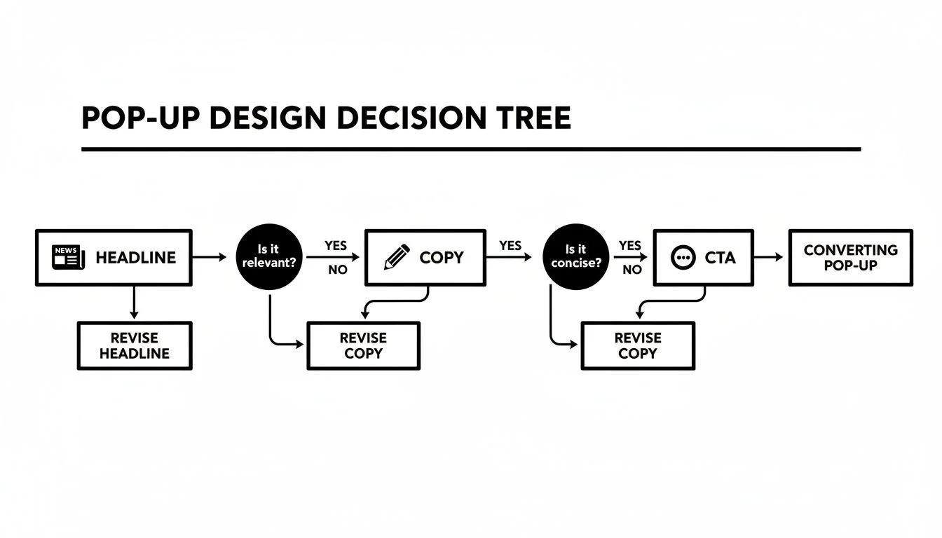
The key takeaway is that every element should build on the last, creating a smooth, logical flow that guides the user where you want them to go. When you combine these smart triggers with deep segmentation, your exit-intent popup stops being a generic annoyance and becomes one of your most valuable marketing assets.
Integrating Social Proof to Build Instant Trust

A good offer is a decent starting point, but it's a whole lot more persuasive when it's backed by the voices of real people. When a visitor is on the fence, seeing that others have already made that choice, and are happy about it, can be the final nudge they need. This is where we go beyond the standard popup playbook.
By weaving authentic social proof into your exit-intent popup, you can dissolve that last-second hesitation and build immediate trust. You're not just throwing a discount at them; you're offering reassurance from a community of satisfied customers.
Dynamic Proof for Dynamic Decisions
Picture this: a potential student for your online course is about to click away. Your exit-intent popup fires, but instead of just a generic offer, it shows a snippet of a real conversation where a current student is raving about the course material. That's dynamic, contextual social proof in action.
This approach turns a simple popup into a powerful, trust-building moment. It’s all about showing the right proof to the right person at their exact moment of doubt.
Here are a few ways I’ve seen this work brilliantly:
- For SaaS: Show a testimonial that mentions the specific feature a user was just looking at.
- For E-commerce: Display a star rating or a short, glowing review for the exact product in their cart.
- For Webinars: Feature a real question asked by a past attendee, highlighting the value of the live Q&A.
This level of personalization shows the visitor you get them. If you're new to this concept, our guide on social proof in marketing is a great place to start.
The most effective exit-intent popups don’t just make an offer; they validate the user's interest. They whisper, "You're in the right place, and here's proof from people just like you."
From Hesitation to Conversion
This strategy is especially powerful for high-ticket items or sign-ups where trust is everything. For e-commerce stores, it is particularly effective for abandoned carts. Exit-intent popups have been shown to recover up to 21% of abandoned carts, turning potential losses into real revenue.
Think about that. By deploying targeted popups on cart pages, some brands have successfully clawed back nearly a quarter of shoppers who were heading for the door.
To make this work, your design has to feel credible. When you're putting your popups together, think about trust badges and other visual cues that scream authenticity. These elements reinforce the message your social proof is sending.
Ultimately, combining a compelling offer with undeniable proof creates an exit-intent popup that doesn't just interrupt, it persuades.
Measuring Performance and Optimizing for Better Results

Putting your exit-intent popup live is just the beginning. The real work, and the real results, come from what you do next. To get the most out of it, you need a solid plan for tracking what works, testing your ideas, and making smart improvements. Without data, you’re just shooting in the dark.
The first thing to nail down is what you're actually going to measure. It's easy to get bogged down in a sea of numbers, so focus on the few metrics that tie directly back to what you're trying to achieve.
Key Metrics to Monitor
I always start by keeping a close eye on a handful of core performance indicators. These give you a quick health check and tell you where you might need to dig deeper.
- View Rate (or Impression Rate): This is simple but crucial. It tells you what percentage of abandoning visitors actually see your popup. If this number is low, your trigger logic might be off, or you could have a technical glitch preventing it from firing properly.
- Conversion Rate: This is the big one. It's the percentage of people who saw the popup and took the action you wanted, like signing up for your list or grabbing a discount code.
- Direct Impact on Goals: Don't just look at the popup's stats in isolation. Are those new email subscribers actually buying anything? Are people using the discount codes you're handing out? Tying your popup's performance to bottom-line results is what really matters.
See a high view rate but a disappointingly low conversion rate? That's a classic red flag. It means your popup is triggering just fine, but the offer, headline, or call-to-action just isn't hitting the mark.
Creating Your A/B Testing Plan
The secret to long-term success is A/B testing. By changing one thing at a time and measuring the difference, you can make informed decisions that consistently push your conversion rates higher. I always suggest starting with the elements that are likely to have the biggest impact.
For your first few tests, focus on the heavy hitters:
- The Headline: Try pitting a benefit-focused headline against one that uses urgency or scarcity.
- The Offer: Is 15% off a bigger draw than free shipping? You won't know until you test it.
- The CTA Button: Small changes here can make a surprising difference. Test different copy ("Get My Discount" vs. "Apply Code") or even just the button color.
Here's a pro tip: Don't stop testing after you get a win. A successful test doesn't mean you've found the "perfect" popup. It just means you've found a better one. Your new winner becomes the control for your next test. Keep iterating.
For a bit of perspective, a decent exit-intent popup in most e-commerce shops will convert around 3-5% of visitors. But the best ones can hit over 9%. I've even seen highly targeted cart abandonment popups pull in jaw-dropping conversion rates of 17-42%. The data consistently shows there’s almost always room to improve with smart, consistent testing.
This cycle of measuring, testing, and iterating is what turns a basic popup into one of your most reliable conversion tools. If you want to dive deeper into this process, our guide on conversion rate optimization strategies is a great next step.
Got Questions About Exit-Intent Popups? We've Got Answers.
Even the most experienced marketers have questions about getting exit-intent popups right. It's a delicate balance between grabbing attention and not annoying your visitors. Let's clear up a few of the most common sticking points.
Will an Exit-Intent Popup Tank My SEO?
This is probably the number one question I get, and it's a fair one. The short answer? No, not if you do it right.
Google's main gripe is with "intrusive interstitials", those annoying popups that block the content the second you land on a page, especially on your phone. An exit-intent popup is different. It shows up when someone is already on their way out, not when they've just arrived. It doesn't get in the way of the content they came to see, which is what search engines really care about.
To keep Google happy, just stick to these simple guidelines:
- Make sure the popup is a breeze to close on any device. A big, obvious "X" is non-negotiable.
- Don't have it take over the entire screen.
- Never, ever trigger it on page load. It has to be tied to a user's action to leave.
As long as your popup is helpful and doesn't hijack the user's initial experience, you're highly unlikely to see any negative impact on your search rankings.
What’s a Good Conversion Rate for an Exit-Intent Popup?
This is one of those "it depends" answers, but I can give you some solid benchmarks. A well-executed exit-intent popup typically converts somewhere in the 3% to 5% range. I've seen industry reports putting the average right around 4%.
Of course, the really great ones can blow that out of the water. A perfectly timed cart abandonment offer with a sweet discount could easily hit 10% or even higher.
My best advice? Don't get hung up on a magic number. Your real goal is to beat your own baseline. Start by aiming for 2-3%, then constantly A/B test your headline, your offer, and your design to push that number higher.
That's how you'll figure out what your audience actually responds to.
How Can I Make Exit-Intent Popups Work on Mobile?
This is where things get clever. You can't track a mouse cursor on a phone, so you have to look for other signals that someone is about to bounce.
The trick is to interpret mobile user behavior that screams, "I'm leaving!"
Here are a few of the most effective mobile-friendly triggers:
- Scrolling Up: When someone starts scrolling back up the page quickly, it's often a dead giveaway they're reaching for the address bar or the tabs. That's a great moment to show your offer.
- Hitting the Back Button: Some tools can actually detect when a user taps the browser's back button, giving you one last chance to present an offer before they're gone for good.
- Idle Timer: If a visitor has been inactive on a page for a set amount of time (say, 45 seconds), it's a good sign they've lost interest. A well-timed popup can re-engage them.
For any mobile popup, the design absolutely has to be clean and responsive, with a close button that’s impossible to miss. On a small screen, usability is everything.
Turn on-page hesitation into instant trust and conversions. With FOMOchat, you can embed AI-powered social proof and support conversations directly into your popups, landing pages, and webinars. See how it works at FOMOchat.com.