
A visitor lands on your product page and decides in a few seconds whether to stay. You are probably staring at a headline that lists features because the last draft felt too thin. That instinct usually makes the page harder, not safer. The brands below won the pause by stating one clear outcome and putting proof beside it.
These value proposition examples skip the poster treatment. Each one is split into the promise, the proof, and a copy tactic you can reuse. I would rather have a plain sentence a stranger can repeat than a line that only sounds sharp in a deck. Buyers dismiss savings talk when nobody shows the math. Say who benefits, what problem ends, how you differ from the next option, and which result supports the claim.
A weak line says "easy to use." A stronger line says "launch a qualified webinar funnel in minutes without extra developers." The second names an audience, an outcome, and less effort. Copy that structure. Watch the trade-off on each promise, because a tight claim is also easier to break if the page cannot prove it. Need a refresher on the craft first? Our primer on marketing copy is a quick warm-up.
1. Dropbox Simple File Sync That Works Everywhere
Dropbox did not lead with cloud infrastructure. It promised the same files, already current, on every computer you use. The feeling was "I stopped losing the latest version." Manual email and USB sticks were the alternative people already hated.

Proof was a short demo of a file appearing on a second machine, plus referrals that offered extra storage for invitations. The demo carried the sale. Rewards only worked because the core job was already obvious. Confusing software plus a bonus still churns.
A Harvard Business Review analysis of business-market value propositions pushed suppliers to quantify better performance against the next-best alternative and to mention only the few differences that matter. Dropbox's difference was fewer manual transfers, not a tour of servers.
Copy tactic: write the outcome the user feels, then show the product working in under a minute. The same order helps when you write product descriptions that start with the result.
Practical rule: If a non-technical buyer cannot retell the promise after one viewing, you still have a feature tour.
The trade-off is that a one-job pitch hides admin controls. Power users may assume the tool is too simple until a second screen shows permissions. Say a studio keeps finals on three laptops. The headline is "The latest file is already on every machine." A clip shows the folder land on a phone. Nearby questions can ask, "Does this replace emailing files?"
2. Dollar Shave Club Subscription Convenience Delivered With Humor
Dollar Shave Club named a complaint people already made out loud. Store razors cost too much, and the packaging made a simple blade feel like lab equipment. The promise was a monthly box at a lower price, delivered to the door. Price, timing, and delivery stayed concrete. Humor was the wrapper, not the offer.
The launch video used blunt jokes to pick a fight with over-engineered retail razors. That tone made a commodity feel new, and early signups followed because the offer was easy to repeat. Later, the brand widened into grooming and personal care. Expansion only made sense after the razor job was trusted.
What to copy, and what to leave:
- Name the pain in their words: "I am tired of paying shelf prices for blades" beats "premium grooming innovation."
- Keep the promise countable: monthly delivery and a lower bill survive a joke. A vibe does not.
- Seed the objections: price, commitment, and cancellation belong next to the offer, not in a buried FAQ. These objection handling techniques have wording you can borrow.
A joke that outruns the offer trains people to remember the brand and forget the deal.
Tone is a trade-off. Personality helps a dull category, and it also dates fast. If the video is funnier than the checkout, you bought attention you cannot convert. Say a shopper compares a $1 trial with a drugstore multipack. The page should answer "What do I pay after month one?" in the same breath as the laugh. That answer is the proof. The joke only earns the second look.
3. Airbnb Belonging Anywhere, Trusted Hosts Everywhere
Airbnb's lodging promise was never only "a cheaper room." It offered a stay in a local home so a trip could feel like living there. The later "Belong anywhere" line pushed community and trust ahead of the booking widget. Emotional desire and stranger-risk had to sit in the same sentence, or the feeling collapsed at checkout.

Bain & Company mapped 30 elements of value across functional, emotional, life-changing, and social-impact categories, from a survey of 8,014 consumers in 12 industries and 47 U.S. companies in October 2015. Companies that delivered on more than one relevant element tended to see higher Net Promoter Scores and stronger revenue growth. Airbnb's useful pair is functional shelter plus the feeling of being welcomed. Reviews, verification, and host profiles are the proof that the feeling is safe enough to book.
Listings that tell a host's story do more than decorate the page. They show a real person on the other side of the key. That is also why authenticity in marketing fails when the story is generic stock warmth with no names, rules, or recourse.
I would not lead with belonging if you cannot show how a guest gets help at 11 p.m. The trade-off is scope. A community promise attracts people who want a neighborhood, and it repels people who only want a silent hotel bed. Say a traveler hesitates on a first stay. Put recent guest questions about locks, check-in, and cancellations where the price sits. The emotional line stays. The risk answer does the closing.
That's pretty much the job we built FOMOchat for. A popup flashing "Someone in Lisbon just booked" adds a little buzz, but it can't answer the lock question. A visible conversation can, and it works as social proof at the same time. Our comparison of conversations versus popups goes deeper.
4. Slack Replacing Chaotic Email With Organized Team Channels
Slack did not sell "another messenger." It sold an end to long internal email threads. The promise was organized, searchable channels so the people who need a conversation can see it, and everyone else can ignore it. That framing turned chat into a productivity system, which made a team budget easier to justify than a personal app.
Adoption started in software teams, then moved into other departments once the status quo had a name. Channels replaced internal mailing lists. The before-and-after was visible: a subject line with forty replies versus a channel you can search.
The copy tactic is competitive replacement, not feature bragging. Say what you retire. A useful pass at competitive positioning starts with the tool people already resent, then shows the smaller habit that replaces it.
What holds up: a side-by-side of one messy thread and one channel with the decision pinned. What fails: "all your work in one place," which every suite can claim. The trade-off is noise. Channels reduce inbox chaos and can create a second inbox if nobody sets norms. Say a 12-person support team still forwards updates by email. The headline is "The update lives in the channel, not in a 30-message thread." A short excerpt of a real team asking "Where did we land on pricing?" signals that people already work this way. Empty screenshots do not.
5. Calendly Ending the Back-and-Forth of Scheduling
Calendly aims at a small, universal annoyance. People book a meeting by picking an open time, instead of trading "Does Tuesday work?" for a week. The benefit is countable: fewer messages and a faster confirmation. One interaction is enough to feel the change, which is why the promise travels.
Booking links in email signatures and on websites made the proof ordinary. Sales and consulting teams used the same link to qualify and schedule. The product did not need a manifesto. It needed the calendar to appear where the friction already lived.
A MarketingExperiments PPC landing-page test kept the ad copy the same and aligned the page headline and call to action with the searcher's exact intent around "annual reports." Conversion moved from 28.91% in the control to 36.54% in the treatment, a 7.63-percentage-point gain and a 26.39% relative lift. The lesson for a scheduler is continuity. If the ad says "stop the email ping-pong," the page should show open times, not a tour of unrelated features.
Place the button where scheduling breaks. Map the annoyance the way you would map customer pain points: name the loop, then cut it.
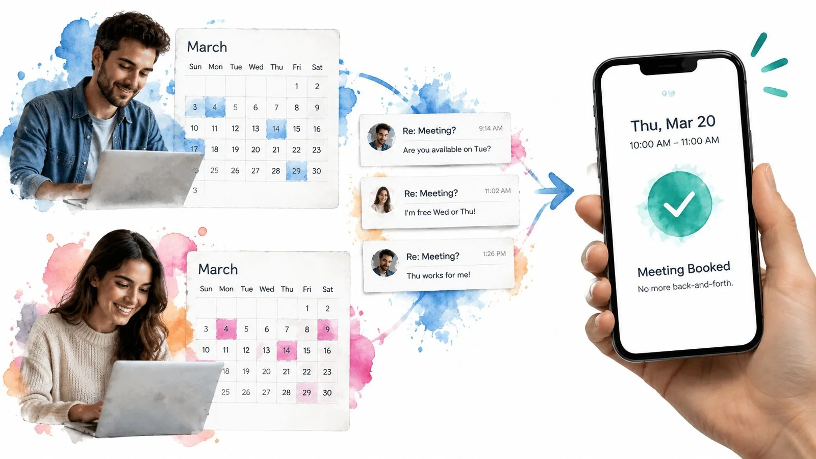
The trade-off is edge cases. A link that hides time zones, buffers, or who the meeting is for creates new back-and-forth. Say a webinar host gets "How do I register?" in the last hour. Answer it in the same view as the promise, with the link and the length of the session. Measurable beats clever here.
6. Duolingo Free, Playful Language Learning Built Around Habit
Duolingo's promise is that anyone can start a language for free in short, game-like lessons. The barrier drops twice: no bill, and no hour-long class. Streaks and rewards make progress visible, which matters because language study dies when people cannot see movement.
Daily streak reminders pull people back. A freemium path later sells ad-free use and harder lessons. Free is the proof of a low first step. The upgrade is a second promise, and it should not crowd the first screen.
Remove the first-step tax: a free lesson today beats a syllabus. Show the streak: people protect progress they can see. Borrow early wins: student notes like "I finished day three" do more than a badge graphic.
I recommend keeping the free start louder than the upgrade. The trade-off is expectation. Playful lessons bring people in, and serious learners may leave if the page implies fluency in a weekend. Say a course creator sells a longer program. The headline can still be "Start with one short lesson, free." Chat on the page can surface a learner sharing an early win, which reinforces momentum without pretending the course is effortless. Habit is the product. The game is only the delivery.
7. Stripe Payments Infrastructure That Developers Can Set Up in Minutes
Stripe promised that a business could accept online payments with a short integration, instead of building a payments stack. Documentation and a plain API made the benefit touchable for technical buyers. Complexity stayed in the product. The path to a first charge stayed short. Integration itself became the pitch.
Startups and marketplaces could launch without a dedicated payments team. That is a staffing outcome, not a protocol story. The proof is a working test charge, not a diagram of card networks.
Show time-to-value in units a buyer can picture. "Minutes to a first payment" is stronger than "reliable infrastructure." Cut the first step until a developer can see money move in a test mode before a meeting ends. The same idea fits any tool that claims a fast embed: the first win has to be visible, or the minutes are marketing.
The trade-off is audience. A developer headline loses a founder who wants fees, payout timing, and dispute handling in plain language. You may need a second line for that buyer, not a second personality. Say a marketplace is choosing a processor this week. The headline is "Accept a payment without hiring a payments team." Three bullets cover test mode, payout timing, and what you still configure yourself. Hiding the setup work makes the minutes claim look slippery.
8. Mailchimp Email Marketing for Small Businesses Without the Complexity
Mailchimp told small businesses they could create, send, and read an email campaign without a designer or a developer on staff. Approachable visuals and a free starting plan lowered the door for owners who do not call themselves marketers. A specialized job became something you could try the same day.
Templates let a shop send a first newsletter. Automated welcomes gave new subscribers a sequence without a blank page. Plain outcomes beat tool names. "Tell customers what is new, and see who opened it" outperforms "marketing automation platform."
A value line still needs priority and credibility. In a MarketingExperiments test of a web host's signup page, the control converted at 1.31%, while the strongest treatment reached 3.44%, a 162% relative increase, and revenue per visit rose 128%. The winning pattern was a short primary benefit plus enough operational detail to reduce risk. Judge the test by signups and revenue per visitor, not by clicks alone. A higher rate that attracts the wrong buyers can still lose money.
Offer a usable free tier so people see a result before they pay. Put analytics where a paid plan earns its keep, so a team can see which messages lead to orders. The trade-off is ceiling. Self-serve copy can sound too light for a complex lifecycle program. Say a retailer sends one weekly note. The page should show a finished template and the first report, not a map of every automation node.
9. Canva Professional Design for People Without Design Skills
Canva reframed design as a task, not a career. Anyone can make a decent graphic from templates and simple controls. The skill barrier is the enemy. Social posts, decks, and simple ads are the jobs. Speed is the proof people can judge without a critique.

Small businesses make their own social graphics. Teachers build slides and handouts. Those scenes matter more than a brand film, because the visitor can imagine finishing the same asset before lunch.
Promise a finished thing. "A campaign image in minutes" is testable. "Unleash your creativity" is not. Put real templates above the fold so success has a shape. A blank canvas with a smile is not proof.
The trade-off is craft. Templates help non-designers ship, and they can make every brand on a street look related. If your buyers are senior designers, this promise will feel like a ceiling. Aim it at the person who currently waits on someone else. Say a founder needs three launch images tonight. The headline is "Publish a clean post without waiting on a designer." Show the template, the export, and one limitation, such as when a custom illustration still needs a specialist. Honest limits make the minutes claim easier to trust.
10. Zoom Reliable, Simple Video Meetings for Everyone
Zoom promised that a video meeting should be easy to join, steady enough to trust, and simple to host. One-click entry attacked the failure everyone remembers: the first five minutes spent on audio, plugins, and "can you hear me?" Reliability was stated in guest language, not in network jargon.
The product spread through webinars, classes, and client calls. Recording and replay extended the same promise past the live hour, so a missed attendee still got the session. Proof is a join path with almost no account friction, plus a room that stays up.
Remove steps from arrival. One link, and no account when you can avoid it, beats a feature grid. Promise the interruption people fear, then show how a guest gets in. If your ad says "no fumbling at the start," the page should repeat join time, what the guest needs, and what happens if they are late. A new benefit in that moment resets the doubt.
The trade-off is seriousness. Easy joining made Zoom the default, and it also made security and hosting controls a later argument. Do not bury host settings if your buyer runs client calls. Say a webinar host wants people in the room before the first slide. The line is "Guests join from one link, without a setup call." Reactions tied to the talk keep attention after they arrive. The promise is the start of the meeting, not the entire event stack.
Replays are where that promise tends to go quiet. With FOMOchat webinar chat on a replay page, later viewers see the questions earlier attendees asked, so the recording still feels like a room with people in it.
How the Ten Value Propositions Compare
| Item | Core Promise | Main Proof Point | Main Trade-off |
|---|---|---|---|
| Dropbox | Keep files automatically synced across devices | A short demo showed files appearing across computers | Easy to copy; value depends on reliability and ecosystem |
| Dollar Shave Club | Get affordable razors delivered automatically | A humorous launch video drove early signups | Price-led appeal may limit loyalty; viral success can be hard to repeat |
| Airbnb | Find local stays with a sense of belonging and trust | Reviews, verification, and host profiles support trust | Trust relies on review quality and moderation |
| Slack | Replace chaotic email with organized, searchable team channels | Teams adopted channels to replace internal email lists | Notifications can become overwhelming; value depends on team adoption |
| Calendly | Schedule meetings without back-and-forth emails | Booking links let invitees choose available times | Complex scheduling needs may require customization |
| Duolingo | Learn a language for free through short, playful lessons | Streaks and visible progress encourage daily practice | Gamification may not deliver deep fluency; free-tier limits can frustrate |
| Stripe | Set up online payments quickly without building infrastructure | APIs and documentation help developers launch payment flows | Most intuitive to technical users; fees need evaluation at scale |
| Mailchimp | Run email marketing without technical or design expertise | Templates and a free plan let small businesses get started | Features can overwhelm beginners; costs can rise with list size |
| Canva | Create professional-looking designs without design skills | Templates and drag-and-drop editing simplify creation | Designs can look similar; advanced needs may outgrow the tool |
| Zoom | Host and join reliable video meetings with minimal effort | One-click meeting links reduce joining friction | Meeting fatigue and privacy concerns; features can overwhelm casual users |
Turning These Examples Into Your Own Promise
Pick one page. Write a single outcome sentence in plain words. Attach one proof that answers the buyer's largest doubt. That proof might be a one-minute demo, a host review, a booking link, a template, or a public answer to "What does setup take?" If the sentence needs a feature list to make sense, it is not ready.
Test the new version against the old one for two weeks. Message tests tell you whether a stranger can name the customer, the problem, and the result. Behavior tells you whether qualified people act. Clicks alone flatter weak claims. Many public roundups, including Copy.ai's collection of value proposition examples, teach memorable taglines more often than they show sample, audience, and baseline. Treat a quoted lift as portable only after you can see that design. I would not ship a line because it tested well for a different category. New to running these? Start with what split testing is before you trust a winner.
AI copy adds a second risk. Reporting on research with 8,000 consumers across eight countries found that only 7% said visibly AI-generated marketing increased trust, while 31% said it reduced trust, and 91% expected brands to disclose AI use, according to Influencers Time. Use AI to clarify facts and summarize objections. Do not invent customers. Label assistance, separate real comments from examples, and let people see the source behind a claim.
Ground the words in customer research feeding GTM decisions so the promise uses the buyer's phrasing, not internal jargon. Then put the doubt on the page where the decision happens.
If you want visible questions and answers to carry that proof, start with a free preview of FOMOchat or book a demo and we will walk through setup. An AI company rep can answer from your site content, and you can add context that the site does not cover. Keep generated examples distinct from real visitor comments.
FOMOchat places an on-page chat beside your value proposition so visitors see others ask about setup, proof, and results while an AI rep answers from your own site. That pairing is built for product pages, course offers, launches, and webinars where a clear promise still needs objection handling in the same view. Visit FOMOchat to preview it on a page you are testing now.