
You've tightened the headline, shortened the form, and sent visitors to the right offer. Yet people still leave, while your inbox fills with questions about integrations, course access, or whether a webinar recording will be available. You're considering chat, but you don't want another popup competing with your signup button.
Conversational landing pages give visitors a way to resolve those doubts without leaving the page. The useful question isn't whether chat looks more engaging. It's whether a conversation helps someone make a decision they couldn't comfortably make from the page alone.
Conversational and Standard Landing Pages Compared
A conversational landing page is a normal landing page with a dialogue layer added, so visitors can ask questions and get answers before deciding to act. Think of a standard page as a shop sign explaining what's for sale, and a conversational page as a helpful assistant at the door. If you want the craft behind that dialogue, our primer on conversation design is a good place to start.
Standard versus conversational landing pages
| Feature | Standard landing page | Conversational landing page |
|---|---|---|
| Visitor path | Read the copy, then fill in a form | Ask questions, get contextual answers, then act |
| Information delivery | Fixed copy and a static FAQ | AI representative answers from approved site content on request |
| Qualification | Usually one long form up front | Questions asked individually, with each answer guiding the next |
| Social proof | Static reviews and logos | Visible group discussion, with genuine and illustrative messages clearly distinguished |
| Best fit | Simple, clear offers with few objections | Complex or high-consideration offers with many questions |
| Main risk | Unanswered objections make visitors leave | Friction and unpredictability if the conversation is poorly managed |
The distinction is about how visitors reach a decision, not whether one design looks more modern. A standard page gives everyone the same explanation. A conversational page lets a visitor ask about the detail that matters to them, such as whether an integration supports their particular workflow.
Qualification can change too. Instead of asking someone to complete every field immediately, a dialogue can establish their needs before requesting contact details. That doesn't mean every conversation needs to collect a lead. Sometimes a useful answer followed by the existing button is enough.
Keep the page's foundations
Chat doesn't replace your offer, headline, pricing explanation, or call to action. Visitors should still understand what you sell without opening a conversation. Use these landing page optimization best practices to make the underlying page clear before adding another interaction.
Practical rule: Treat chat as an optional uncertainty resolver, not an entrance exam visitors must pass before converting.
Use the comparison table as a fit check. If visitors understand the offer and need a button, keep that path short. If they repeatedly ask questions that affect suitability or purchase confidence, the conversational column deserves a controlled test.
How a Conversational Landing Page Works, Step by Step
A useful conversation starts before anyone types into the widget. The marketer needs to define what the assistant knows, what it may say, and what happens when it can't answer.
Our process at FOMOchat has four stages: the customer provides context, the AI generates participants, the conversation unfolds on the site, and visitors can join. Here's how to prepare those stages responsibly.
- Supply the context. Gather product details, pricing, features, integrations, refund terms, and relevant information that isn't public. Assign someone to approve each topic. Check the source pages before launch, because an outdated plan description can produce an outdated answer even when the assistant follows its instructions correctly.
- Review generated participants and sample exchanges. Edit example questions and answers to match your brand voice and actual buyer concerns. Label displayed examples as illustrative rather than suggesting that customers wrote them. Review factual claims separately from tone, since a friendly answer can still be wrong.
- Choose how the conversation appears. Let visitors understand the offer before asking for attention. A delayed invitation or user-requested opening is a sensible test design, especially near a question-heavy part of the page. Our Landing Page Mode plays conversations on a timeline from page load, so distinguish timeline playback from an intrusive automatic popup.
- Let visitors join and retain control. Answer their question from approved content and offer a route to the canonical page for details. If you're designing conversational qualification, keep the transcript visible, allow earlier responses to be edited, show progress, validate fields consistently, and request confirmation before submitting. Sketching the branches first helps a lot, and our chatbot conversation flow guide walks through it.
Design the recovery path
A JMIR Human Factors usability study found conversational forms faster than multipage forms, but participants found them less predictable and struggled to revise earlier answers. Correction is part of the experience, not an edge case to leave until later.
For custom integrations or qualification flows, you might hire an AI chatbot developer through AY Automate to implement validation, recovery, and handoff requirements. Treat those as explicit build requirements, not assumed widget capabilities.
The broader operational flow also includes qualification, handoff, and measurement:
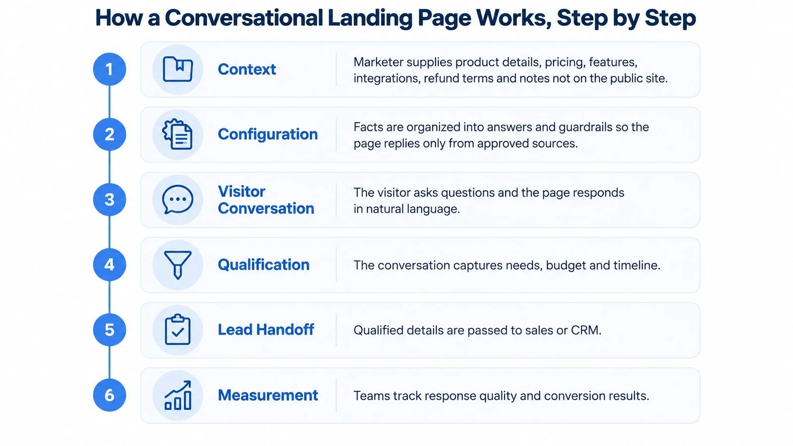
Sketch the four stages for your own page. Beside each answer topic, name who writes it and who approves it, including the fallback when approval isn't possible.
When Chat Helps Conversion and When It Gets in the Way
Start with a realistic baseline: a MarketingProfs summary of Unbounce's 2024 analysis reports a 6.6% median conversion rate across 41,000+ landing pages, based on more than 57 million conversions. That's a comparison point, not evidence that adding chat causes a lift.
The better starting question is whether your visitor has an unresolved decision. Use the following table as a testing priority, not a prediction of guaranteed results.
Where chat is likely to help or hurt
| Offer or visitor situation | Chat likely helps? | Reason |
|---|---|---|
| Complex B2B software with integration questions | Yes | Dialogue can replace a long qualification form |
| Online course with outcome or fit questions | Yes | Visitors need reassurance about format, timing, and realistic outcomes |
| Webinar registration with schedule questions | Yes | Answers about agenda and attendance can remove hesitation |
| Fixed-price ebook download | No | Extra interaction adds friction without resolving meaningful doubt |
| Simple free signup | No | The call to action already matches a straightforward offer |
| Checkout or thank-you page | No | The intended short visit leaves little room for a conversation |
Complexity makes the stronger case
A 2025 Journal of Business Research study, using two field experiments involving more than 16,000 B2B participants, found that WhatsApp-based conversational lead capture produced significantly more leads and higher-quality leads than traditional landing pages. The proposed explanation involved perceived interactivity, responsiveness, and personalization.
That supports a specific hypothesis: a visitor evaluating complex software may prefer answering relevant questions sequentially to confronting a long form. It doesn't prove that an embedded chat widget will produce the same result. The study also identifies purchase complexity, desire for control, and cultural practices as moderating factors.
Use personalization and customization to make questions relevant to the buyer's stated needs. If someone asks about implementation, answer that question before asking for their phone number.
Placement can create unnecessary work
For a simple ebook, the visitor may already know the topic, price, and format. Asking them to interact before downloading introduces another task without answering a meaningful question.
The LanderKit discussion of landing-page chat conversion also highlights the risk of proactive chat distracting visitors from the primary action. Compare delayed, user-triggered, and CTA-adjacent placements against automatic opening, while keeping the offer unchanged.
A conversation earns its place by removing a decision obstacle, not by generating more messages.
Distinguish registration assistance from open-ended conversation during a presentation. Our AI Continuation isn't suited to video or webinar mode, tightly controlled messaging, checkout or thank-you pages, or time-limited promotions requiring exact wording.
Sort your offers into the table and choose a page where questions regularly delay action. Measure lead quality alongside lead volume, so you don't mistake more submissions for better prospects.
This is also where conversations and notification popups part ways. A ticker saying "Someone in Ohio just signed up" can't answer the integration question that's actually stopping a buyer. That gap is exactly why we built FOMOchat around conversations, and our piece on why notification popups fall flat for complex products goes deeper.
Using Social Proof and Clear Disclosure Without Misleading Visitors
In a 2024 survey of U.S. consumers, 52.3% said online reviews influenced their purchase decisions at least somewhat, and 28.5% said they influenced them a great deal, according to Reviews.org. Those findings concern reviews, not simulated chat, but they explain why marketers must handle apparent customer voices carefully.
Reviews provide a useful visual reminder of the distinction between genuine testimony and illustrative dialogue:
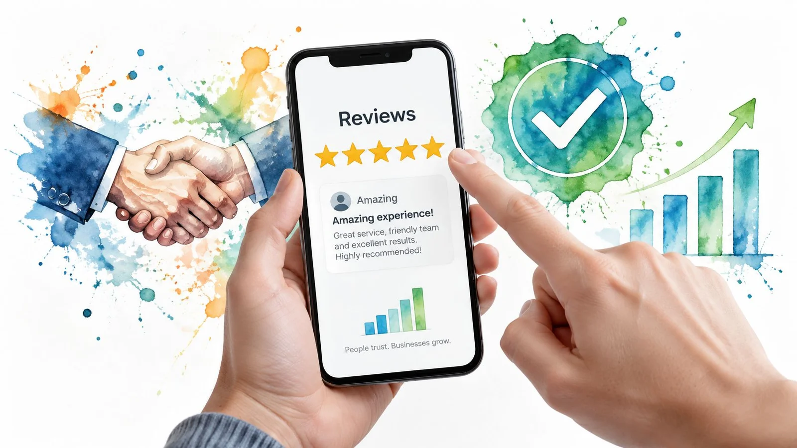
A group discussion can look like independent customer evidence even when a marketer generated it. Use genuine review examples to understand what actual testimony contains, but don't turn scripted buyer questions into implied endorsements.
A clear disclosure standard
- Label AI-generated dialogue. Make the label visible beside the conversation, not hidden in a policy page.
- Separate message types. Distinguish real visitor contributions, imported customer messages, and illustrative exchanges.
- Describe participation. Never imply that customers joined a conversation when they didn't.
- Keep claims verifiable. Don't invent customer quotes, purchase activity, outcomes, or satisfaction.
A study of AI chatbot privacy found that 17 of 20 tested chatbots shared information with at least one third party during a normal chat session. That finding isn't a claim about every provider, but it makes naming data recipients important.
Write a short data-use notice using your actual configuration. For example, adapt this sentence only after checking it: We collect your messages and submitted contact details to answer your request, and share them with our chat provider and support team.
Escalation and trust checks
Send sensitive or uncertain questions to a human or the authoritative policy page. An assistant shouldn't improvise health advice, financial guidance, or refund exceptions. Our AI learns from website content, so product, pricing, and policy information must stay accurate and current.
Review any supporting video with the same attention to claims and disclosure:
Monitor disclosure comprehension, complaint rate, handoff rate, and post-purchase refunds or cancellations. Ask visitors what they thought the conversation represented, rather than assuming the label was understood.
A display disclosure you can adapt is: This conversation includes AI-generated illustrative participants, not customer testimonials. The AI representative answers from our website; real visitor messages are marked separately.
Examples From SaaS, Courses, Launches and Webinars
SaaS and course decisions
A software buyer reaches your demo page and wonders whether their existing CRM will connect without custom development. The assistant should explain the supported integration, identify any plan restrictions, and direct the buyer to implementation documentation. If the requirement isn't covered, it should offer a sales handoff rather than promise compatibility.
Track qualified demo requests. Define qualification through product fit and a genuine implementation need, not merely whether someone supplied an email address.
A prospective student has a different concern: they work shifts and can't attend every live class. The course assistant should distinguish live sessions from recordings, explain access terms, and state any attendance requirements. Avoid answering a scheduling question with a broad promise about career transformation.
For that page, track enrolment completion. If visitors frequently ask the same timing question, also move the answer into the main course description.
Launch and webinar decisions
Say a launch visitor wants to know whether an early signup guarantees availability. The answer should state what the signup provides, explain the release timing from approved content, and describe any published guarantee without expanding its meaning. A waitlist place and a confirmed order aren't interchangeable.
Track early signups, using a definition that excludes duplicate or invalid submissions. For design inspiration, the landing page lessons from SimpleLab Digital can help you examine page layouts, while your own buyer questions should determine the dialogue.
A webinar visitor asks whether the session suits an experienced operations manager or mainly covers beginner material. Give an answer grounded in the agenda, intended audience, session length, and attendance arrangements. Don't claim that every role will benefit equally.
Track registrations that attend, rather than stopping at form submissions. That keeps the evaluation tied to whether the explanation attracted suitable attendees.
The same thinking carries past the registration page. With FOMOchat webinar chat on a replay, later viewers can see the questions earlier attendees asked, so a recording doesn't feel like a dead end. Our webinar landing page examples show where that fits in the bigger funnel.
Borrow the questions from the closest example, not the entire design.
The useful counter-example
A fixed-price ebook page clearly states its topic, contents, format, and delivery method. If visitors have everything they need, a visible purchase button is the better starting point.
Don't add a staged discussion just to make the page seem busy. Choose the scenario closest to your offer and write the answer that would help that visitor decide.
Run a Controlled Chat Test Before Launch
Test chat when the offer requires evaluation, visitors repeat meaningful questions, and the page supports enough attention for an exchange; keep a straightforward ebook or simple signup page plain.
Use Coachful's funnel A/B testing guide to plan the comparison, and these practical checks for testing landing pages to organize the work.
- Record the baseline. Define conversion and qualified-lead rate before changing anything. Choose a fixed observation period, then split comparable traffic between the unchanged page and the chat version where possible.
- Change the interaction only. Start with delayed or user-triggered placement, keeping the CTA visible. Don't simultaneously rewrite the offer or change traffic targeting.
- Compare outcomes and friction. Measure conversions, qualified leads, corrections to earlier answers, complaints, and human handoffs. Include disclosure comprehension and downstream cancellation behaviour.
- Keep the commercially useful version. Choose the outcome that matches the offer, such as suitable demo requests or attending registrants. Message volume isn't a success criterion.
- Review transcripts weekly. Identify unsupported answers and fix source content before adjusting conversational wording. Our analytics allow individual visitor conversations and messages to be reviewed. Our guide to conversation analytics covers what to look for.
Assign the decision
Our setup takes about 5 minutes: enter the website URL, let the AI analyze it, generate a conversation, and paste the code. That's installation time, not evidence that the experience is ready for unrestricted traffic.
Before launch, put a calendar review date and an actual person's name in the test record. For example, schedule the decision for the end of your chosen observation period and make the growth lead responsible for recommending keep, revise, or remove.
FOMOchat combines an AI company representative trained on your website with an embedded group-chat experience where visitors can ask questions before acting. Visit FOMOchat to book a demo and explore whether a clearly disclosed conversation fits your landing page's unanswered questions.