
Almost one in four consumers surveyed across the United States, United Kingdom, Germany, France, Australia, and Canada had used generative AI instead of a search engine to find a product in 2025. Among consumers aged 18 to 34, the share reached 41%, according to the 2025 Shopper Experience Index from Bazaarvoice. That shift changes what a product page must do. It no longer serves only search visitors comparing options in a familiar browser journey. It also receives visitors who may arrive with a specific recommendation, a compressed set of expectations, and immediate questions about fit, evidence, price, or compatibility.
A product page conversion rate is useful only when you know who entered the page, what action counts as a conversion, and what happened afterward. The strongest CRO programs don't chase a universal percentage. They identify which visitors hesitate, locate the unanswered question causing that hesitation, and test a page change against a clearly defined business outcome.
Why Your Product Pages Are Not Converting
A product page can attract steady traffic, load with polished imagery, and still produce disappointing sales. The headline looks clear, the button uses a familiar color, and the analytics report healthy page views. Yet visitors browse the gallery, inspect the description, and leave without adding the product to their cart or starting the next step.
Consider a team selling a specialist software plan. Visitors arrive from paid campaigns, read the feature list, and open the pricing section. Some want to know whether the plan integrates with their existing tools. Others need confirmation about onboarding, data handling, or the difference between tiers. If the page answers none of those questions, the team may misdiagnose the problem as weak demand or expensive acquisition. The core issue is unresolved uncertainty. Our guide to product page optimization walks through the fixes that usually matter first.

Traffic is not intent
Visitors from a product review, an email campaign, a branded search, and a broad social advertisement don't arrive with the same level of purchase readiness. A visitor researching a category may need education. A visitor who has already compared plans may need proof, reassurance, or a direct answer. Blending both groups into one product page conversion rate hides the difference.
The page can also lose people after they make a positive decision. A shopper may click the primary CTA, encounter an unclear delivery condition, struggle with variant selection, or abandon a complicated checkout. Baymard's ecommerce research links checkout abandonment to the full buying journey, not just the content above the product page fold. If that's where your drop-off sits, our playbook on how to reduce cart abandonment is the better starting point.
Practical rule: Treat a low conversion rate as a location signal, not a diagnosis. It tells you that fewer visitors completed the chosen action. It doesn't tell you whether the cause was traffic quality, missing information, weak trust, slow performance, or checkout friction.
Use the metric to find the gap
Start with the path from entry to outcome. Track the visitor's source, device, interaction with the main product information, primary CTA click, add-to-cart or registration event, checkout start, and completed conversion. A page with strong CTA interaction but weak completion has a different problem from a page where visitors never engage with the offer.
That distinction makes testing more efficient. Instead of adding another badge or rewriting every paragraph, you can ask a narrower question: Which objection prevents this visitor from taking the next meaningful action?
What Is Product Page Conversion Rate
The product page conversion rate is the percentage of visitors or sessions that complete a defined action on or after viewing a product page. The standard calculation is:
(Conversions ÷ Visitors or sessions) × 100 = Conversion rate
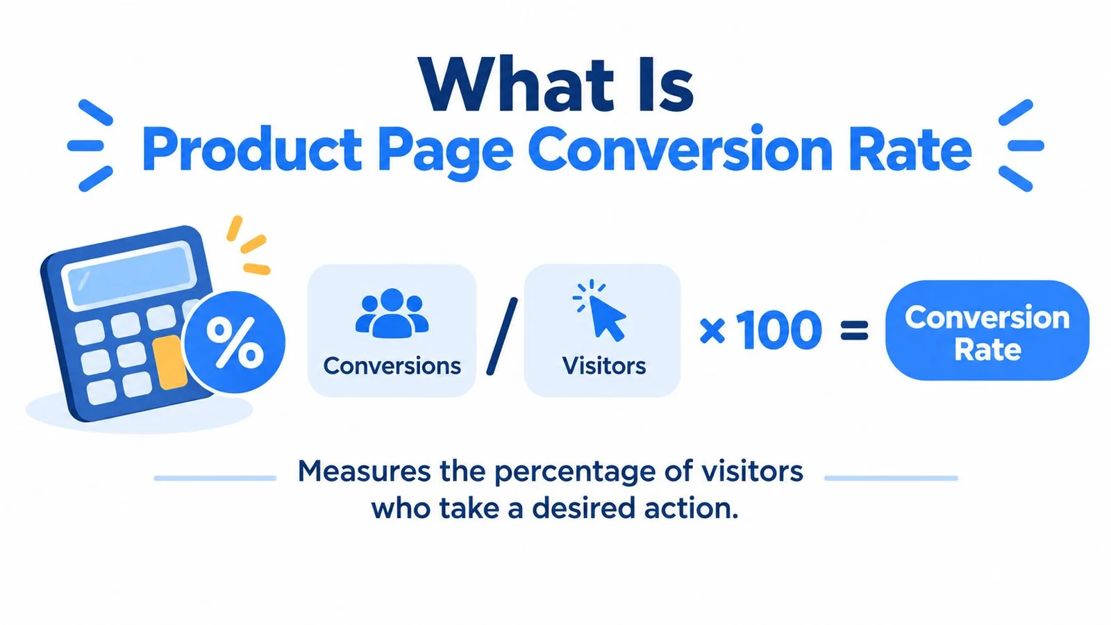
A conversion doesn't always mean a completed purchase. For an ecommerce store, it may be a purchase or an add-to-cart event. For a SaaS company, it might be a trial signup. For an education business, it could be a qualified enrollment lead. The definition must match the page's commercial role, and the team must keep that definition consistent between the control and the treatment.
The denominator changes the story
Suppose one report calculates conversions against unique visitors while another uses sessions. Neither calculation is automatically wrong, but they describe different populations. A visitor who returns several times contributes differently from a single-session visitor, and a blended rate can shift when the device mix, acquisition channels, or traffic intent changes.
That's why a product page conversion rate isn't a universal benchmark. It depends on the denominator, market, device mix, product category, traffic intent, and conversion event. A page can receive substantial traffic and still show a low rate when many visitors are researching rather than buying. Teams that compare rates without those conditions may optimize for a misleading average.
For a clear explanation of the wider conversion-rate concept, see this guide to CVR in digital marketing. Then document five fields in every product-page report:
- Conversion event: State whether the outcome is a purchase, registration, qualified signup, or another action.
- Population: Identify whether the denominator is visitors, sessions, or another defined group.
- Traffic source: Separate organic search, paid campaigns, email, social, creator referrals, and AI-referred traffic where possible.
- Device: Report mobile and desktop separately before calculating a blended result.
- Date range: Record the exact period so seasonality and campaign changes don't distort comparisons.
Measure the downstream outcome
A product-page action can be useful without being the final commercial result, but it shouldn't replace the final result. Baymard reports that 18% of users have abandoned orders because the checkout experience was too long or complicated, and it found that only 25% of ecommerce sites provide enough product imagery for shoppers to evaluate an item properly. Both findings support a wider measurement view, where product-page engagement and checkout completion are monitored together through Baymard's ecommerce CRO research.
A credible experiment therefore compares the same conversion definition for control and treatment, while separately tracking qualified checkout starts and completed conversions. If a new element increases CTA clicks but produces no improvement in completed purchases, it may be moving curiosity rather than reducing purchase friction.
The Benchmarks That Actually Matter
A single industry average rarely identifies the change a CRO team should make. A useful benchmark compares a defined visitor cohort with a comparable cohort, using the same conversion event and funnel stage. Traffic source now matters even more because organic, paid, social, email, creator, and AI-mediated discovery can bring visitors with different intent, expectations, and product knowledge.
Baymard's checkout benchmark reviewed 344 top-grossing US and European ecommerce sites, more than 30,000 checkout elements, and over 110 usability guidelines. Its assessment rated 65% of sites as mediocre or worse, while only 2% were rated good. Baymard also estimates that the average large-scale ecommerce site has 32 meaningful checkout improvements available and could potentially achieve a 35% increase in conversion through better checkout UX. These are modeled opportunities, not a forecast for every business. The Baymard checkout usability benchmark doesn't establish a universal product page conversion rate.
Benchmark the journey, not just the page
A page-level rate can appear acceptable while a later step loses qualified demand. A low rate may also be reasonable when a page attracts early-stage researchers who return several times before purchasing. Compare the metric across the journey:
| Comparison | What it can reveal |
|---|---|
| Mobile versus desktop | Whether layout, speed, or CTA access creates device-specific friction |
| New versus returning visitors | Whether the page educates first-time visitors or fails to close familiar ones |
| Acquisition source | Whether intent and product knowledge vary by channel |
| Product category | Whether shoppers need more proof, explanation, or comparison |
| CTA action versus completed conversion | Whether friction appears after the initial product-page decision |
| AI-referred versus other traffic | Whether visitors arriving through AI summaries need different context or validation |
AI-mediated discovery changes the denominator and the page experience. A visitor referred from an AI answer may arrive with a narrower question and less exposure to your brand, while a branded search visitor may already understand the offer. Report those cohorts separately where volume allows, then compare their product-page actions, checkout starts, and completed purchases. A blended rate can hide a high-intent segment that needs a different experience. For segmented baselines by source and device, see this breakdown of the average conversion rate for ecommerce.
Benchmarking principle: Compare like with like before comparing yourself with the market. The relevant benchmark is the rate for a defined audience, source, device, and decision stage.
Prioritize usability opportunities
More traffic doesn't repair an unclear offer, incomplete imagery, or a difficult checkout. Product pages support decisions with clear information, visual evidence, trust signals, and accessible answers. Checkout design determines how much of that intent becomes revenue.
Teams reviewing page structure can use this CRO advice from Silver Spoon Agency as a practical reference for evaluating ecommerce friction. The useful question is whether each element helps a defined visitor complete the next task, not whether the page contains every recommended component.
Measure product-page action rate, add-to-cart or registration rate, qualified checkout starts, and completed conversions together. If an element increases interaction but weakens completion, investigate before rollout. Your internal baseline, segmented by source, device, and discovery path, usually provides a better decision rule than a borrowed average.
Key Drivers of Product Page Performance
Product page performance has several levers, but they don't solve the same problem. Speed removes delay. Social proof reduces perceived risk. Conversational support addresses unanswered questions. Treating them as interchangeable leads teams to test the wrong intervention.
Speed protects the first interaction
Google's summary of SOASTA research reports that mobile pages loading one second faster achieved up to a 27% increase in conversion rate. The result is an observed upper-bound relationship, not a universal forecast, so teams should validate it with controlled testing through Google's mobile site speed guidance.
The mechanism is behavioral. Slow pages delay the first meaningful interaction, and some visitors leave before they see the product evidence or primary CTA. A speed test should therefore pair real-user performance data with funnel events rather than treating page speed as a separate SEO report. Our checklist on how to improve page performance covers the usual culprits.
Prioritize the assets that delay the decision:
- Product imagery: Compress images and serve modern formats without sacrificing the detail shoppers need.
- Layout stability: Reserve space for media and controls so the CTA doesn't move while the page renders.
- JavaScript execution: Reduce render-blocking scripts and defer nonessential personalization, analytics, and chat code.
- Segment reporting: Compare mobile and desktop by traffic source, browser, geography, connection quality, and new versus returning visitors.
A blended site average can conceal a disproportionately large mobile effect. If the mobile CTA isn't usable quickly, a later trust intervention won't reach enough visitors to matter.
Trust answers a different objection
Reviews, customer imagery, guarantees, specifications, and clear policies help visitors decide whether the offer is credible and suitable. They work best when placed beside the question they answer. A review near the purchase decision supports confidence. A compatibility explanation near the relevant feature prevents a visitor from leaving to research elsewhere.
An AI chat widget serves a different role. It can respond to questions that the page hasn't anticipated, but its value depends on factual accuracy, clear limits, and a sensible escalation path. It shouldn't cover weak product information or slow down the primary content. In FOMOchat, for example, you set response guardrails so the AI representative stays within answers you've approved. Our explainer on how guardrails work shows why that matters for trust.
Teams improving catalog structure and content can also consult this guide to improve ecommerce product pages. Use it as a prompt for reviewing imagery, specifications, page hierarchy, and the path to purchase, then validate each proposed change against your own visitor segments. If your copy is the weak spot, our guide on how to write product descriptions is a good next read.
The priority order is usually simple: make the page usable, make the offer verifiable, then add assistance where a recurring objection remains. Measure CTA reach and completed outcomes, not chat activity alone. A busy chat isn't the same as more sales.
Testing Frameworks for CRO Teams
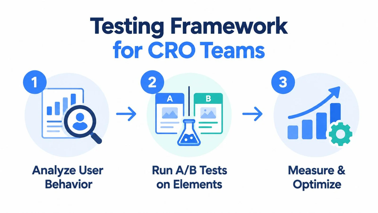
A reliable CRO program starts with an objection, not an element. “Add a chat widget” is an implementation idea. “Visitors who understand the product still hesitate because they can't confirm compatibility” is a testable problem.
Start with evidence
Review session recordings, search terms, support questions, product-page exits, and funnel progression. Look for repeated uncertainty rather than isolated behavior. If visitors repeatedly open specifications and then leave, the page may need clearer evidence. If they reach checkout but don't complete, the page change may not be the right intervention.
Write the hypothesis in a way that connects a change to a user problem:
A useful hypothesis: If we place a concise compatibility answer beside the primary CTA, visitors who arrive from comparison content will complete more qualified signups because the page resolves their main objection before the next step.
Define the primary conversion before launching. Choose secondary signals that help explain the result, such as CTA clicks, add-to-cart or registration rate, qualified checkout starts, product-information interactions, and support escalation. Bounce rate and time on page can provide context, but neither proves that the visitor became more likely to buy.
Test one decision at a time
A control might show the existing product page. The treatment could add an AI support widget that answers approved questions about features, pricing, and setup. Keep the conversion definition, audience rules, traffic allocation, and measurement window consistent. If you change the page copy, CTA position, reviews, and chat experience simultaneously, you won't know which intervention caused the result.
For social proof, compare a specific presentation against the current version. You might test customer questions near the CTA against a static review block, or test a compact notification against no notification. Keep expectations modest for that second test on complex products. A "someone just bought this" toast can't answer the question that's actually stopping a buyer, which is the core argument in our piece on why social proof notifications don't work for complex products. That gap is exactly what FOMOchat's conversational social proof is built to fill. The result should be evaluated by source and device, because a visitor from a high-intent campaign may respond differently from someone discovering the category for the first time.
Use this A/B testing guide for CRO teams to reinforce the discipline of defining the control, treatment, hypothesis, and success criteria before launch.
A test can produce a positive primary result and still create commercial risk. Check returns, cancellations, refunds, support contacts, and answer accuracy when the treatment makes claims or gives recommendations. A short-term lift isn't sufficient if the change creates confusion after purchase.
Turn results into a learning system
Record what changed, which segment responded, and which objection the result supports or rejects. A failed test can still improve the roadmap if it shows that the assumed problem wasn't important, or that the chosen solution appeared in the wrong place.
The strongest teams don't ask whether a page is “optimized.” They maintain a queue of observed frictions, rank them by business impact and confidence, and continue testing the next unresolved decision.
Optimizing for Trust and AI Discovery
AI-mediated discovery makes product-page accuracy part of conversion work. Visitors referred by an AI tool may arrive with a concise product comparison already in mind. They may not need broad persuasion, but they can be less tolerant of vague claims, missing evidence, or an answer that contradicts the recommendation they received.
Trust is also uneven. In January 2025, 43% of surveyed consumers across the United States, United Kingdom, Canada, and Australia said they would trust information from an AI chatbot or tool, while 43% remained concerned about privacy or security weaknesses, according to the Consumer Adoption of AI report from Attest. Separate 2025 research in the same report found that 79% of US consumers considered accuracy the most important quality in AI shopping assistance, ahead of speed at 36% and transparency at 35%.

Build pages around decision requirements
Baymard's product-page UX benchmark found that only 48% of desktop sites and 38% of mobile sites achieved a decent or better rating. The remaining 52% of desktop and 62% of mobile implementations were mediocre or worse, as documented in its current-state product-page UX research. The benchmark evaluates usability quality, not a universal conversion rate, so it helps teams prioritize friction without predicting a specific lift.
Audit mobile first. Check whether visitors can:
- Understand the offer and its fit quickly.
- Inspect the image gallery and product evidence.
- Select variants without losing context.
- Find shipping, enrollment, returns, or refund information.
- Read FAQs and reviews near the relevant decision.
- Reach a credible CTA without excessive scrolling or layout movement.
A practical guide to product visibility can supplement this audit by prompting a review of how products appear across discovery and content surfaces. Visibility only creates value when the destination page confirms the claim that attracted the visitor.
Make assistance auditable
AI support should distinguish known facts, uncertainty, and unavailable information. Test sensitive answers about compatibility, outcomes, pricing, and delivery separately, then monitor answer accuracy, escalation, refunds, cancellations, and post-purchase satisfaction alongside conversion.
Trust signals and assistance work together when each has a defined job. Reviews provide independent evidence. A support layer helps visitors interpret the offer or resolve a question. This broader review of symbols of trustworthiness can help teams evaluate whether the page earns confidence before asking for action.
The most useful product page conversion rate is therefore not a badge of quality. It's a diagnostic view of a specific audience moving through a specific decision path.
FOMOchat provides an AI company representative and interactive social-proof conversations that answer product questions and surface relevant visitor discussions on the page. Visit FOMOchat to configure the experience, set response guardrails, and test whether timely assistance improves qualified signups, enrollments, or registrations.